This was the last full week of indie month. I have not grown fatigued at all with using indie shadows, and in fact, this is the most fun I have had with makeup in a long time. For one, single shadows are totally my preference (a fact I did not know about myself until I started my one week, one palette project), and two, the colors are so unique and special.
With every new release that has come out, I find myself thinking that all of those shadows don't hold a candle to my collection of single shadows, especially indie shadows. And for this revelation, I am grateful. I love feeling in control when a new palette releases and thinking that most of everything is an easy pass.
And that's really interesting for me because when I watch a lot of people's makeup collection videos or declutter videos, I've noticed that most people don't have a ton of single shadows. Or they say how they never use their singles because palettes are just so much better. And I wonder if that phenomenon happens because most people genuinely feel that way or if it's because we continue to hear people hype palettes. When's the last time you heard about a collection of single shadows be hyped? And not in the sense that you can buy a ton of them and pop them into a custom palette. So, this excludes MAC, Makeup Geek, Make Up For Ever, Colourpop pressed shadows, etc. When's the last time people seriously hyped a single shadow that came in it's own distinct packaging?
Or is the reason that singles are not hyped because we all have become so conscientious of saving space and putting everything into palettes because we have all accumulated so much?
Whatever it is, I'm happy I found singles again and am even happier I have a beautiful collection of unique indie shadows.
Here are five looks I did this week.
Look 1: Femme Fatale Faerie Fire and Shiro Cosmetics There's No Such Thing As Magic
Faerie Fire on the lid (over Pixie Epoxy) and There's No Such Thing As Magic blended into the crease.
Look 2: Shiro Cosmetics He Loves His Hammer
He Loves His Hammer on the lid (over Pixie Epoxy) and Kat Von D Shade and Light Quad in Plum blended into the crease.
Look 3: Hello Waffle Furry Godmewther and Shiro Cosmetics Little Bird
Furry Godmother on the lid (over Pixie Epoxy) and Little Bird blended into the crease.
Look 4: Femme Fatale Candied Apple
Candied Apple on the lid (over Pixie Epoxy) and Melt Rust Stack blended into the crease.
Look 5: Notoriously Morbid Fight for Beauty
Fight for Beauty on the lid (over Pixie Epoxy) and Kat Von D Meow blended into the crease.
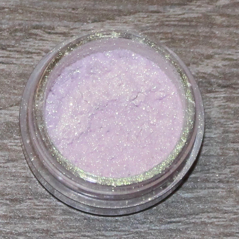
Femme Fatale Faerie Fire
Status: Keep
I enjoyed this shadow, I just think that I am a bit over the duochromes that mainly look white or gold on the lid. I do like those shadows, but I have used a lot of them in this indie month challenge, and they are not always all that flattering on me. With this color, it looks so pink in the pot, but when applied to my eyes, it was lime green. It was a really cool color, and I'm glad that the camera picked up the duochrome of it. I think for work, it wasn't my favorite color, but it is certainly a color that I will wear again and enjoy.
Shiro Cosmetics There's No Such Thing As Magic
Status: Love
I paired Faerie Fire with this shadow, and I really loved it. This was a lovely pink satin color that looked more matte than satin. I don't have a ton to say about nice mattes other than they are nice and I enjoy using them. And that's how I feel about this shadow. I don't think this is a "must have" if you have other mattes in your collection that you enjoy, but it is certainly a nice shadow.
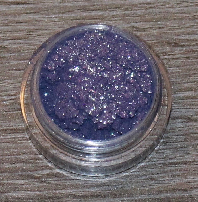
Shiro Cosmetics He Loves His Hammer
Status: Love
This color really took me by surprise. I have mentioned a lot during indie month that many of the colors in the pot have surprised me when applied to the lid, but it is usually in a slightly negative way. The opposite was true for this color. I actually avoided using this color for a long while because it looked so gray and dark in the pot. I just wasn't excited to use it. I finally forced myself to use it this week, and holy cow, was I surprised. It is a gorgeous taupe purple color, and may be one of my favorite taupes in my entire collection.
Hello Waffle Furry Godmewther
Status: Love
I just love this color. This is definitely one of the best performing shadows from Hello Waffle that I've tried. It is a bit cool-toned for me, but I still love it. I think it gives that perfect soft, pretty color. I paired it with a pink in my crease, and I thought the look was really pretty. I would love to try this color with some of the shades in my Kat Von D Shade and Light Eye Quad in Plum as well as some of the purple shadows from the Viseart Dark Matte palette. And I really appreciate that this shadow is one that can be versatile in that way while still being very unique.
Shiro Cosmetics Little Bird
Status: Love
I liked this color a little more than There's No Such Thing As Magic, but I think both are really great. This was a shadow that was highly recommended, and I can see why. I have a few matte pinks in my collection, but they payoff is not as good as from this shadow. I thought it paired so beautifully with the shadow from Hello Waffle, and I imagine since it is a satin finish, that it would also be very lovely all over the lid.
Femme Fatale Candied Apple
Status: Favorite
This was the biggest surprise of not only this week, but probably all of indie month for me. When I was researching which colors I wanted to buy in exploring these different indie brands, I kept hearing about this shadow from Femme Fatale. And I actually ordered it in a large size (most of the shadows I've purchased have been mini sizes) because of all the glowing recommendations. When it arrived and I swatched it on my hand, I was so, so disappointed. It looked just like any green-brown duochrome shadow, like MAC Club or the shadow from Wet N Wild Comfort Zone. And as I've mentioned before, I am actually not a huge fan of that kind of shadow. I think it looks interesting when swatched, but I just don't like how it looks on my warm olive skin. I was so sure that I was going to declutter this shadow, and it was also one that I put off wearing. I finally decided that I had to wear it in the last week and that I could just live with wearing a shadow that I didn't really like for one day.
But, oh my gosh, I was so wrong. I
love this shadow. I think what's so special about it is that it is really soft, bight, and shiny. I don't know how else to describe it. The "brown" undertone in it is essentially not brown at all, and is more pink. And I guess that's what I didn't see when I swatched it for the first time. This shadow reminds me a lot of the concept of Femme Fatale Faerie Fire, but is much more successful (in my opinion) in application. I love this shadow and I could not be happier that I have it in my collection.
Notoriously Morbid Fight for Beauty
Status: Enjoy
This shadow was the one I was most looking forward to using this week. When I swatched it on my hand, I couldn't believe how stunning it was. It was a perfect light blue and pink duochrome that didn't seem to sacrifice on either color the way I feel a lot of duochomes do (like Faerie Fire). However, when I applied it onto my lid over Pixie Epoxy, It came of very heavily blue, but the concentration of color was also quite patchy, if that makes sense. It wasn't a smooth duochrome. Some areas looked blue and others looked pink instead of the color shifting. I don't know it that was due to user error, and maybe this is a shadow that doesn't work with Pixie Epoxy. I'm not sure. I liked it enough that I am happy to keep it in my collection, but I didn't fall as hard for it as I was expecting, and that is always a little disappointing.