Friday, December 29, 2017

Palettes I Am MOST Glad I Didn't Buy in 2017

As 2017 is drawing to a close (thank goodness, by the way—this has been one hell of a hard year), I wanted to reflect on the palettes that I am most glad I didn't buy this year. These are the palettes that I really, really wanted, more than the others, but still made the decision not to buy. And now that we are a few or several months removed from when these palettes first came out—and the hype has died down quite a bit—I thought it was a good time to check back in and talk about why I'm glad I didn't buy these products.

(I've also linked my original anti-haul posts).

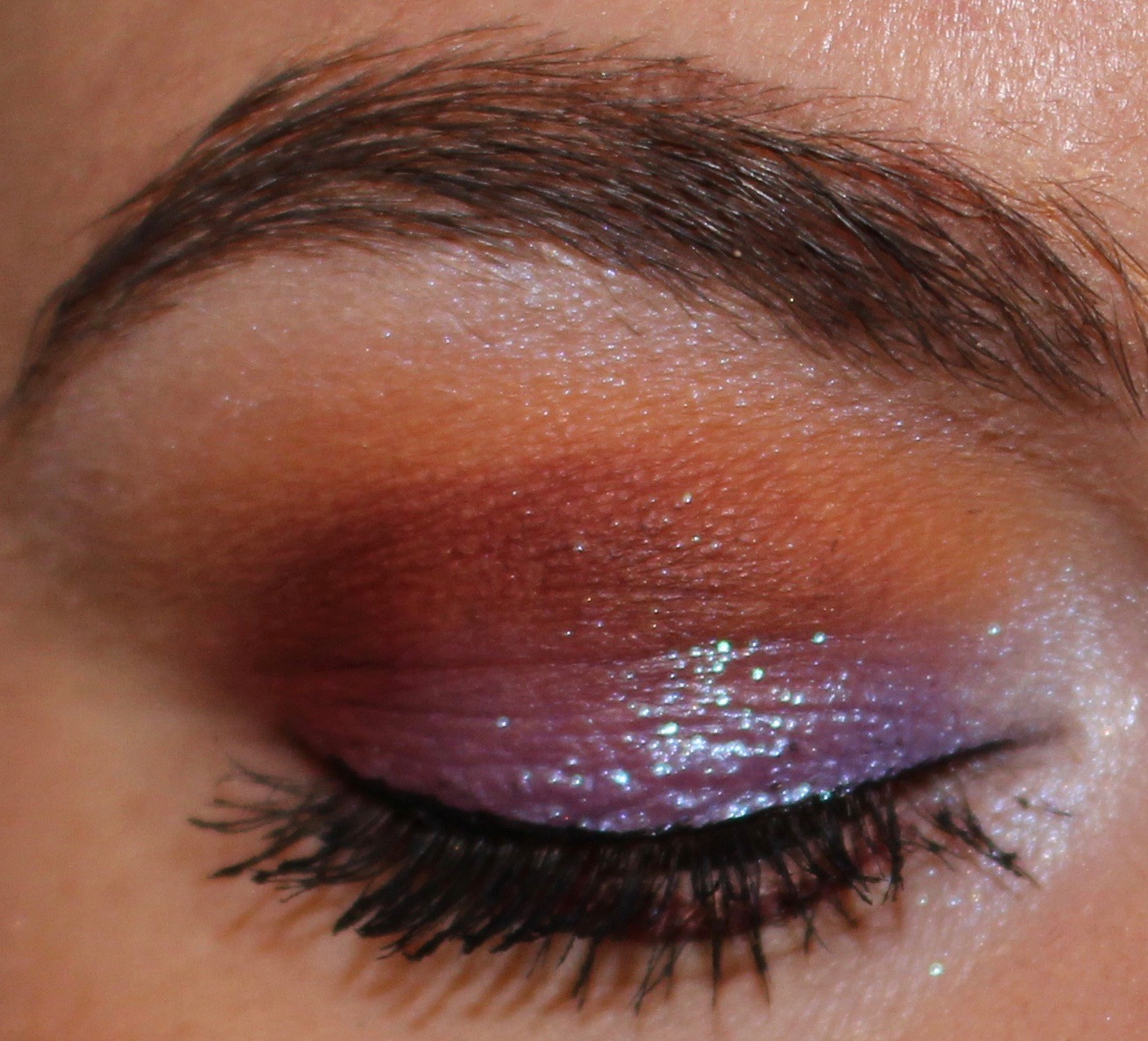
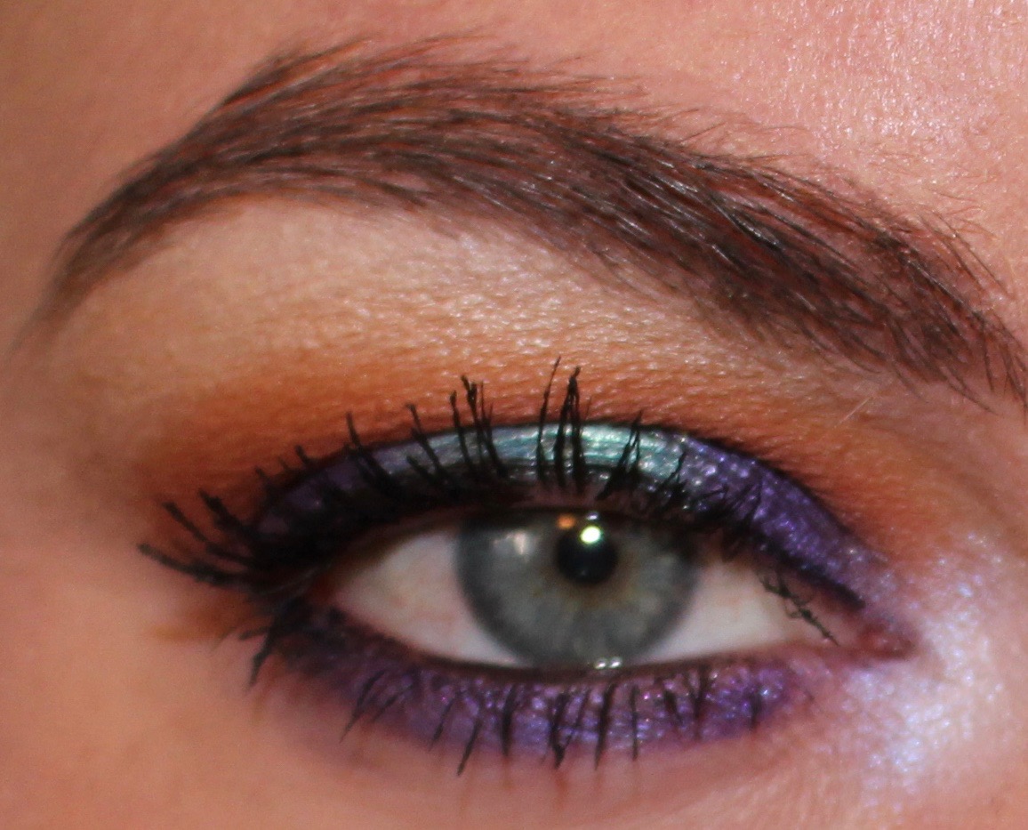
Kat Von D Shade and Light Glimmer


Believe it or not, but Kat Von D ended up being the brand of the year for me. Over Christmas, I received a very thoughtful gift, which was the original Kat Von D Metal Matte palette from holiday 2016. I laughed when I received it because I had just written about how it was my "palette that got away," and now it's the third Kat Von D palette I have owned after first writing an anti-haul post. (The other two are Pastel Goth and Saint and Sinner—Saint and Sinner was a gift, and my reasons for purchasing Pastel Goth are here.) I also purchased a preowned Mi Vida Loca Remix palette this year, and now I have more palettes from Kat Von D than any other brand. 

2017 was also the year that I decluttered my Shade and Light Eye palette. I was honest with myself and realized that I was only really using the warm quad in the palette, and when I purchased the Melt Rust Stack, I knew that it would easily become my favorite warm matte palette, and it did. I didn't need to have an entire palette that wasn't getting used, so I decluttered it. 

But then Kat Von K came out with a shimmer/glitter version of the Shade and Light Eye palette, and man, did I want this. Had this palette come out a few years ago when I had less neutrals/was somehow justifying adding even more neutrals into my collection, I would have snapped it up in a heartbeat. And even when I saw it swatched for the first time, I felt pangs of lust. But I resisted, and I'm so happy that I did. 

Now, more than six months later, I never hear anyone talk about this palette. The "glimmer" formula some of the shades have don't seem to be winners as they are more eyeshadow toppers, which, let's be honest, most people don't want (myself included). This absolutely would have been a palette that I would have played with for a couple days, got bored with how neutral my eyeshadow came out, and then reached for something else, putting this in the back of my collection. I'm glad I don't have it. 


There were so many makeup life lessons that I had to learn in order to resist buying this palette. Without question, this is my favorite Naked palette, and I know that without having to own it. I love the color scheme and love how warm it is. But I also know (from owning three Naked palettes in the past and decluttering all of them) that I really, really don't like the Urban Decay palette shadow formula. So even though this is my favorite Naked palette in terms of how it looks, I likely would have disliked how it performed as much as I did the other three. 

I also had to learn that these colors were all too similar. That's what makes the palette look so fantastic in pictures and in person, because it is cohesive and has a lovely gradient. But that doesn't translate to versatile eyeshadow looks. Seeing this palette turn up in so many declutter videos and end of the year "worst makeup" videos made me feel vindicated. So many people have discussed that they love the color scheme but that they can only make one look with this palette, which is what I had suspected. As much as I wanted this palette, I'm glad that I resisted. I know it would have made me angry thinking about spending over $50 on essentially one eyeshadow look with a formula I don't even like, so it's good I passed on this. 


These palettes presented some real temptations from me, especially when people wrote to me and said that these shadows were truly something excellent. When I first saw the palettes in person and saw/felt the packaging, I have to admit that I felt as though I had possibly made a mistake. But then I swatched the shadows and worked with them a bit. And the truth is they just aren't that great. They certainly were nothing extraordinary in terms of performance, and I have other shadows from brands like Makeup Geek and Coloured Raine that performed better and packed a lot more pigment. 

I continue to be interested in all Pat McGrath's releases because she is a legend, but apart from the magnificent packaging, these shadows didn't have anything about them that made me think their price tag was justified. I also tend to think that shadows within luxury price ranges tend to get the brunt of hyperbole, which is natural. People want to justify the money they spent, so they tend to exaggerate how amazing something is that's expensive. These palettes, at least in my experience, just don't have fantastic shadow quality. And I'm glad that I didn't spend a ton of money to have some pretty gorgeous makeup cases with average makeup inside. 


Something I didn't expect to happen in 2017 is that I finally broke free from the Viseart spell. I reduced my Viseart palette collection from six to two, and I have gradually grown to feel like Viseart is generally overhyped. The two palettes that I still own are Neutral Matte and Dark Matte, and of the two I would recommend Dark Matte. Viseart used to be my favorite matte formula, but if I am going to be entirely honest, I don't know how much of that was real feeling and how much of that was hype clouding my judgement. My Viseart shadows perform well—I don't have any complaints about that. But if you haven't used Viseart yet and are expecting it to be noticeably different than using shadows from Makeup Geek, Coloured Raine, or Colourpop, you might be disappointed. 

I wanted this palette for rows three and four, and while I'm sure those rows have lovely shadows, there is just nothing in this palette that I don't already own. And like I just said, I don't think that Viseart shadows are so special as to justify spending the high price on them to rebuy shadows that I already have. 

Seeing how much I have used my duped Peachy Mattes palette (I'll talk about that one in a bit), I just can't justify the cost of this palette, and I'm so happy that I chose not to buy it. Sometimes all it takes is looking at your single shadow collection to really show you that you don't need to spend nearly $200 to get the colors you want. Sometimes (most times) you already have them. 


I don't even want to tell you how many times I've thought about buying this palette. If you've read my blog for any amount of time, you know that I am not big on Natasha Denona. Like Viseart, I think this brand is grossly overhyped. It makes me a little sad to watch people who haven't tried Natasha Denona shadows talk about how much they would love to have one of her palettes. And I get it—I had that mindset at one point too, and I've mentioned before that I think a lot of people need to buy Natasha Denona to learn that Natasha Denona is overhyped and overpriced. 

But I really just could not get enough of this color scheme. Even though I knew I had some of these colors already, I just loved the configuration of this palette and thought about caving so many times. And I'm so glad I didn't because Colorpop came out with Yes, Please!:


This was certainly a favorite palette of mine this year, but what I find really interesting is that I haven't used it in a few months. My interests can change quickly with eyeshadow, and I have just been so into my peaches, corals, and pinks that I haven't reached for this palette much lately. And I'm totally fine with that. Because it cost $16. I'm sure I'll swing back into wanting to use these exceptionally warm colors again soon (maybe toward the end of winter), and I'm glad that I don't have to think that I have let a $129 palette sit unused, like I would had I purchased Natasha Denona Sunset.


If you've read my blog much in the past few months, you know that I probably don't need to write much about why I'm glad I didn't buy this palette. This palette, in my opinion, was the best thing Too Faced released this year. Not only that, but I feel like it was the only good thing Too Faced released this year. And it was the one product that gave me pause and made me consider purchasing something from this brand I have grown to dislike so much. 

But then I realized I could try to duplicate it with shadows in my collection. And beyond that, I realized that I could customize it to make it the perfect palette for me. And from there, I got my duped palette:


This has been such a favorite of mine, and I have to give some credit to Too Faced for creating such an inspiring color scheme and layout. But I'm really glad that I didn't add another palette to my collection, especially since I like my custom palette more than the one from Too Faced. 


In my opinion, Desert Dusk feels a bit like the palette of the year. I'm not sure if that's a fair assessment, however, because it only came out in the last quarter of the year. This palette was everywhere, and I absolutely agree that the color scheme is incredibly inspiring. I've mentioned this before, but I am from the Southwest originally, and I grew up in the desert. I recently went home for the holidays, and I was in awe of how truly beautiful our sunsets are. And I'm excited that the colors of the desert sky were such a huge source of inspiration in so many palettes this year. 

But Huda Beauty does not have a formula that I like. And the majority of the shades in this palette, I feel, are pretty average, nothing special shades. It's the pops of color and the duochrome shades that draw you in, and despite how pretty it looks in the pan, I was happy that I resisted and was able to instead create what started as a duped palette and morphed into my own personal desert sunset palette:


Without question, I love my palette more than Desert Dusk. I think the color scheme is prettier and more versatile and contains a lot more interesting shades. Like the Just Peachy Mattes palette, I credit Huda Beauty with creating a gorgeous color scheme that I wanted to replicate. But in my opinion, my palette takes the cake here. And it should! For the most part this palette is made up of single shadows that I hand-selected, and the other shadows are from palettes that I've depotted. These are very obviously shadows that I love, so it makes sense that I would love my own version of a palette with a color scheme I enjoy. 

Because of how much joy and use I have gotten out of this collection of shadows, I am so happy that I did not buy Desert Dusk. I think I likely would have gravitated toward what I consider the most interesting shades in the palette (Twilight, Amethyst, Royal, and Retrograde) and not used much else since the looks I would have created would have been very neutral. Instead, I have a palette with some of the most unique singles in my collection, and I always have fun figuring out new looks with it. 


I don't think this kind of a post would be complete this year without mentioning Subculture. When I originally wrote my anti-haul post on this palette, the reviews had not yet come in and the drama/controversy had not yet happened. This palette ended up being a really great lesson in hype for me, which apparently I still need to learn. Despite the fact that I really disliked the formula of Anastasia Beverly Hills Modern Renaissance, I knew that it was going to be difficult to resist the hype (should we just call hype "hyperbole" at this point?) of the latest ABH palette. And I really liked the color scheme of this palette and that it was something different from we had seen over and again. 

But I had to have a serious moment with myself as a recovering makeup addict and tell myself that I don't like the formula of ABH shadows in palettes. I braced myself for the hype train to pass over and to have ridiculous feelings of fear of missing out, but instead, the opposite happened. I saw backlash and outrage that I had never seen before over a makeup item and more drama than I knew what to do with. (I have an entire post on this here.) 

And while, yes, I'm glad that I didn't buy Subculture because it was a bit of a disaster and very clearly a product that should not have been released in the condition it was in, I am also happy that I didn't buy it because I knew I wasn't going to like the formula. Granted, I had no way of knowing how much the formula was going to be an issue, but the problems people reported were a heightened version of all the problems I had with Modern Renaissance. I know that had I bought this palette and experienced those same issues, I would have been disappointed with myself because I knew better. 

***

In reality, I'm glad that I didn't buy any of the products this year that I anti-hauled, but these were the palettes that stuck out the most to me as products that I really considered purchasing or really wanted. And the harsh reality is that had I purchased all of these palettes, I would have added a whopping eight palettes to my collection this year alone. And that's not including the palettes that I actually did purchase as well as those I received as gifts. I could have easily tripled my palette collection just in 2017. I can also say with confidence that had I purchased any of these palettes, they probably would have gone largely unused in favor of some of my other products. 

As always, I'm eager to see what kind of products the new year will bring, and I'm excited to continue anti-hauling them. 

On a personal note, as I mentioned at the top of this post, 2017 was an incredibly difficult year for me. This blog and the community around it have consistently been positive forces in my life, and I sincerely appreciate everyone who read, commented, and supported Anti-Haul Blog this year. 

Thanks for reading. 

Thursday, December 28, 2017

What I'm Not Buying: Violet Voss Hashtag Palette


Fresh off the heels of the holidays, Violet Voss has released their latest palette, Hashtag. 

And I won't be buying. 

I feel like I maybe should put a disclaimer right at the top that things might get a little petty in this post (#Hashtag). 

When I first saw this palette, I was immediately intrigued by the vibrant color scheme and thought it would fit in nicely with the 2018 Pantone Color of the Year (ultra violet). But that was immediately eclipsed when I learned that this palette's name is Hashtag. That snapped me from my "oooh, pretty colors" trance and put me back in touch with reality and why I'm just not the biggest Violet Voss fan. But we'll get into that in a bit. 

Let's look at the palette:


I've included two pictures here because the palette looks different in both of them, and they are both promotional pictures provided by Violet Voss. In addition to the photos looking different from one another, both pictures (to me) look oversaturated. I wouldn't be surprised if the colors in this palette are actually significantly muted when compared to these photos. 

I would really like to talk about the colors in this palette, but I'm not sure which photo to base my thoughts on. 

The only row that kind of looks the same in both photos is the last row. Otherwise, these look like two different palettes. 

To me, the worst offenders are:
  • Fresh (top photo: light pink; bottom photo: cream)
  • Sauce (top photo: deeper pink; bottom photo: milk chocolate)
  • Savage (top photo: blood orange; bottom photo: light orange)
  • No Filter (top photo: bronze/copper; bottom photo: gold)
  • Throwback (top photo: copper; bottom photo: darker gold)
  • Lit (top photo: cranberry; bottom photo: bronze)
  • Vacay (top photo: red; bottom photo: copper)
  • FOMO (top photo: gold pink; bottom photo: champagne)
  • Living (top photo: violet; bottom photo: light cranberry)

What's curious is that the top photo is the "official" product photo, but the official swatches look like the bottom photo (see below). I believe it's worth noting the discrepancies between these photos, especially since Violet Voss has advertised the palette with both photos. 

Like all Violet Voss palettes, when I look at this one I see a lot of repetition. And for $45, that's unacceptable. That's always one of my biggest gripes with this brand. I don't need three gold shadows. Nor do I need four shimmery purples with very little distinction between them. I feel like Violet Voss often tries to do a gradient with their shadows so that the shadows look different in the pan, but when applied to the eyes, the difference is marginal at best. 

Let's look at swatches:


This swatch picture was also provided by Violet Voss as a promotional picture, and it is shown on the Sephora website alongside this product. This picture also looks oversaturated to me, and like colors in the image have been heavily edited. As I mentioned, these swatches look more like photo 2 above than they do photo one. For example, Fresh looks like a cream instead of a pink, and Sauce looks like a warm brown instead of a deeper pink. 

As a consumer, this is frustrating. Many people like to buy items as they release, and they use these images to gauge if they want to purchase. This swatch photo and the top photo are both on the Sephora website alongside this product, and the colors don't even look that similar. It makes it incredibly difficult to make an informed decision on whether or not to buy when the colors are this off on multiple promotional images. 

When I look at the swatches of this palette, I feel like I see only five distinct colors:
  • Cream
  • Black
  • Red-orange
  • Gold
  • Violet

I see those colors in different finishes and in slight variation of intensity, but I really only see those colors. This palette contains 20 shadows, so for there to only be five distinct colors is pretty alarming. 

I wrote an anti-haul post on the Urban Decay Naked Heat palette, and I said that one of the reasons I wasn't going to buy it is because all of the colors look the same and I couldn't see myself being able to create more than one or two looks out of it. Several people have written to me saying that they purchased that palette and love it (which is great), but I've also seen it pop up in so many end of the year declutter videos or "Worst Makeup of 2017" videos. And the reasoning people always give about why they are decluttering it is because every single look they try to do ends up looking the same no matter the shades they use. 

I think the exact same thing will happen with Hashtag. Since there are three main color groups (I'm excluding the cream and black since there is only one pan of each color in the palette), I think people will be able to get about three looks out of this. And they will be a purple one, a gold one, and a red-orange one. And even that number of looks can be deceptive since those three colors are very distinct. People may buy the palette, do those three looks, and think the palette is very versatile. But it's not. Because if you use different shadows within the same color schemes, my bet is that you will still come out with the same looks. The cream will be used as a brow bone highlight or as a shade to set eyeshadow primer, and the black will be used to add depth or smoke out a look. And that's it. 

This is something that I see all the time with Violet Voss palettes. They take a general color scheme and repeat the same shades over and over in the palette and then charge a mid-range price for it. This palette costs $45. For 20 eyeshadows, that may seem reasonable when you compare to brands like Urban Decay and Too Faced that charge upwards of $50 for 12 to 15 shades, but you have to keep in mind that these are not exactly 20 unique shades. 

Other palettes with similar color schemes include Huda Beauty Desert Dusk:


And Lorac Desert Sunset:


Other violet-heavy palettes include Natasha Denona Lila:


Ciate London x Chloe Morello Pretty, Fun, and Fearless:


Laura Mercier Artist Palette:


And Viseart Theory Amethyst:


In my own collection, there's BH Cosmetics Zodiac:


I know on the surface Zodiac and Hashtag don't look overwhelmingly similar, but Zodiac has the five general colors that are in Hashtag plus more. This palette is also $22 and is of fantastic quality, which, in my opinion, makes it a better buy than Hashtag. 

And finally, the palette in my collection that most suits this color scheme is my duped Desert Dusk palette:


I was recently put into a situation where I could have been away from the vast majority of my makeup collection for at least six months. That situation didn't come to fruition, but it did make a real-life version of "If you could only have one palette, what would it be?" I cheated because I chose two, and it was my duped Peachy Matte palette and this one. The most ironic thing about it is that out of my entire collection, the two palettes I could not live without are actually a collection of single shadows. 

And I think this is especially appropriate to mention when discussing the Hashtag palette because, as much as Hashtag might have pretty colors that draw you in, I think it would be a much better and cheaper option to buy a few singles instead. I've said a few times in this post that Hashtag is essentially made up of three colors plus a cream and a black, and I think it would be a much wiser decision to just buy three singles in those three colors if you don't already own them. 

That's the other thing—you probably already do own them. When I look at the two promotional photos for this palette, I am actually quite drawn to the color scheme, and I recognize that there is not a palette within my collection that has the exact color scheme. So my brain gets tricked into thinking this is a new and different palette, but the reality is that it's not. It's hard to even say which colors I'm most drawn to as the two promotional photos vary so drastically. I like the colors in photo one more, but I have a feeling the colors in photo two are more true to life. The reality is that I am most drawn to the violet shades in the palette because I have golds, coppers, and cranberries in spades in my collection. But, as you can see from my custom palette above, I also have violets in spades as well. 

My guess is that most people interested in buying this palette are also after the violet and reddish shades. I also assume that those same people have at least one gold, bronze, copper, and cranberry in their collection. And while it might seem tempting to have an entire palette full of those colors, I can guarantee that you don't need that many colors that have so little difference between them. 

To conclude this post, I would like to talk about Violet Voss and some reasons why I am not personally excited to buy from the brand. I will be transparent here and say that I have never owned a Violet Voss palette. I have swatched and worked with Violet Voss palettes, but I have never personally owned one. My opinion of the brand is that I am really stunned that they have somehow ended up in Sephora. When Morphe showed up in select Ulta stores, I wasn't really upset about it. Ulta has always had a solid drugstore makeup section, so I didn't feel like adding Morphe was that much of a stretch. And Violet Voss certainly has prices that put them in the mid-range of brands, so in that sense I can see the move to Sephora. However, I am surprised that Sephora added what I consider to be an overpriced internet/social media brand. 

I was not impressed when I worked with Violet Voss palettes in the past, and the quality reminded me a lot of the original Morphe formula. The shimmer shadows swatched well, but the mattes did not, and the shadows smelled really bad, just like Morphe. The packaging felt cheap, and the palette overall felt extremely overpriced. If Violet Voss charged BH Cosmetics prices, I feel like that would be more appropriate. Even so, I have been more impressed with the BH Zodiac palette than I was with anything from Violet Voss. 

I also very much dislike the "hip, internet lingo" that Violet Voss has adopted in their product names (Holy Grail, Ride or Die, etc), especially since a lot of it is appropriated from Black American culture. 

And that brings me to the pettiest point in this post and also the thing that I hate the most about this palette: the name. 

Hashtag. This palette is called Hashtag. That is the most "How do you do, fellow kids?" marketing I think I've ever seen. 


Hashtag means nothing. Actually, it means that Violet Voss knows that young people use social media and use hashtags. It has absolutely zero relevance to the theme of the palette, the packaging, or the colors inside. It is literally just "a word the young kids say."

And for me, this kind of marketing is a major turnoff. And it's not just because that marketing is definitely not targeted at me. It's because that marketing is lazy. "Holy Grail" at least kind of made sense, because the palette was full of red shadows and it came out when those colors were just starting to be on trend. "Ride or Die" also kind of made sense, because the palette was huge and filled with every neutral color (repeated five times over), and so could be seen as the one palette people would ever really need. But Hashtag? That doesn't mean anything within the context of this palette. 

As of right now, I can't see myself owning a Violet Voss palette any time soon. That's not to say that it will never happen, but I have not been impressed with the quality, especially for the price, from what I have personally seen thus far. Hashtag leaves a lot to be desired, from the name, to accurate and consistent promotional pictures, to a variety of colors or at least distinction between shadows in the same color families. While I'm excited to see what kind of palettes will be inspired by the ultra violet Pantone Color of the Year, I'm just not interested in this palette. Hopefully Violet Voss (and Morphe for that matter) will learn that consumers don't want to see the same few colors repeated over and over in the same palette.

What appeals to me most about this palette are colors that I already own, that are likely of better quality. There's nothing about Hashtag that I need, and I won't be buying.

Sunday, December 17, 2017

Weekend looks: Natasha Denona and New Wet N Wild


Wet N Wild has changed their eyeshadow formula and come out with a few new palettes. The one that is getting the biggest amount of buzz is Rosé in the Air, which has a very similar color scheme to the incredibly popular Anastasia Beverly Hills Modern Renaissance palette. 

I was familiar with Wet N Wild's old formula, and it was one that I liked, generally speaking. At one point in time I had owned Comfort Zone and Petal Pusher, and they were both palettes that I really enjoyed. But then a few years passed, trends shifted, and I decluttered them from my collection. However, I never hesitated in recommending Wet N Wild palettes to others because I felt the formula was excellent. 

When I heard that these palettes were being discontinued, I have to admit that I didn't have high hopes that the replacements would be just as nice. I try to be as informed as possible when I write my blog, and I wanted to try the new Wet N Wild formula so that I could know how to gauge further recommendations. 

I created two very similar looks this weekend, one starring a Natasha Denona shadow and my Peachy Matte palette and one starring Rosé in the Air.

Look 1: Natasha Denona True Gold and Peachy Matte


Natasha Denona True Gold on the lid (applied with a finger), Colourpop Say I Do and The News blended into the crease as transition shades, and Colourpop Making Moves and Stay Golden blended into the crease. 

Look 2: Wet N Wild Rosé in the Air


3 on the lid, 4 blended into the crease as a transition shade, 8 blended into the crease, 7 and 5 padded onto the outer corner, and 2 on the brow bone. 6 on the lower lash line.


Look 1: Natasha Denona True Gold and Peachy Matte

It had been a while since I had used this Natasha Denona shadow, and I have to say that it didn't live up to my memory. I cannot apply this shadow onto my lid with a brush, and when I apply it with my finger, there is a ton of fallout. I thought about decluttering some of my Natasha Denona shadows a while ago, but I felt like some of them were special. Then Jouer came out with the Skinny Dip palette, and True Gold is pretty much duped by the shade Skinny Dip. In my opinion, the Jouer shadow is superior because it can be applied with a brush. Overall, I think this look came out really pretty, but the Natasha Denona shadow did transfer into the crease of my eye pretty shortly after application. I imagine I will declutter this shadow the next time I minimize my collection. 

Look 2: Wet N Wild Rosé in the Air

So, I don't know how I feel about this palette, which is not surprising since this was the first time I used it. This palette swatches really well. I was actually surprised how well it swatches. However, when applied onto the lid, the shimmer shadows were quite sheer. I was impressed with the matte shadows and felt they were quite pigmented and blended well. When compared to the look with the Natasha Denona and Colourpop shadows, I feel like the Wet N Wild look is a little lackluster. I should also mention that I may be predisposed to not really love this palette since I disliked Modern Renaissance so much. It's not a color scheme that I am really drawn to or inspired by, and since there are only two simmers in this palette (which are more of a pearl finish than shimmer), that limits the number of looks I can do unless I want to do a matte look, which isn't something I usually like. (Not surprisingly, I had these same complaints with Modern Renaissance.)

When I compare these two looks, look number one is clearly the winner. And while the main shadow in look one is from Natasha Denona and is quite expensive, the rest of the shadows are from Colourpop and are considerably less expensive. With that said, this entire palette from Wet N Wild is $5. And for $5, I think this palette is impressive. I would not say that it is the same quality as shadows from Colourpop, but it is not bad. I wouldn't be surprised if I end up decluttering this palette to a friend, but I would like to use it a bit more.

Saturday, December 16, 2017

Weekly Looks: Colourpop, Fyrinnae, BH Cosmetics, Kat Von D, Morphe, Melt, and more

I had a pretty good week, all things considered.

If you've been around my blog for a while, you might remember that I had two pretty major surgeries over the summer. I don't think I really felt the full effect of what my body had been through until several months later, and over the past two months, I developed a minor complication that was impeding full recovery.

Earlier this week I had to undergo a procedure to drain some fluid out of a joint, which was a lot more painful that I would have expected. Overall my joint has been feeling much better since the procedure, but walking still feels a little shaky, and winter/snow in New York City has forced me to pretty much stay inside.

And while fundamentally that's not too great, I had a blast this week. Here are the highlights:

  • I was able to write some anti-haul blog posts and engage with the community more
  • EmilyNoel83 released the "Emily Awards," and I've loved seeing what she considers the best makeup items of the year
  • I discovered and listened to Serial podcast season one
  • I finally watched E.T. for the first time

In terms of my makeup, I think I felt like I was lacking some inspiration this week. On multiple days I would sit in front of my vanity and wonder what I should do. I have never had an extensive wardrobe, so I've never related to standing in front of a full closet thinking you have nothing wear, but this was the closest I've gotten. Some weeks I think having a large eyeshadow collection gives me limitless options, and other weeks I think having so much can stifle creativity.

Here are five looks I did this week.

Look 1: Colourpop Two Birds and Anastasia Beverly Hills Rosette


Colourpop Two Birds on the lid, Colourpop Silver Lining blended into the crease as a transition shade, and Anastasia Beverly Hills Rosette blended into the crease. 

Look 2: BH Cosmetics Zodiac 


Leo shimmer shade on the lid, Virgo matte shade blended into the crease as a transition shade, Cancer matte shade blended into the crease, and Leo matte shade padded onto the outer corner. 

Look 3: Fyrinnae Meerkat and Melt Stacks


Meerkat on the lid (over Pixie Epoxy), Melt Antique blended into the crease as a transition shade, Melt Rubbish blended into the crease, and Melt Love Sick padded onto the outer corner and blended into the crease. Melt Love Sick on the lower lash line. 

Look 4: Morphe Jaclyn Hill 


Royalty and Twerk on the inner and outer parts of the lid; Pool Party on the center of the lid; Creamscicle, Pooter, and Pukey blended into the crease as transition shades; Roxanne, Jacz, and Buns blended into the crease; and Chip blended to deepen the crease. Royalty and Twerk on the lower lash line. 

Look 5: Kat Von D Saint and Sinner


Ministry on the lid, Sacred Heart blended into the crease as a transition shade, Worship blended into the crease, Exorcism blended to deepen the crease, and Amen on the brow bone. 


Look 1: Colourpop Two Birds and Anastasia Beverly Hills Rosette

I think my week started with not really knowing what I wanted to do and feeling bored with everything I had been doing. So I was looking at one of my custom palettes, and I was drawn to this orange-gold shade from Colourpop that was close in the palette to a purple from Anastasia Beverly Hills. I put the colors together, and I was torn all day on how I felt about it. Part of me really liked the color combination, and another part of me couldn't get over how much it just looked like Wario from Super Mario Bros:


I suppose it also looks like the Los Angeles Lakers colors, but Wario was where my mind went. Individually, I love all of the shadows I used (though Colourpop Silver Lining looked a little ashy), but I'm undecided on the final look. 

Look 2: BH Cosmetics Zodiac 

I've talked about this palette before, and my thoughts are still the same. I really like it and am quite impressed with it, especially given its price. This is probably one of the more "boring" looks that I could have done with the palette, but I wore this the day of my medical procedure, so I think I was just looking for something a little low-key. Overall, I think the look came out quite pretty.

Look 3: Fyrinnae Meerkat and Melt Stacks

This was also another look that I didn't quite know how I felt about it while I was wearing it, but when I went back to look at the photos, I realized just how much I liked it. Meerkat is such a pretty color, but it does have quite a bit of glitter in it, which is never something I really like. (Side note, for some reason almost every single look I did this week just had gobs and gobs of fallout all over my face and I had to constantly work to remove it. Clearly I'm doing something wrong.) I decided to pair it with my Frankenstein's Monster Melt Stack, which is a hodgepodge of a few different stacks. I've done a bit more decluttering in recent months, and I decided to consolidate my favorite parts of my Melt Stacks into one stack. The one pictured is all of Rust (because Rust is my absolute favorite) plus Unseen (from Dark Matter) and Love Sick (from Love Sick). Having to do this look over again, I would probably not put Rubbish in the crease and just go in with Love Sick so that the red would be more obvious instead of looking brown.

Look 4: Morphe Jaclyn Hill 

(Please see this post if you have questions about why I own the Morphe Jaclyn Hill palette when I have written an anti-haul post on the product.)

I've used this palette quite a bit since it was gifted to me, especially since I used it for several weeks while traveling, but I had not yet used the "colorful quad" in the palette. There wasn't any specific reason for this; I figured the shadows would be close to identical to the shades from the Juvia's Place Masquerade palette, and I already have those in my collection. But something this week made me want to explore the colorful quad, so this is what I came up with. Overall, I think this look is super pretty, but the shadows are indeed nearly identical to the ones from Masquerade. I feel I should also mention that the shimmer shadows that I put on my lid transferred to the fold of my eye in a way that most shadows don't. I have deep-set eyes, meaning they are not quite hooded but close to it, so part of that is certainly just the way my eyes are (I'm wearing a Natasha Denona shadow today that is doing the same thing), but it is not something that happens regularly, so I thought it was worth mentioning.

Look 5: Kat Von D Saint and Sinner

(Please see this post if you have questions about why I own Saint and Sinner when I have written an anti-haul post on the product.)

In my continued quest to get some looks out of the Saint and Sinner palette, I used it again this week. I've had this palette now for about six or so weeks, and I've used it at least once every week. I just now feel like some of the color combinations are popping out to me as being something potentially interesting. I should also add that I have not yet done a "neutral" or "safe" look with this palette, and that's simply because monochromatic looks or looks that don't have a lot of depth have not been interesting me lately. I've gone through periods where all I've wanted was a sweep of champagne shimmer over my lid, and right now, I just want to throw all the color possible onto my eyes. It's easy for me to think of these more neutral color combinations with this palette, but it has been harder to pair some of the more colorful shades together. But this was my favorite look of the week, and it is one that I think I will come back to for special occasions or nights out. I loved this look, and I even received a compliment on it from a stranger. I've mentioned this before, but the biggest thing I've learned about this palette is that I have to be okay with putting shimmers in my crease. There just are not enough mattes in the palette to be appropriate for all of the different colors. Truthfully, I have started to really enjoy this palette, and I can imagine that it will one that I'm glad that I have, but had I not received it as a gift, I don't think it would have turned into a "one that got away" kind of palette.