Sunday, September 17, 2017

Weekend Looks: Sephora Pro Editorial vs. NYX Brights


So, last week, after I wrote about the NYX Fire palette, I continued to be intrigued by the dialogue surrounding the price increase of the NYX In Your Element palettes. As I mentioned in that post, the Fire palette was the first experience I had with NYX shadows, and I was really impressed. And I said that if the quality of those palettes was the same as other NYX palettes, then I, too, would be really disappointed with the price increase. So I made a conscious decision to buy a NYX palette that had caught my eye but that I had previously chosen not to buy because I had similar colors in my collection. While I don't like to bring new makeup into my collection on a regular basis, there have been a couple of times where I felt a little uninformed as a blogger due to having limited or no experience with a product. And this was one of those times. 

So I thought it could be interesting to try to create the same look with two separate palettes, one being from NYX and one being something I already know I love. And that's what I did this weekend. 
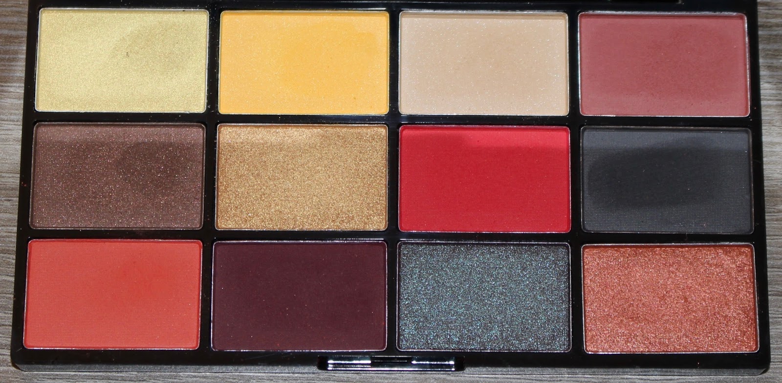
Look 1: NYX Brights 


9 on the inner lid, 6 on the outer lid, 4 in the crease (supplemented by Colourpop Cannonball and Makeup Geek Cocoa Bear), and 16 blended above the crease (supplemented by the yellow shade in the NYX Fire palette). Marc Jacobs highliner in Whirl(pool) on the waterline. 

Look 2: Sephora Pro Editorial 


Chris and Helend P on the inner lid, Electric Violet on the outer lid, Tangerine blended into the crease (supplemented by Makeup Geek Cocoa Bear), and the yellow shade from NYX Fire blended above the crease. Marc Jacobs highliner in Whirl(pool) on the waterline. 


Overall, I am impressed that the two looks came out as similar as they did. But, if it's not obvious by the look descriptions above, I struggled with the NYX Brights palette. I had to pack on the color and apply several layers. And even then, I still had to go in with other shadows to get the look I was after. The orange shade in the crease, especially, just was not very pigmented. When I finally caved and applied Colourpop Cannonball, it felt like such a treat to use a shadow that had pigment and was easy to work with. And I feel like my overall feelings can be summed up by the fact that I went in with the yellow shade in the the Brights palette and ended up needing to use the yellow shade in the Fire palette to get it to show up. 

The Sephora Pro Editorial palette by comparison was so nice to work with. I've written about this palette before, and while I have mixed feelings (because the glitter shades are awful), I really love the colorful mattes. I had to supplement this look with Makeup Geek Coca Bear and the yellow shade from the NYX Fire palette because there were no comparable shades in the Pro Editorial. 

In terms of comparing these two palettes, I personally strongly prefer the Sephora Pro Editorial. With that said, the NYX palette can still make pretty looks, but in my experience, it just takes a little more product and time/effort. However, I think the NYX Brights palette has a better overall color scheme than the Sephora palette. I would have much preferred if the glitter shades in the Sephora palette especially were taken out in favor or some shades of yellow and lighter blues. 

But, the main purpose of this experiment for me was to compare the performance of these NYX shadows with the ones in the Fire palette. With tax, I think I paid around $20 for the NYX Brights palette, and the Fire palette was $30. In my experience and in my opinion, the quality of the Fire palette is far, far superior to that of the Brights palette. The packaging of the Fire palette is also considerably better than the Brights palette. And for the upgrades, I would happily pay an extra $10. In fact, I don't think the Brights palette should cost $20. I had pretty high expectations going into using the Brights palette because of the performance of the Fire palette, and I was disappointed. Again, that doesn't mean that the Brights palette is unusable, but it was not a palette that impressed me. And I will be giving it to a friend, especially since I have and really enjoy the Sephora palette. 

Separately, I would just like to praise the Marc Jacobs highliner in Whirl(pool) as this was by far my favorite part of both of these looks. I've previously used up a few Marc Jacobs eyeliners, but I was put off of using them after I used a sample-sized one that came in a holiday kit. I'm now convinced that the formula must be different on the sample sizes because Whirl(pool) reminded me of how much I used to love these eyeliners. It didn't budge on me all day, which is a complete anomaly. Also, the color. I love the color. I'm hoping to get brave enough to wear this to work because I just want to wear this all the time now. I cannot remember the last time I loved an eyeliner this much. 

Saturday, September 16, 2017

This Week's Looks: Makeup Geek, Fyrinnae, and Laura Mercier


Last week was my second week back at work since having surgery. If you've been wondering why things have been a little quiet on the blog in the past couple weeks, that's it. I've been completely exhausted. Under the best of circumstances I still get exhausted during the work week, so adding these other elements has resulted in complete and utter exhaustion. I barely even wore makeup last week because it was just too much for me. But, every week is a little better, and this week felt like I was getting back on track. 

I posted last week about a palette I made of singles in my collection that duped the Too Faced Just Peachy Matte palette. I use "dupe" here a little loosely because I made some adjustments to make the palette more versatile and closer to what I would have wanted it to be. And I have to say, I was so inspired by this palette all week and continue to be. I kept wanting to use it every day, which is a little rare for me. I was also inspired to try out slightly different color schemes that I'm used to (while still trying to be "work-appropriate"), and I have to say that I had a really fun week. For the exception of lid shades, all shadows I used this week are in this dupe palette. 

(I'm still a little rusty with taking daily look pictures, so please forgive some of the photo quality.)

Here are four look I did this week. 

Look 1: Makeup Geek Mai Tai 


Mai Tai on the lid, Costal Scents Peach Petal blended into the crease as a transition shade, and Colourpop Wait For It and Making Moves blended into the crease. 

Look 2: Fyrinnae Rapunzel Had Extensions


Rapunzel Had Extensions (over Pixie Epoxy) on the lid, Makeup Geek Peach Smoothie blended into the crease as a transition shade, Coloupop Wait For It blended into the crease, and Coloupop Making Moves lightly padded onto the outer corner. 

Look 3: Laura Mercier African Violet


African Violet on the lid, Costal Scents Peach Petal blended into the crease as a transition shade, Colurpop Making Moves and Stay Golden blended into the crease, and Makeup Geek Bitten padded onto the outer corner. 

Look 4: Fyrinnae Winter Again 


Winter Again on the lid (over Pixie Epoxy), Costal Scents Peach Petal blended into the crease as a transition shade, Colourpop Wait For It and Making Moves blended into the crease, and Colourpop Stay Golden padded onto the outer corner. 


At this point I have talked about all of these eyeshadows before, and I love them all, which is why they are still in my collection. So I'm going to talk about the overall looks. 

Look 1: Makeup Geek Mai Tai 

I think this look turned out fine. I think it's a pretty look; it's simple and neutral and something that I think a lot of people can wear and feel like they're wearing color. I've gotten so many compliments when wearing Mai Tai because it has the beautiful duo chrome that's hard to capture in a photo. Looking at my peach palette this week, Mai Tai was the first shadow I thought to make a look, which I think makes sense. It's an easy shadow and color scheme. This was probably my least favorite look this week, but not because I didn't like it. I just liked some of the other color combinations a little better. But this look was the "gateway drug" if you will that made me want to use the peach palette all week. 

Look 2: Fyrinnae Rapunzel Had Extensions

Every time I use Rapunzel Had Extensions, I feel like I'm cheating just a little bit. It's such a stunning shadow that I feel like it's genuinely hard to get a bad look with it. I typically pair RHE with oranges or browns, and while the orange-peach tones I used this week aren't too far from that, it will still a little different for me. And unsurprisingly, since RHE is a perfect peach shimmer, I loved how this look turned out. Colourpop Wait For It is a really cool shadow. It's one of those chameleon shades, and it can pull more pink or orange depending on what it's paired with. I paired it mostly this week with pinker shades, but the color combination of this look really brought out its orange tones, which I loved. I also loved how Makeup Geek Peach Smoothie performed in this look. Typically Peach Smoothie kind of disappears on me, but I was really pleased to see how it performed with the other colors in the look, and I love the subtle peach between brow bone and crease. 

Look 3: Laura Mercier African Violet

This was my favorite look of the week, and I guess this one is also cheating a little bit, because I unconsciously recreated a more intense version of one of my all-time favorite looks from my custom Inglot palette:


After pairing the peach tones with pink and gold tones, I wanted to try something a little different. And my first thought was purple. African Violet is one of my favorite purples because of how much gold is in it. While that might seem like an obvious flattering color, it's a combination that I personally haven't come across outside of this shadow. African Violet is typically a shadow I wear when I want to look a little sophisticated. I usually pair it with neutral plum shades, and I always like how it looks. So pairing this shadow with the bright peachy-pink Colourpop shadows was certainly new for me. And I just really loved how it looked. Every time I caught a glimpse of this look in the mirror, I was struck by how much I loved it. I actively felt pretty wearing it, and I thought it flattered my eye color and skin tone really well. 

Look 4: Fyrinnae Winter Again 

This is where things got a little adventurous for me. I had loved the peach palette so much with all the other colors I paired it with, and I wanted to try it with a blue. Ideally, I would have loved to pair the peach tones with a teal shadow, but I thought that would be just a little too outrageous for work. I was pushing it as it was with this icy blue. This is definitely a favorite Fyrinnae shadow for me. It's not like a typical duochome white-blue (like in ABH Moonchild or KVD Alchemist) because it's more on the sky blue side instead of the royal blue side, if that makes sense. I don't know how I feel about this look. And I didn't know how I felt about it the entire time I wore it. I alternated between really liking the color combination and also feeling like it didn't flatter me. I did receive a compliment on this look from someone at work who doesn't typically offer compliments, so there's that. But I liked that I tried something a little different and love that this dupe palette—made up entirely of shadows I already had in my collection—has inspired me enough to want to play with color combinations throughout the week. 

Sunday, September 10, 2017

Weekend Looks: NYX In Your Element Fire Palette


It was recently my birthday, and I received some makeup. August was a really terrible month for me because I was recovering from surgery, and having two major surgeries within two months of each other is probably one of the most physically challenging things I've ever done. And with a summer of surgeries, being temporarily disabled, and then having a birthday, I received some new makeup. And that puts me in an interesting place because I won't want to necessarily keep everything. I've tried to keep a mentality of "if something comes in, something has to go out," and while I have done some decluttering recently, the amount of new stuff coming in (compared to what it has been) has felt a little overwhelming. 

One of these new makeup items is the NYX In Your Element Fire palette. I know there is some controversy (is that the right word?) surrounding this palette because of the price, and I'll talk about that. 

I haven't worn makeup for the better part of the last six weeks, so I have to admit that I feel a little rusty in application as well as writing these posts. But I figured people would be interested in hearing how this palette actually performed (as opposed to just talking about it being overpriced).

Here is the palette:


And here are two looks I did this weekend. 

Look 1:


1 on the inner lid; 5 on the outer lid; 7, 9, and 4 blended into the crease; 3 blended above the crease; and 10 padded onto the outer corner. 

Look 2:


7 on the lid, 9 blended into the crease, 2 blended above the crease, and 10 padded onto the outer corner. 


So, I've gotta say: I really like this palette. A lot. But with that said, if you have the Colourpop Yes, Please! palette, like I do, then you really don't need this palette. Of the two, I would probably recommend Yes, Please! more because you get the same number of shadows for half the price. 

However, it is worth mentioning that the NYX palette has nearly double the amount of product as Yes, Please! (Yes, Please! has 0.85 grams per shadow and Fire has 1.41 grams per shadow), and the NYX palette also has much better packaging (a strong plastic case with a huge mirror versus a thin cardboard case with no mirror).  

NYX Fire retails for $30, and this price has made people angry in a way that I haven't seen in a long time. I'll say upfront that this is my first experience with NYX eyeshadows. And I think this is important because if NYX shadows always performed this good, had great packaging, and were available at a lesser price point, I can definitely understand the anger. I cannot speak on how these shadows compare to the quality of other NYX shadows, but I can say that I think this packaging is much nicer and better than other NYX palette packaging I have seen. To put things a bit into perspective, this packaging is significantly better than anything from Natasha Denona, and yet people are unbothered by the utterly outrageous prices of those products.

I have tried all of the mattes in this palette, and they are fantastic. I haven't tried all the shimmers (and if there was to be a weak point in this palette I would guess it would be a shimmer), but I have been happy with the couple I have tired. From my experience, I would put the quality of this palette to be in line with Yes, Please! as well as other great palettes. There is nothing that feels "cheap" or "drug store" to me, other than the brand's name.

It is very disappointing when a brand is unreliable. Most of the time, we equate that feeling to quality of products. But it also has to do with price. If a brand is known for consistently putting out quality products at a certain (lower) price, it is disappointing when they raise their prices without giving reason. It makes the brand unreliable. And I think that's where a lot of the anger is coming from. I know people felt similarly when Makeup Geek came out with face products that were over $20 each. Even if it's a great product, it's not what people have come to expect from the brand. And it feels hurtful to a loyal customer base when a brand decides to up their prices.

So, I absolutely get all of that. And I think that is a valid criticism of the In Your Element release. I think it would have been a smarter move on NYX's part to lower the price by about $7. The packaging is nicer than other NYX packaging (and includes the great mirror), and if you take into consideration the amount of product as well as the upgraded packaging, this price really is in line with Yes, Please! in terms of value. But, when you have a ton of makeup in your collection, sometimes it doesn't pay to have a palette with a ton of product. And in that case, a $16 palette of beautiful quality is a much better value.

Personally, I would pay $30 for this palette. And I am happy to own it. Since I own Yes, Please! also, I'll really have to evaluate both palettes to see if I want to keep both. I absolutely advocate for not buying both, especially if you already own one of them. I will say that owning this palette has really piqued my interest in NYX, and I would be curious to try some of their other palettes at some point. I don't plan on purchasing any other In Your Element palettes as I have suitable alternatives in my collection (maybe I'll write some anti-haul posts), but I hope—considering the anger over the price—that all of them are as good as Fire.

Saturday, September 9, 2017

Duped: Too Faced Just Peachy Matte Palette


About a month ago, I wrote an anti-haul post about why I wasn't going to buy the Too Faced Just Peachy Matte palette.

I have been really over Too Faced, their marketing, hype-buildings tactics, and antics for a while now. But I have to admit that I was a little surprised to find that this palette, while certainly nothing extraordinary in terms of quality, seems to be not quite as terrible as what I have come to expect from them in recent years.

And after seeing photos of the actual product (instead of the promotional image I have here), I have to admit that I started feeling a little weak. You see, a peach-themed eyeshadow palette (especially a matte palette) is very much in line with what I like. And I was wondering, for the first time, if I had jumped the gun with an anti-haul post.

I went into Sephora last night to replace my favorite cleanser, and while I was there, I decided to take a look at this palette in person. And I'm so glad that I did—all feelings of temptation were instantly gone. Because I knew—unequivocally—that I could dupe this entire palette.

So I did.


I've recently done another declutter, and I was able to get rid of a few palettes and several single eyeshadows. I finally decided to declutter the shadows that were in this MAC palette, and it ended up being the (near) perfect size for my Peachy Matte palette. 

Now, before I go into the colors, I'll say that not every single one of these shadows is a perfect duplicate of the shadows in the Just Peachy Matte palette. And that was intentional on my part. There are some shades in that palette that I just personally wouldn't use over other colors in my collection, so I decided to make this a curated version of the palette to fit my specific preferences. 

And I've got to say that I love this palette! 

Let's compare. 

Just Peachy Mattes:


Custom Peachy Mattes:


I'd like to mention that the inspiration behind this project is a series that Lauren Mae Beauty does on her YouTube channel, called "Let's Dupe It." If you haven't seen Lauren's content, I highly recommend it. I really appreciate her perspective on buying and "collecting" makeup, and she and I seem to have a similar perspective in the sense of continuing to be interested in new makeup, still purchasing select items, and decluttering as our tastes change. She also has a really fantastic video on makeup addiction within the makeup community that I highly recommend. 

I'd also like to mention that I found Temptalia's review of the Just Peachy Mattes palette to be incredibly helpful in figuring out duplicate shades that I had in my collection. 

Let's run through the colors in my palette:


Top row: Zoeva Bitter Start, Costal Scents Petal Peach, Colourpop Cannonball, and ABH Fudge
Middle row: Makeup Geek Beaches and Cream, Colourpop Wait For It, Colourpop Making Moves, and Coloured Raine Moments
Bottom row: Makeup Geek Peach Smoothie, ABH Blazing, Colourpop Stay Golden, and Makeup Geek Bitten

I have yet to find a great way to swatch my shadows and simultaneously take a quality photo. Suffice to say that all of these shadows perform beautifully (or they wouldn't still be in my collection). In general I'm also not the biggest fan of swatches (even though I do consult them when debating a purchase) because I very rarely find them to be an accurate depiction of how a product will perform. As an example, all of my Viseart matte shadows swatch terribly, but they are some of my favorite shadows. On the flip side, Morphe shadows swatch great on me, but the more I used them, the more I found they irritated my eyes. And, of course, there's ABH Subculture, which swatches so beautifully but is notorious at this point for its performance issues. 

My favorite part about this palette and experience is that I literally did not have to purchase a single shadow (or even the palette). These were all existing items in my collection, and as soon as I put the palette together, it felt like a brand new item instead of shadows I've had in my collection for a while. I think this was also a really valuable exercise for me in actually creating my own duped palette. I feel my collection can dupe almost everything that comes out, but the majority of my shadows are in palettes or are loose indie shadows. So it was really gratifying for me to be able to use my single, pressed, uniform shadows for this palette and get the satisfaction of the colors looking "uniform" and not like Frankenstein's monster. 

Beyond making this palette for the purpose of this blog post and encouraging those reading to try something similar with their shadows at home, I fully expect to use this palette as a staple in my collection. Even though I have had these shadows for a long time, it was great to be able to look at them in a new light, out of the way they were previously organized. That's half of what makeup consumerism is all about—drumming up hype to get us to buy stuff we already have because we like the way it's organized. So it's good to be able to see through that. I really love this palette, feel it is of superior quality to the Too Faced palette, and I saved myself $45 and adding yet another palette to my collection.