Kylie Cosmetics has released their latest eyeshadow palette, Blue Honey.
And I won't be buying.
I have a lot of valid reasons for not wanting to buy this palette, and I'll get to those in a bit. But in the spirit of transparency, I feel it necessary to say that I highly doubt I will buy anything from Kylie Cosmetics in the near future, and that is because this is a brand that I really don't like. I find Kylie herself to be incredibly problematic for a number of reasons, but I very specifically don't like what this brand represents, which is targeting a young demographic and charging a lot of money for a name instead of high quality products.
And let me just step in right here to clarify that I am not saying that Kylie Cosmetics products are bad. I am saying that the price of these products is not related the quality of them.
Kylie Cosmetics and Colourpop are owned by the same company and come out with extremely similar products and formulas, which is normal for brands under a parent company. The main problem I have with Kylie Cosmetics is what is so fantastic about Colourpop, which is the model of manufacturing trendy makeup at affordable prices. Kylie Cosmetics is a company that takes those same trendy products and upcharges more than double to have a famous person's name on it.
And while I have never tried anything from Kylie Cosmetics because it's not a brand that I like or particularly want to support, they also have not released anything that personally appealed to me.
Until Blue Honey.
If this was a Colourpop palette, I feel like I probably would have purchased it right away, without even considering what else was in my collection. And that is so disappointing because I know better by now! But luckily, Kylie Cosmetics released it and charged way too much, which brought me back to my senses.
Let's look at the palette:
Do you know what I like so much about this palette? That it doesn't look exactly like every other palette that is available. I think it's really fantastic, truly, that we are hitting saturation in the makeup community. It has been an interesting phenomenon to watch people complain about new releases because they have similar/exact things already and they want to see something new, all while they are sitting in front of a miniature version of Sephora in their own homes. And I don't say that with any kind of malice, because I also have a large makeup collection.
The fact is, for those of us with large collections, there just isn't really going to be much, if anything, that can be released that we don't already own in some way. People who still have a spending/makeup addiction or are caught up in the euphoria of buying new things will find saturation unpleasant. They have an itch to buy, but there isn't anything left for them to buy. And it is at this stage that we need to look inward to what we already have (which is, essentially, everything) and use that instead of always looking for what's coming next.
Blue Honey doesn't so obviously look like something I already own though. It looks different, and I like different. But for $38 (not including tax and shipping—we will get to that), I also know that this palette is not worth that price.
Let's look at the colors as pigments:
When I look at this picture, I see a lot of things that I already own. I see a lot of red-toned warm brows, a taupe, a copper, and some blues. Breaking it down like that, I realize that I already have these types of colors. What drew my eyes in the most were the blue shades, but if you take those away, this is the same as everything we've seen before. It's a warm-toned neutral palette.
So, I looked at my own collection to see what I had that was similar. I recently reorganized some of my custom palettes into warm-toned and cool-toned singles:
And I realized that between these two palettes, I probably had adequate duplicate shadows.
And I did.
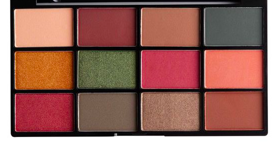
Here is Blue Honey:
And here is my duped version of Blue Honey:
I found that the pictures of Blue Honey were a little misleading in terms of what the actual shadow colors were (which is unfortunately not an abnormal occurrence in the makeup industry), so instead I referenced various swatch pictures.
Here are the colors I used:
Top row: Zoeva Bitter Start, ABH Pink Champagne, and Makeup Greek Desert Sands
Middle row: Colourpop Two Birds, Urban Decay Boom, and Costal Scents Lakeshore
Bottom row: Makeup Geek Cocoa Bear, MAC Coppering, and ABH Fudge
Out of these shadows, two were depotted from existing palettes: Zoeva Bitter Start (from Cocoa Blend) and Urban Decay Boom (from the Jean-Michel Basquiat palette). The rest are singles.
Additionally, if you own the Morphe x Jaclyn Hill palette, you also already own Blue Honey:
I've enlarged and circled in red the shadows that I feel are duplicates of those in Blue Honey. They are:
Blue Honey Row 1: Enlight (Raw), Obsessed (Buzz Off), and Creamscicle (Sweet Like Honey)
Blue Honey Row 2: Queen (Bumble), Jada (Blue Honey), and Pool Party (Royal Jelly)
Blue Honey Row 3: Roxanne (Busy Bee), Firework (Sweet Thing), and Jacz (Honeymoon)
The only shadow that isn't quite a dupe is Morphe Enlight, which is a shimmer, because Kylie Cosmetics Raw is matte. Otherwise, these colors are pretty close.
Without knowing it, I not only already owned Blue Honey (which I thought was a really unique color scheme), but I actually owned it twice. (For those wondering, the Morphe x Jaclyn Hill palette was given to me as a gift.) And, yes, it did look like a unique color scheme to me, but that was only because the Morphe x Jaclyn Hill palette has more shadows in it. That distracted my brain and didn't allow me to see that Blue Honey was embedded into it.
And there are other palettes with similar shadows and color schemes, like Juvia's Place Zulu:
Juvia's Place Festival:
Juvia's Place Masquerade:
NYX Earth:
NYX Water:
And ABH Subculture:
Remember earlier when I mentioned that Kylie Cosmetics and Colourpop are owned by the same company and come out with really similar products? Well, Blue Honey looks a lot like the Colourpop x Kathleenlights Dream Street palette:
Let's compare:
While Blue Honey and Dream Street are not exact dupes, they both have:
- A matte cream
- A matte mustard
- A matte blue-green
- A shimmery blue-green
- A shimmery gold
- A shimmery taupe
- A shimmery copper
- A matte warm brown
- A matte reddish brown
They share nine shades in common, and in case you missed it, Blue Honey only has nine shades.
I don't advocate to buy Dream Street instead of Blue Honey (for those reasons, please reference the
anti-haul post on Dream Street), but it is pretty telling that Dream Street costs $16 for 12 shades, and Blue Honey costs $38 for nine shades.
To make matters even worse, Kylie Cosmetics only offers free domestic shipping on orders over $40, and Blue Honey just misses that mark by $2 (and in case you're wondering, yes, this is intentional). And Kylie Cosmetics shipping costs a staggering and criminal $8.95 for domestic shipping and $14.95 for international shipping.
So that means that the already overpriced $38 palette is really $47, not including tax, which would push it to over $50. And for that, you can buy a palette of better quality with nicer packaging and more shadows.
Like Colourpop, Kylie Cosmetics does not accept returns or exchanges, and all sales are final. Colourpop claims that they do this in order to keep their prices low, so I can't see the reasoning for this with Kylie Cosmetics. And this means that if you spend the $50+ on this palette and don't find that it lives up to that price, you cannot return it and will be out that money.
Blue Honey, in reality, is not that unique of a palette. And like I said at the top of this post, at this point, I think it would be difficult for a brand to be able to come out with a totally unique palette. Since Blue Honey only has 9 shades, it makes it pretty easy to dissect it and see how many basic, non-unique shades there are. And in my opinion, there is only one pretty unique shade, and that is Blue Honey, the matte blue-green. And if that is the shade that is drawing you to this palette, I would highly recommend looking into singles instead. Coloured Raine has two that are really similar, with one leaning more blue and one leaning more green.
They are Majestic:
And Gumby:
I know I say this in every post about Kylie Cosmetics, but I understand the pull people (especially adolescents) have to their favorite celebrities. And I know what it feels like to be young and want to buy whatever that celebrity attaches their name to. But those celebrities also know that they have this power, and often times they exploit it. (Why else do you think Justin Bieber came out with a perfume when he was 17 and at the height of his popularity?) I can say with close to absolute certainty that there is nothing about Blue Honey that makes it any better or more luxurious than products from brands like Colourpop or Morphe other than Kylie's name on the front and pictures of eyes.
And while I can appreciate the slightly different color schemes that Kylie Cosmetics are bringing to the table, I just can't endorse them due to their grossly overpriced products, absurd shipping costs, and terrible return policy (or lack thereof).
Recently, I have noticed that my collection of pre-made non-companion palettes is declining. That is because I have been focusing on my collection of single shadows, and I reorganize them to fit different trendy color schemes or color stories that I find inspiring. I currently only have five pre-made "complete" palettes (not including ones I consider to be companions). I also have five custom palettes full of singles (three of which are "dupes" of popular pre-made palettes), and I have found that I get far more use out of the custom palettes than I do the pre-made ones. This is relatively new to me as my singles used to be the most ignored shadows in my collection. But I'm so glad that I have discovered my love for them because they are the biggest reason why I don't buy new palettes.
Blue Honey is a great palette to try to replicate at home. My guess is that most people would be able to come close to duping the entire thing. And if you need to buy one or two singles, look into brands like Coloured Raine, Colourpop, or Costal Scents. You might spend $10 or $15 on singles, but that's far cheaper than spending $50 for this palette.
Like all of Kylie Cosmetics products, Blue Honey is overpriced. It's a palette that is easy to replicate and one that I have at least two times over in my own collection. Part of being a smart consumer is recognizing when brands are going out of their way to gouge you, and that is certainly what is going on with Kylie Cosmetics. They offer cheap, cardboard packaging and shadows that can be found for less money elsewhere, and I don't personally care about the Kylie name to look past that. I don't need this palette, and I won't be buying.