Showing posts with label Stila Glitter and Glow. Show all posts

Sunday, July 9, 2017

Recent Looks: Urban Decay, Femme Fatale, Ardency Inn, Stila, and Colourpop


Hi all. I haven't made one of these posts in a very long time, and that's because, as I've mentioned, I've been recovering from major surgery. It has almost been six weeks since my surgery, and I am just now finally getting back into the swing of things in my life, including putting on makeup and writing these posts. In a few weeks I will have another surgery, so these posts will be on hiatus again. 

What's included here is a mishmash of things I've worn in the last few weeks. To be completely honest, I don't remember exactly when I wore all of these looks, but here they are, all the same. 

Look 1: Urban Decay Jean-Michel Basquiat Palette*


Boom on the lid, Bobbi Brown Camel blended into the crease, and Untitled padded onto the outer corner. Exu, Boom, and Untilted on the lower lash line. 

Look 2: Femme Fatale Watery Grave


Watery Grave (over Pixie Epoxy) on the lid and Costal Scents Fine Wine blended into the crease. 

Look 3: Urban Decay Electric Palette, Colourpop Cannonball, and Kat Von D Pastel Goth


UD Savage on the lid, Colourpop Cannonball blended into the crease, and Kat Von D Star blended over Cannonball. Star, Cannonball, and Savage on the lower lash line. 

Look 4: Colourpop High Strung and The News


(High Strung: Row 3, Column 2; The News: Row 1, Column 4) 


High Strung on the lid and The News blended into the crease. 

Look 5: Ardency Inn Royal and Melt Love Sick


Royal on the lid and Love Sick blended into the crease. 

Look 6: Stila Magnificent Metals Glitter and Glow: Next to Notte


Next to Notte on the lid and Zoeva Substitute for Love, Costal Scents Oktoberfest, and Lime Cime Muse blended into the crease. 

Look 1: Urban Decay Jean-Michel Basquiat Palette

*Upfront, I want to address that there is controversy surrounding this palette and collection from Urban Decay. One controversy is the question of if Basquiat would have been supportive of this kind of a collection. I don't really like it when people speak for someone else, so I am choosing to not offer an opinion of if Basquiat would have approved. I will say, however, as someone who worked in fine art at a major museum, that using artwork for profit feels in line with what a lot of art is. The second controversy, in my opinion, is quite significant. And that is that Urban Decay chose to have Ruby Rose model for the collection instead of a black model. This, I feel, was incredibly tone-deaf on Urban Decay's part. I know this decision disappointed a lot of people, myself included. Separately, I want to add that this palette was given to me as a gift. 

Status: Keep

With all of that said, I did enjoy using this palette, but I have not used it outside of this look. The teal color, Boom, is absolutely gorgeous, and I loved it paired with the navy and lime green. I am not the biggest fan of the quality of Urban Decay palettes, but find I do really enjoy their colorful shadows. I'm interested to see how the rest of the palette performs.

Look 2: Femme Fatale Watery Grave
Status: Keep 

I really enjoyed this shadow, and it reminds me a lot of Fyrinnae Illusionary, but a touch darker. I paired this with Fine Wine from Costal Scents and really enjoyed how it looked. I feel like cooler tones (maybe?) might be the next trend with everyone a little burnt out on all the warm-toned palette releases, and I think purples like this with depth are unique cool tones.

Look 3: Urban Decay Electric Palette, Colourpop Cannonball, and Kat Von D Pastel Goth
Status: Love

This look was entirely inspired by this look from KathleenLights. I'm not a person who watches many tutorials, but I thought this look was just so gorgeous. I wore it on the Fourth of July and I loved it. This was also the first time that I've used Star from the Pastel Goth palette, and I was really pleased with how bright and pigmented it is. (One of my major complains about that palette is that the shadows can be very pale.) Wearing this look reminded me of how much I love color and how much I wish it could be considered work-appropriate. (On a separate note, why the hell is makeup work-approbate or not? I can understand wearing clothing that is not revealing and having some level of decorum, but if I want to wear hot pink eyeshadow, I feel like I should be able to.)

Look 4: Colourpop High Strung and The News
Status: Keep

I really enjoyed this look as a normal, "work-appropriate" look. It's funny. Last year, this would have been a more "out there" look for me, but ever since I discovered color (thanks to my one week, one palette project), these looks are pretty tame for me. Nonetheless, both of these Colourpop shadows were really pretty, blended well, and I enjoyed using them.

Look 5: Ardency Inn Royal and Melt Love Sick
Status: Favorite

Oh, man. I loved this look. Maybe it's obvious to other people, but purple and red is not a color combination that immediately comes to mind for me. The only reason I discovered it in the first place is because of the Melt Love Sick Stack, and during my one week, one palette project, I paired the purple shade from that stack (Promiscuous) with the deep red Love Sick shade. This was my first time wearing Royal, and I have to say that I absolutely love all of my Ardency Inn shadows. I don't know why more people aren't talking about them. Love Sick blended seamlessly into Royal, and I just thought this look was so cool and pretty.

Look 6: Stila Magnificent Metals Glitter and Glow: Next to Notte
Status: Love

My love affair with the Stila Magnificent Metals continues. A glittery red shadow isn't one that I ever thought I would love, but here we are. I've read some reviews of this that say the color is actually purple, but that kind of perplexes me because mine is very red. I paired it with some of my warmer shadows and thought the look came out really pretty. I asked someone today (when I wore this look) if my makeup was "too much," and they said, "Surprisingly, no." That's something that's nice about Next to Notte. I think it packs the same amount of glitter and shine as the other Magnificent Metals, but because the color is so deep and opaque, it doesn't scream, "RED GLITTER!" in your face. Not that I would be opposed to that.

Sunday, March 19, 2017

Weekend Looks: Fyrinnae and Stila


I suppose I was in a pink mood this weekend. And, in all honestly, I'm probably in a pink mood the majority of the time. But I really let it out this weekend.

Here were the looks I did.

Look 1: Fyrinnae Cupcake Frosting 


Cupcake Frosting on the lid (over Pixie Epoxy), Makeup Geek Cupcake blended into the crease, and Colourpop 143 padded onto the outer corner.

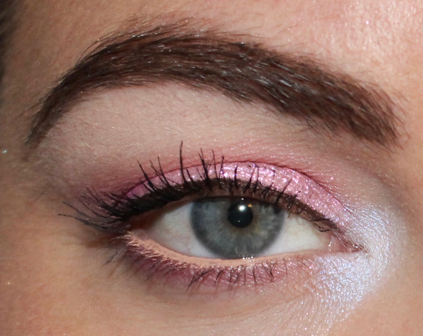
Look 2: Stila Glitter and Glow Sea Siren


Sea Siren on the lid and Inglot singles blended into the crease. 

Fyrinnae Cupcake Frosting
Status: Undecided

I received this shadow as a free sample in my first Fyrinnae order. It definitely needs to be applied over Pixie Epoxy in order to show up, and as I've said before, I'm never too thrilled when a product absolutely needs to be used with another product in order to work properly. I thought the color was really pretty, but I wondered if it was just a little too sweet for me. I received a ton of compliments on it, which I was not expecting, and that made me think twice about it. When I caught a glimpse of myself in the mirror, I always thought the look was really pretty, but I don't know if I would directly purchase this shadow. For the time being, I'm going to hold onto this shadow, and if I finish it, I'll see if I have any desire to repurchase. 

Stila Glitter and Glow Sea Siren
Status: Really enjoy

This is my favorite Glitter and Glow shade from the Stila limited edition collection. This color has a very lovely lavender/blue/white shift that I think can pair nicely with several shades. I chose to pair it with pink and purple mattes, and I think the look came out pretty cool. As much as I really like this shade, what keeps me from loving it is that it takes a while to dry/set. You can clearly see in the above photos that this product transfers when I blink my eye, and that was after closing my eyes for several seconds and even fanning them. I do have deep set eyes that are slightly hooded, so I also understand that this could be a problem specific to my eye shape. With all of that said, I think on the whole I would recommend passing on the limited edition Glitter and Glows. I love the original one I have in Rose Gold so much that I thought I would certainly love these more unique colors, but I've found that they just don't have the same oomph. I like all of the limited edition shades enough to keep and see the kind of use they get, but I certainly wouldn't say that you're missing out if you don't have them.

Saturday, March 18, 2017

This Weeks Looks: Morphe, MAC, Stila, and Tom Ford


This week was stressful for me. We had a snow day from work on Tuesday because of the blizzard, and I guess that kind of thing makes a lot of people happy, but not me. For one, it messed up all of my schedules at work which meant that I had to play catchup the rest of the week and handle the fallout. Two, fun fact about me, I absolutely loathe the snow. I am from the Southwest, and I always thought I would love snow if I ever got to live in an area with that kind of weather because I really hated the oppressive heat of my region. But, alas, I never liked it. And it has come to the point now where I detest it. Because in NYC, the snow makes everything about living here (which is already very hard) so much harder. And when it lingers, like it has this week, it continues to make everything challenging. 

I am a person who is affected by the weather. I think because I grew up with an abundance of sun and a complete lack of weather, I am more strongly affected than others. The winter is by far my least favorite time of year. I hate the cold, I hate the weather, and I hate how long it lasts. And the fact that the snow this week (which wasn't even close to how bad it was predicted to be, by the way) has negatively affected my commute, activities, and work responsibilities has left me a little tired today. I also realized that I completely forgot to take a picture of my makeup one day, which shows just how out of it I have been. 

But based on my makeup choices this week, I'd say I'm pushing for spring, even if it's just on my face. 

Here are four looks I did this week. 

Look 1: Morphe 35T shadow and MAC Cranberry


Morphe shadow on the lid, Makeup Geek Cupcake blended into the crease, and MAC Cranberry padded on the outer corner and blended into the crease. 

Look 2: Stila Glitter and Glow Into the Blue


Stila Into the Blue on the lid and Colourpop 23 blended into the crease. 

Look 3: Tom Ford Honeymoon 2 and 3


2 on the inner lid and 3 on the outer lid.

Look 4: Tom Ford Honeymoon 1 and 3


1 on the inner lid and 3 on the outer lid (all over Fyrinnae Pixie Epoxy). 


Morphe 35T shadow 
Status: Keep

This is the only shadow I have left from the Morphe 35T palette. I liked so many of the shades when I first bought the palette (and I am not a Morphe fan by any stretch), but found I was never reaching for it because there were just so many shadows. So I decided to depot it and only keep the shadows I really liked. And that was when I started really seeing how similar all the shadows were. Not even to other shadows in my collection, but to other shadows in the palette. Over time, I've continued to whittle down the shadows I kept from this palette. And then I was just left with this one. It's a "rose gold" that isn't very gold. It's more like a "pink gold" color. If I had a single like this from another brand that was prettier or higher quality, I would ditch this shadow too. But I really like the color, so I'm going to keep it. 

MAC Cranberry
Status: Love

I paired the Morphe shadow with Cranberry, which is one of the three MAC shadows I still have. I really love this color and think it works so well as a lid shade or something to deepen a look. I received so many compliments on this look, and I think it's because of Cranberry. I definitely think the Morphe shadow is pretty, but Cranberry does all the work in this look. 

Stila Glitter and Glow Into the Blue
Status: Keep, for now

When I look at this product in the packaging, there is a very clear blue-purple duochrome mixed in with gold. However, it didn't transfer onto my lids like that. On my lids, it was a very sparkly blue. I definitely thought it was pretty, and I enjoyed the look, but it wasn't what I was expected or what I wanted. I continue to struggle with taking pictures of the Stila Glitter and Glows because they are so shiny that when my flash hit them, it makes it look like there is no product on my lid. I was able to capture something closer to what it looks like with my flash off, but it still doesn't do it justice. So I am keeping this product for now and seeing how I use it. Like I said, I do think it's a beautiful product and preforms well. It just wasn't what I expected. If I don't use it, however, I will declutter. 

Tom Ford Honeymoon
Status: Love

I'll say upfront that if you have been eyeing Honeymoon for a while but just can't justify the price, don't buy it. And I say that because it is really easy to duplicate the colors in this palette at a fraction of the price. MAC Cranberry, for example, is a slighter bluer-toned version of the 3 shade, and I think Cranberry is a little prettier. The other shades are really neutral and easy to duplicate. So, you might ask why I love this quad and am keeping it if I just provided reasons not to buy it. And I'm keeping it because I really love this specific Tom Ford formula. I've owned four Tom Ford quads (Honeymoon, Nude Dip, Cocoa Mirage, and Golden Mink) and have owned one Charlotte Tilbury quad (Dolce Vita), which many people compare to Tom Ford. Of all of these quads, I only have Honeymoon and Nude Dip left. I did not feel the others were worth the money at all (especially Cocoa Mirage if you have a warm skin tone or prefer peach tones), and not only were they not worth the money, I actively disliked all the formulas. The formula of Nude Dip and Honeymoon are the same and different from the others. I find both quads really lovely to work with and incredibly shiny. I can't get over the shine sometimes, and I love that. They feel luxurious to me in a way that the others ones simply felt like a waste of money. Even still, they are a luxury item. And you can absolutely find products that are fantastic and lovely at a much cheaper price.