Showing posts with label Elf. Show all posts

Thursday, December 20, 2018

Project Pan Finale: Empty Products

A few months ago, I decided to embark on a project pan to use up or hit the pan of several makeup items. My goal was to finish 12 products before Christmas/the end of 2018. And as you will see below, I not only hit that goal, but I surpassed it! I used up/hit the pan of 19 makeup products!

In this post, I'll walk through all of the products I used up and discuss if I plan on repurchasing or not.

Soap and Glory One Heck of a Blot
Goal: Finish
Status: Will not repurchase


As you can see with this dirty pan, I accomplished my goal of finishing the setting powder. The powder developed hard pan, which made it difficult to use, so I needed to repress it to get rid of the hard pan and give myself an even pan again. This is what it looked like before repressing:


And after:


Once I repressed the powder, it was much less densely packed, which meant that I picked up more product with my brush. While I liked this product and I think it does a good job of keeping the face matte, with the loosened product, I found that it left a white cast on my face and make me look really powdery. This didn't happen until I repressed the product, which, again, was generally difficult to use before repressing. 

I don't like to keep more than one powder in my collection at a time, so I have replaced this product with the Hourglass Veil translucent powder. So far, I really like that one. 

Chanel Soleil Tan de Chanel
Goal: Hit the pan
Status: Will continue to use, but will likely not repurchase


Back when I was living in New York and using makeup as a coping mechanism, I purchased the very expensive and not at all inclusive Chanel Soleil Tan de Chanel cream bronzer, which is also known as the "universal bronze." This is not a universal bronze. This is the first and only cream bronzer I have ever used, and while I think it's a good product, I have to really blend it out or else it leaves my face with an orange/brown stripe. Obviously part of this could be my application or user error, but the shade just isn't right for me or what I would want. With that said, the product works, and I would like to use it up since there is nothing wrong with it and I spent quite a bit of money on it. 

Generally, I find that I prefer my powder bronzer (Hourglass Luminous Bronze Light), so while I intend to use up this product, I doubt I will repurchase. 

Tarte Exposed blush
Goal: Hit the pan
Status: Will continue to use, but will not repurchase 


This may be the only powder blush I have ever hit the pan of, and the only reason I have is likely because I have to use so much product just to get any color payoff. I do like the color of this blush, but Tarte is not a brand that I want to support. I'm tired of how non-inclusive the brand is, and until that changes, I don't want to purchase anything for them. I don't know if Exposed will stick around in my collection long enough for me to use up the entire thing, but if it does, I will not repurchase. 

Physician's Formula Butter Highlighter in Pearl
Goal: Hit the pan
Status: Will continue to use


I have a lot of highlighters in my collection, but this is one of my favorites. I'm not a huge fan of the twist packaging or the swirl design, but I really love the product. It has a duochrome finish, and I find that it lasts longer on my skin than many mid-range or high-end products. I don't hear a lot of people talk about this, but it's certainly a product that I love. This is only the second highlighter that I have ever hit the pan of, and the other is Becca Moonstone, which is my all-time favorite. 

Hourglass Ambient Lighting Powder in Dim Light
Goal: Hit the pan
Status: All-time favorite


After I finished my Dim Light powder last year, I immediately replaced it with this one. I love this product. I use it as an all over finishing powder, and I find that I just don't like my makeup without it. I will continue to repurchase and love this product. 

Physician's Formula The Healthy Foundation and Milani Conceal + Perfect
Goal: Finish
Status: Will not repurchase 


I am usually a huge proponent of "do not use a product that you hate just to finish it," but I made an exception for these two foundations. In an attempt to find a more inclusive foundation to support (we will get into this more in the next product), I purchased both of these foundations. On their own, I hated both of them. Mixed together, I hated them less. The worst offender of the two was The Healthy Foundation. This looked so dry on my skin, and I have combination skin. The coverage was very thin, and while I don't like full-coverage foundations, this one didn't even seen to be able to provide an even layer of coverage at all. The shade I purchased was also too light for my skin tone. Conceal + Perfect, on the other hand, was way too full coverage for me, and the shade I purchased was too dark. I was able to mix the two of them together for shade and coverage/texture, and while that was better than either on their own, it still wasn't great. 

It's worth noting that the cap on The Healthy Foundation continually broke and splintered off as I worked through the bottle, which made this miserable to use. I can see both of these products working for people with skin types that are different from mine, but I will not repurchase. 

It Cosmetics CC+ Cream
Goal: Finish
Status: Will not repurchase until the shade range improves 


If you've been a longtime reader of my blog, you'll know that this is my all-time favorite foundation. Truthfully, I would be very happy to just use this foundation and not even try another one. But, this foundation shade range is unacceptable, and I cannot support it. Until recently, there were only four shades in this range, and none of them were dark enough for deep skin tones. The range has expanded to 12 shades, but seven of those are meant for light skin, three for medium skin, one for dark, and one for deep. So, even though the range is slightly better, it still skews too heavily toward light skin, and it is not something that I am comfortable supporting. 

To replace this, I have recently purchased the Fenty Beauty Pro Filt'r foundation, and I absolutely love it. 

Elf Mineral Face Primer
Goal: Finish
Status: May repurchase one day, but not now 


I used up a few primers during this project, and I think this one is good value for the money. I liked it just as much as the Make Up For Ever mattifying one, and think it gives generally similar results to the Hourglass Mineral Veil. I didn't love it, however, and I have found other primers that I like more.

Samples: Fenty Beauty Pro Filt'r Instant Retouch Primer, Becca Backlight Primer, Becca Blurring Primer
Goal: Finish
Status: May repurchase Becca Backlight Primer


I had three primer samples, so I used them all up in this project. 

Fenty Beauty Pro Filt'r Instant Retouch Primer: I hated this primer. It was impossible to pump (but that may just be the sample), the smell was off-putting, and the texture was very waxy and thick. It clung to the foundation and my Beauty Blender—making it impossible to wash—and I did not like the results on my face. 

Becca Blurring Primer: I also hated this primer. I left behind a powdery residue on my fingers and face after application, and I found that it didn't work well with my foundation. 

Becca Backlight Primer: I've purchased this before and didn't care for it or notice any difference with it, but it looked absolutely gorgeous with the Fenty foundation. I am currently using the Australian Gold mineral tinted sunscreen as a primer, and I love that, but I can see myself buying the Becca Backlight again soon. 

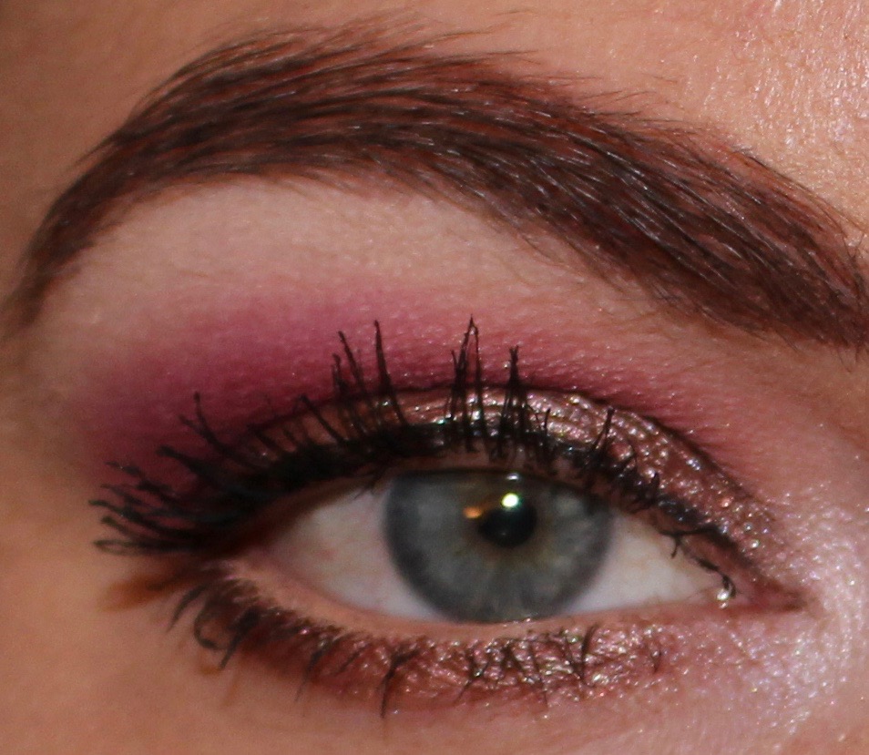
NARS Smudge Proof Eyeshadow Base
Goal: Finish
Status: Have already repurchased 


This is my all-time favorite eye primer, and one that I will continue to repurchase. I have finished several bottles of this primer, and I will continue to repurchase it. 

L'Oreal Lash Paradise Base
Goal: Finish
Status: Have already repurchased


I haven't tried too many mascara primers, but I loved this one. I use it with Benefit Bad Gal Bang mascara, and I love the effects of it. I finished up this entire bottle (even before the two month expiration date) and immediately repurchased another. I love how it makes my lashes look. 

Sample: Benefit Bad Gal Bang 
Goal: Finish
Status: Have already repurchased 


I received a sample of this mascara, and, in an unusual act for me, I used up the entire thing. I have long loved many Benefit mascaras (They're Real and Roller Lash have been favorites of mine), but I always find that I get tired of paying the high price, and then I'll buy a drugstore one for a while. That tradition may continue, but I really love the combination of this mascara and the L'Oreal Lash Paradise primer. 

Physician's Formula Eye Booster
Goal: Finish
Status: Have already repurchased 


This is another boring one to write about as this has been my all-time favorite eyeliner for years, and it continues to be. I have used up many of these eyeliners, and I always immediately repurchase another. 

Anastasia Beverly Hills Brow Definer 
Goal: Finish
Status: Undecided 


I find that I'm always torn on brow pencils. On the one hand, I really like the smaller brow pencils (like ABH Brow Wiz), but on the other, I hate how quickly I use those up. The ABH Brow Definer certainly lasts longer, but I like the precision that smaller pencils provide. This is the second Brow Definer that I have used up, and likely won't be the last, but I do like smaller pencils better.

NYX Micro Brow Pencil
Goal: Finish
Status: Will continue to use


A while ago, I was gifted several of these NYX brow pencils, so this is what I will be using until I finish all of them. I love this pencil and have purchased it before, and this is the size of pencil that I prefer to the ABH Brow Definer. The negative with this pencil and others like it is that there is so little product, and I go through it very quickly. Even during the time I started this project, I was able to use up two of these pencils (that were brand new) in a shorter amount of time than I used up the ABH Brow Definer that was more than half-finished. But, I'm happy to have a nice supply of them, and I will continue to use. 

Saturday, January 13, 2018

Weekly Looks: Kat Von D, Fyrinnae, Morphe, Stila, Natasha Denota, and more

This has been a low-key and nice week for me. The weather finally decided to warm up, and temperatures moved literally from single digits into the 60s! Unfortunately, this seems to be temporary, and temperatures look like they will continually decline until it snows again.

I've also been really productive this week and celebrated that victory every night by watching a new movie that I haven't seen. My favorite of the week was The Money Pit, a 1986 comedy starting Tom Hanks and Shelley Long. I don't think I have ever laughed that hard at a movie, and it took me by complete surprise. If you haven't seen it, I definitely recommend checking it out.

In terms of makeup this week, I still seem to be caught up in my berry/red tones, but I tried to mix it up a bit. As much as I love variety with my makeup, if I'm really drawn to a certain color, I want to be able to use it as much as possible.

Here are the five looks I did this week.

Look 1: Morphe Jaclyn Hill, duped Just Peachy Mattes, and and Elf Jewel Pop


Inner and Outer lid: Moprhe Little Lady
Center of lid: Morphe Faint
Transition: Colourpop The News
Crease: Colourpop Making Moves
Deepen crease: Elf 6 and 7
Eyeliner: NYX Vivid Violet

Look 2: Duped Desert Dusk


Lid: Fyrinnae Rapunzel Had Extensions (pressed)
Transition: Coloured Raine Princess 
Crease: Lime Crime Rebirth
Above crease: Coloured Raine Empress
Brow bone: Too Faced Satin Sheets
Inner corner: Coloured Riane Crown

Look 3: Stila Shimmer and Glow in Kitten and Elf Summer Breeze


Lid: Stila Kitten
Transition: Elf 3
Crease: Ef 5
Deepen crease: Elf 9 and 10
Brow bone: Elf 1

Look 4: Kat Von D Mi Vida Loca Remix


Inner lid: Vinyl
Lid: Misfit
Transition: Noble
Crease: Misfit
Deepen crease: Lemmy
Brow bone: Moulder
Inner corner: Vinyl
Lower lash line: Misfit and Lemmy

Look 5: Duped Modern Renaissance


Lid: Natasha Denona Vintage
Transition: BH Cosmetics berry/mauve
Crease: ABH Love Letter
Above crease: Natasha Denona Nina's Orchid
Brow bone: Viseart white
Inner corner: Make Up For Ever Pearl

Look 1: Morphe Jaclyn Hill, duped Just Peachy Mattes, and and Elf Jewel Pop

(I received the Morphe Jaclyn Hill palette as a gift)

I loved half of this look (Colourpop and Elf) and was really disappointed by the other half (Morphe). In the upper right portion of the Jaclyn Hill palette, there are three pinkish shades. I typically only use the center of the three, called Sissy, which is a gold-pink. It's a situation where I didn't need to apply the other two onto my lid to know I wouldn't like them, so I've always gone for the middle shade. But this week I challenged myself to use the other two, and I wasn't impressed with the results. First, they look indistinguishable on the lid. That's not uncommon with Morphe, but is still disappointing. Second, they didn't look as intense as I wanted, so I had to use them wet. Third, they do not look pink when applied onto the eye. They end up looking quite gold or champagne. Since I chose those shades because I wanted a light pink, I was especially disappointed with that. The Elf palette, however, really impressed me. I only used it to deepen the work I did with my duped Peachy Mattes palette, but the color payoff was fantastic. I'm really looking forward to using this palette more. 

Look 2: Duped Desert Dusk

We all know that I love this palette, so I don't need to harp too much on that. With this look, I tried to make it different from so many of the others I've done, but even with the strong orange shade, it all blends into a seamless coral glow. I think the look came out really beautiful, but it's essentially a look I've done a dozen times over at this point. 

Look 3: Stila Shimmer and Glow in Kitten and Elf Summer Breeze

This was the first time I used a Stila Shimmer and Glow (I had only used the Glitter and Glow products), and as expected, it was really beautiful. I can certainly see this being an ideal product for people who love the concept of the Glitter and Glows but don't want to deal with the glitter fallout. I'll admit that, like all the Stila Magnificent Metals, it was difficult to blend the edge with the powder shadows, but the line was only noticeable in photographs. I never liked the way Stila's pressed shadow in Kitten looked on me, which was always disappointing since it's a classic shade. With the Simmer and Glow, however, I feel like I have found the ideal way to wear Kitten. 

Look 4: Kat Von D Mi Vida Loca Remix

As much as I loved my neutral and sunset looks this week, by the time I got to this day, I was thirsting for some color. Naturally, I took out the Mi Vida Loca Remix palette, and I was immediately drawn to the green section in the bottom right. I don't believe I've ever done a fully green look (especially with greens that are this rich and not part gold), and I was interested to see how I would like it. And I loved it. You can't tell in photographs, but my eyes are the kind that look like they change color depending on what other colors I'm wearing. In photographs, due to the flash, they always look blue, but in person, they range from blue, green, and gray. (Most often they look green with a blue ring.) When I wore this look, the green in my eyes really popped, and I loved how it looked. I haven't done many monochromatic looks, but I liked this so much that I want to try it with blue next. 

Look 5: Duped Modern Renaissance

I wrote a post earlier this week on how I created a duped version of Modern Renaissance that was customized to how I would have made the palette. And with this look, I wanted to draw in two of the shadows I added to the palette that I think would have made fantastic complements to the color scheme. At first I just had Natasha Denona Vintage, the BH Cosmetics berry/mauve, and ABH Love Letter, but I felt it needed a bit of softening, so I added Natasha Denona Nina's Orchid lightly above the crease. I love the hit of a purple glow that it gives. I really liked the look a lot, but then I realized when looking at these photographs that it looks a lot like a look I created withe the Coloured Raine Queen of Hearts palette (before that was depotted and put into other palettes). And that's a nice reminder for me that even though colors may look slightly different, often times they perform nearly identical on the lid. 

Monday, January 8, 2018

Recent Looks: New Wet N Wild, Urban Decay, Fyrinnae, Kat Von D, Elf, Colourpop, and more

2018 is here, and I'd like to wish everyone a happy New Year. In terms of weather, 2018 is not messing around, at least in New York City. We've had the lowest temperatures I've ever been in, which has made the prospect of leaving the house not very attractive. And then this bomb cyclone moved in, which typically would have given me some snow blues, but it resulted in a snow day. As someone who grew up in the desert, I always dreamed of having a snow day, so those are always a little fun.

Thankfully, despite the one day of snow and the lingering bitter cold, it has been unusually sunny in NYC, which keeps my spirits up.

In terms of recent looks, I received some makeup over the Christmas holiday. I mentioned this in another post, but the item I was most shocked to see was the Kat Von D Metal Matte palette. I've mentioned before how this was my "one that got away" palette, but I was satisfied overall with my decision not to buy it. And then I received it as a gift, and I had to laugh when I opened it. I've used some of this new makeup this week, but I've also used some older favorites.

Here are some recent looks I've done.

Look 1: Wet N Wild Not A Basic Peach


(for shadow number reference)


Lid: 7 
Transition: 1 and 10
Crease: 3 and 4
Outer corner: 9
Brow bone: 2
Lower lash line: 5

Look 2: Wet N Wild Not A Basic Peach


Lid: 5
Transition: 1
Crease: 4
Outer corner: 9
Brow bone: 2
Lower lash line: 7

Look 3: Kat Von D Metal Matte*


Inner and outer lid: Ignite
Center of lid: Twinkle
Transition: Fringe
Crease: Silk
Brow bone: Bone

Look 4: Fyrinnae Illusionary and Elf Mad for Matte Summer Breeze


Lid: Illusionary (over Pixie Epoxy)
Transition: Elf 4
Crease: Elf 6 and 7
Deepen crease: Elf 8
Brow bone: Elf 1

Look 5: Stila Glitter and Glow Smoky Storm and Viseart Neutral Matte


Lid: Stila Smoky Storm
Transition: Viseart light peach
Crease: Viseart darker peach
Outer Corner: Viseart black
Brow bone: Viseart white

Look 6: Wet N Wild Rosé in the Air


Lid: 5
Transition: 4
Crease: 8
Brow bone: 2
Inner corner: 3

Look 7: Duped Modern Renaissance 


Lid: Urban Decay Toasted
Transition: ABH Buon Fresco
Crease: ABH Love Letter
Outer corner: ABH Love Letter
Brow bone: Viseart white
Lower Lash line: ABH Love Letter
Inner Corner: Make Up For Ever Pearl

Look 8: Kat Von D Saint and Sinner*


Lid: Immaculate
Transition: Martyr
Crease: Devil 
Outer corner: Revelation
Brow bone: Amen
Inner corner: Absolution 

Look 9: Duped Modern Renaissance/custom palette


Lid: Lime Crime Shell
Transition: ABH Buon Fresco
Crease: Natasha Denona Nina's Orchid
Crease: ABH Love Letter
Outer corner: ABH Love Letter
Brow bone: Viseart white
Lower lash line: Natasha Denona Nina's Orchid
Inner Corner: Make Up For Ever Pearl

Look 10: Colourpop My Little Pony


Inner half of lid: Firefly
Outer half of lid: Princess Sparkle
Transition: Flutterbye
Crease: Twilight
Brow bone: Butterscotch
Inner corner: Snuzzle
Lower lash line: Firefly and Princess Sparkle

Looks 1 and 2: Wet N Wild Not A Basic Peach 

In my last weekly looks post, I mentioned that I had purchased two of the new Wet N Wild palettes, Rosé in the Air, which is supposed to be a Modern Renaissance dupe, and Not A Basic Peach, which I imagine was inspired by Too Faced Sweet Peach and other peach-themed palettes. I like Not A Basic Peach so much more than Rosé in the Air. The shadows required a bit of building, but the overall payoff was very impressive to me. The shimmer shadows aren't as striking as some more expensive brands, which is a bit of a letdown for me, but they are not bad by any means. The mattes seem to be hits and slight misses. Some of the mattes are really rich, but other barely show up on me. Regardless of the price, I would still recommend Not A Basic Peach, and I don't see myself decluttering it any time soon.

Look 3: Kat Von D Metal Matte
*This palette was given to me as a gift

As I've mentioned, this palette was a very unexpected gift that I received for Christmas, and for my first look, I wanted to use some of the more unique shades in it. I couldn't decide if I wanted a mint or lilac shimmer on the lid, so I chose to use both. The result was... subtle. The mattes worked great and the shimmers were also pretty, but the colors I chose were so light and pastel that it was difficult to tell the difference between them on the lid. I'm certainly looking forward to using this palette more, but my impression after one use (which is not much, so definitely take this with a grain of salt), is that if you were also lamenting this as a palette that got away, I don't think you're really missing out on too much. It's a beautiful palette, but there's not too much in it that I don't already own.

Look 4: Fyrinnae Illusionary and Elf Mad for Matte Summer Breeze

I received two Elf palettes for Christmas, which included Summer Breeze. Before this, I had never owned any makeup products from Elf. I've owned the lip scrub and a few brushes, but I hadn't tried any makeup until recently. To be honest, my expectations with this palette were pretty low. Sure, it has a gorgeous color scheme, but I just really didn't think it would hold up to other shadows in my collection. And I'm happy to report that I was wrong. This palette is really good, and it certainly impressed me. I paired it with one of my favorite Fyrinnae shadows, and I think the overall look is really pretty.

Look 5: Stila Glitter and Glow Smoky Storm and Viseart Neutral Matte

If it's not obvious, this was my New Year's Eve makeup. I received a ton of compliments on my eyes that night, and people commented on how striking the glitter was. I've written about the Glitter and Glow products a few times now, and we all know that I like the Viseart Neutral Matte shadows. As always when using a Glitter and Glow, the look was so much prettier in person than in a photograph, and it was something I really enjoyed.

Look 6: Wet N Wild Rosé in the Air
Look 7: Duped Modern Renaissance 

I don't know if it was obvious, but I attempted a bit of an experiment this week. I've written several times at this point that I did not like ABH Modern Renaissance and that I thought it would be a simple palette to recreate in one's own collection, with the exception of the berry shades. I wanted to see how similar of a look I could create with Rosé in the Air as with a pseudo Modern Renaissance.

Again, I have to say that I didn't really like Rosé in the Air all that much. I used the shade that is most similar to Antique Bronze from Modern Renaissance, which was the shade that specifically made me decide to return Modern Renaissance. I really, really hated that shade, and so I was not surprised to find that I didn't like it in Rosé in the Air either. This look required quite a bit of building, and in the end, I didn't think it had a ton of great payoff.

The next dayI tried to recreate that look with a duped Modern Renaissance. And what's interesting about this duped palette is that I have two shades that are actually in Modern Renaissance—Buon Fresco and Love Letter.

In case you're wondering, the dupe for Modern Renaissance is the first two rows of this palette:


Obviously it's not an exact dupe (hello, gorgeous orchid), and while I own a satisfactory dupe of every shade in that palette, this is roughly what my ideal version of it looks like (I've since rearranged it a bit). 

As I mentioned, I don't like Antique Bronze, but a shadow in my collection that I do love and that is similar enough in color is Urban Decay Toasted. I then used the two shadows that are actually in Modern Renaissance, and I was happy with the recreated look. I suppose you can judge for yourself if you think the looks are similar and how close of a dupe Rosé in the Air might be for Modern Renaissance: 


Rosé in the Air


Urban Decay Toasted, ABH Buon Fresco, and ABH Love Letter


As I've said, I don't like Rosé in the Air much, but mainly because the shimmers don't pack much of a punch. With that said, Rosé in the Air is not bad. I imagine that this will be something that I declutter from my collection soon, because I already own all of the shades. 

Look 8: Kat Von D Saint and Sinner
*This palette was given to me as a gift

I've got to say, the more I use this palette, the more I really like it. It certainly is unique, and it's one that has really pushed my creativity. Ironically, this look is one of the least creative ones I've done with the palette, but it was also one of my favorites of the week. I really love the look of a deep olive paired with orange, and I thought the look was neutral while also being a little smoky. I've talked about this palette quite a bit at this point, and I'm happy it was gifted to me. 

Look 9: Duped Modern Renaissance/custom palette

I'll make a larger post on this later, but with this palette, in addition to duping shades in Modern Renaissance, I also expanded upon the shade range to include more shimmers, which is something I always felt was lacking in Modern Renaissance. This was my other favorite look of the week, which isn't surprising considering I love these pink sunset looks. One thing to note is that I reversed my typical crease and outer corner colors with this look. Typically, I put the red color in the crease and the purple on the outer corner, but with this look, I put the purple in the crease and red in the outer corner. I really loved the end result! 

Look 10: Colourpop My Little Pony

I'm still undecided on this look and on the Colourpop My Little Pony palette on the whole. I do like this frosty green look, but it came across as a little too frosty/silvery on me. With this palette, I've largely found that the colors in the pan don't actually look that way when applied to the lid, which is pretty disappointing. I definitely thought the greens would be more distinctly green, but then I've also found that the mauve/burgundy shades come off as hot pink instead of mauve/burgundy. The pigmentation is great, as is the blendability, but the differences in color make this palette a little challenging and disappointing to use.