Saturday, August 19, 2017

What I'm Not Buying: Kat Von D Everlasting Glimmer Veil


Kat Von D has released a new lip product, called Everlasting Glimmer Veil. 

And I won't be buying. 

In the makeup world, I am a self-proclaimed eyeshadow addict. That was the first kind of product that really sucked me in, and I've been enamored with eyeshadow since. That's why the vast majority of content on my blog is about eyeshadow. Those have been the most difficult products for me to resist purchasing. In pretty much all other areas of makeup, I have a pretty tame collection, though "tame" is subjective. 

My lip product collection, I would say, is pretty lean. And I think that's because it has been challenging over the years to find colors that flatter me. I have a warm olive complexion, and I've just found that most lip colors look a little... off on me. That's not to say that I haven't found great ones—I certainly have. But I tend to live within a few color families that I know work for me (and this is mainly mauve). 

So when I look at people who are always up on the new lip products, I find that a little amazing. Lipstick just isn't where I play with makeup, so the releases always tend to pass by me, a little unnoticed. 

But this one didn't. 

Kat Von D announced a new lip product to her line, which can either work on its own or over her matte liquid lipsticks. And, as the name suggests, these products are shimmery/glittery. 


Let's look at swatches:


As you can see, there is a range of colors available with neutral and colorful options. And if these were liquid eyeshadows, I would certainly be interested in the orange, purple, teal, and blue options. 

The main draw of this product, I think, is in its marketing, as a product to be worn over liquid lipsticks: 
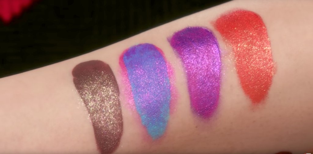

And the effect is very pretty:


But, this product is $22. And in reality, you can layer products you already have over other products you already have and achieve, probably, a similar result. 

Unless I'm missing something, this product just seems to be a (kind of late to the game) version of metallic liquid lipsticks. Like the ones from NYX:


Or Colourpop:


Or Jouer:


Or Too Faced:


Or the multitude of brands that have come out with a product like this. 

Personally, I've never been the biggest fan of the metallic lip trend. And I think that's because I grew up in the 1990s/2000s and relate metallic lips (and all the other "90s trends" younger girls seem to think are so cool) with being an awkward pubescent girl trying to achieve these looks:


But what's cool about makeup is that it is so personal, and everyone has different tastes and things they feel most flatter them. Metallic lips just aren't that for me. 

And in terms of glitter or sparkle, if I have any desire to add that to a lip color, I have Jouer Skinny Dip lip gloss:


While I am not personally a lipstick or lip product addict, from what I have seen from people who claim to be is that they continually buy the same colors over and over again. And the reason they give for buying the same thing is that they want to try whatever "formula." I feel that is something I hear all the time. It's definitely something that eyeshadow addicts are guilty of as well, but I feel it is even more prevalent with lipstick. 

But, here's the thing. When you have found a formula and color that you really love, I don't think it serves much purpose going out and buying more of the same colors in different formulas. I've seen people who will buy one lipstick, really like how it performs, and then buy every single color available. And then another new product will come out, and the cycle repeats itself. And the thing is, it's not like it is reinventing the wheel each time. Most lipstick formulas, I would say, are quite similar. Some of my favorites are Marc Jacobs, Bite, Estee Lauder, NARS, and MAC, but I also have an all-time favorite from Maybelline and Revlon. And just because you find a new formula that you like, it doesn't usually mean that you no longer like the last formula you discovered that you loved. And then you just keep accumulating all these lipsticks in the exact same color that—for the most part—probably don't perform all that different. 

My guess is that the people most interested in buying the Glimmer Veils probably already have colorful metallic liquid lipsticks or lip glosses that they can layer over other lipsticks and get the same effect. For those who are a little intimidated by color, I imagine they will gravitate toward Thunderstruck, which is the lightest, most neutral shade. And from what I can tell, Thunderstruck will perform similarly to any shimmery lip product. 

One last thing that I'd like to talk about is the marketing of this product. I want to reiterate that I really enjoy Kat Von D as a brand. I think the brand typically comes out with interesting products or color schemes that I haven't really seen before, and I like the ethics of the company in terms of being cruelty free and vegan. With other brands, I usually do a bit of an eye roll when I see they have released yet another new product, but I always pay attention and get a little excited by anything new from Kat Von D. (I also like that the brand doesn't come out with a new product every month like other brands.) But the marketing of this product as a "transformer" for the brand's liquid lipsticks feels like just that to me: marketing. Granted, I have not personally tried this product, but from what I have seen (including in the demo Kat Von D did), it seems like the effect could be achieved with many existing products that people already have in their collections or less expensive drugstore options. 

This product also feels like "makeup to play with." And what I mean by that is that this is makeup for people who want to post on Instagram with a totally fun, colorful look. Or people who just want to play around and get inspired by doing different things. I can also see this as a "going out" or special occasion product. And all of that is fine, don't get me wrong. I think playing around, being inspired, and trying new things is really great and exactly how makeup should be used. But I don't think this type of product will be an everyday staple for most people. And because of that, I just think looking into cheaper options might be the smarter way to go. 

While I think the concept of this product is interesting and find the (PR) lip swatches really pretty, I just don't think this product is all that practical or flattering outside professional photos. (See Temptalia's swatches here.) Metallic lips just aren't a trend that interests me, so this is an easy pass. 

Tuesday, August 15, 2017

What I'm Not Buying: Dose of Colors Desi X Katy Collection


Dose of Colors has teamed up with YouTube beauty personalities Desi Perkins and Lustrelux for a collection that includes an eyeshadow quad, two highlighters, two liquid lipsticks, two cream lipsticks, and a lipgloss. 

And I won't be buying. 

Up front I want to say that I really respect a lot of what is happening in this collection. I like that the majority of products are inclusive and can work/were created for skin tones that are very often excluded. I also like that, in addition to this being a collaboration between brand and influencer(s), this is also a collaboration between two women. 

But I have written before about how I am generally just not a fan of collaborations. There are many reasons for that, and I have discussed them at length, but I also feel there is a bit of added pressure to buy when your favorite beauty influencer had a hand in creating something. So many people buy products simply because they like the person attached to it, even if they don't need the products. 

And that's exactly what I want to talk about in this post. Why I don't need any of the products in this collection. 

Let's look at it:


The entire collection costs $167. The lip products range from $15 to $18, and the eyeshadow quad and highlighters cost $28 each. 

Let's first talk about the eyeshadow quad, called The Girls:


This quad is exclusively shimmers, and while I think the colors are pretty and straddle the line between being neutral but also interesting, the recommended method of application is one's fingers. Now, some people might imply that eyeshadows are "cheap" if they can only work with fingers, and while that can be true with some shadows, it is not true for all. For example, some of my Natasha Denona shadows can only be applied with a finger, and they look absolutely stunning. But on the flip side, some shadows in my Sephora Pro Editorial palette can only be used with fingers, and they still look awful.

Let's look at swatches:


As I said, while I think these colors are very pretty, I already have all of them elsewhere in my collection. Mainly, I have them in my custom palette:


The colors are essentially a shimmery champagne, copper, taupe, and bronze. I imagine most people, especially those interested in a collection by a non-mainstream brand and two YouTube influencers, already have plenty of these colors in their collections as well.

Let's move on to the highlighters. There are two shades.

Mírame:


And Fuego:


While, like the eyeshadows, these highlighters are very pretty, I'll repeat what I say often about new highlighters on the market: a highlighter is a highlighter is a highlighter. I honestly feel like once you have one or two highlighters that work for you and your complexion, you really have all that you "need." And I feel like most highlighters on the market really do the same thing for your skin, which is to give a nice glow. So having an entire drawer of highlighter really doesn't make a ton of sense, because most of them, essentially, perform the same. 

What I like about the highlighters in this collection, however, is that they are more inclusive than the majority of highlighters on the market. It's a well-established fact that the beauty industry heavily skews toward favoring lighter skin tones, and in the past, when companies have released products that are more inclusive, like the Makeup Geek X KathleenLights highlighter palette:


People with lighter skin tones complained that the palette didn't work for them. And I find that to be incredibly tone-deaf and obnoxious. So I enjoy the fact that in this big collaboration, both highlighter shades are deeper than those typically sold. 

With that said, I already have more highlighter than I know what to do with. (And that is especially why I feel that once you have found a highlighter you enjoy, a highlighter is a highlighter is a highlighter.) And personally, I have two highlighters that I really enjoy that work great for my skin tone. 

They are Becca Moonstone:


And Becca Opal:


As you can see, I have used up quite a bit of Moonstone, and that picture is actually a few months old. Since it was taken, I have cleared out the upper right side of the product. (I would take a picture to show updated progress, but I am still not able to get up after surgery.) 

And while I am certainly not suggesting that these two highlighters are duplicates of the ones in the Dose of Colors collection, they are similar colors that work for my skin tone. 

Let's look at the lipsticks. The collection has two nudes. A lighter one, called No Shade:


And a deeper one, called More Creamer Please:


Now, I have to say that the lip swatches of all the colors in this collection are absolutely gorgeous. But with my coloring, I have found that finding the right nude shade can be a little tricky. But over the years I have found a few that I love, including MAC Velvet Teddy:


And NARS Barbara:


There are countless nude lipsticks available, but these are two that I absolutely love and that work for me and give me the variety of a lighter nude and darker nude. 

The collection has two liquid lipsticks, an oxblood color called Saváge:


And an orange-red, called Hot Fire:


Okay, let's take a moment to talk liquid lipsticks. So, I know this is blasphemous, but I am actually not the biggest fan of liquid lipstick. I tried the trend out when it first appeared, but I immediately found that it was just not for me. I tried several formulas, including those raved to be "the best," and struggled with my lips looking like cracking Play-Doh or drying out to the point of extreme pain (Colourpop, I'm looking at you). So, I jumped off this train pretty soon after I got on it. 

With that said, I do still own a few liquid lipsticks, and two of them are from Dose of Colors (Cold Shoulder and Campfire, which, ironically, aren't too far off of the colors in this collection.)

Cold Shoulder, while not oxblood, is a deep purple color that I am not brave enough to wear most of the time. It's easily the deepest shade in my collection, so it completely satisfied my desire for any dark lipstick. And since I wear those colors so infrequently, it wouldn't make a lot of sense for me to have more than one dark lipstick. 

And in terms of an orange-red, yes, I have Campfire, but that shade is not nearly as bright as Hot Fire. Instead, my orange-red of choice is Besame Carmine:


And finally, the lipgloss:

This gloss, called Over the Top, is full of glitter and is meant to make your lips look incredibly shiny. I'm not really a lipgloss person, but I do have a couple, including one that is new to my collection, Jouer Skinny Dip:


And Skinny Dip, while maybe a little extra shimmery, is essentially the same concept as Over the Top. 

 So there you have it. I literally own a duplicate or a close duplicate of every item in this collection. And my guess is, since this is targeted at the makeup addicts of the world who want to support their favorite beauty personalities, that most people who lust after this collection already own a duplicate of most of everything too. Now, as I write this post, this collection is already sold out. And I don't know if the brand is planning to restock or not or what the situation is. The collection just launched yesterday, so I find it kind of eye rolling that the collection is already sold out. And I know people will mention that this is a small brand, but when you have a collaboration of this sort, you very obviously know the demand for it. After all, it's why you are collaborating with these people in the first place. 

Typically in these anti-haul posts I show multiple examples of products that look similar to the new product, but in this post, I honestly felt showing multiple highlighters, nude lipsticks, lipglosses, liquid lipsticks, and basic neutral eyeshadows would be a little overwhelming. So I kept this post to just the duplicate items in my collection. And while I shouldn't be, I was actually a little surprised to find that I did actually own something very similar for every single item in my collection. 

This is a beautiful collection, and the packaging is no exception:


But I feel strongly that there is no reason to continually buy the same thing over and over. And I get that there are more emotions attached to this collection because it is a collaboration with not one, but two popular beauty personalities. But just because you are proud of the collaboration and the women who made it, doesn't mean you need to buy a ton of products you already own. 

And like I said in my Jaclyn Hill X Morphe anti-haul post, some people will just by anything a person attaches their name to or had a hand in making. It doesn't mater if they already have twenty eyeshadow palettes that look exactly like that, they are going to buy it for their fandom. And I get that. I was that way when I was younger. At one point in time, if Justin Timberlake had a makeup line that sold the worst products imaginable, I would have purchased every single piece from it. And from what I have seen thus far, the products in the Desi X Katy collection are performing well. I will never enjoy applying my eyeshadow with my finger, so that was an easy pass for me, and there is just no need for me to add all of these products that I already have to my collection. 

So, if you have fear of missing out over this collection, maybe it will give you comfort to know that no one will ever know people are wearing items from this specific collection when they go out. If you wear a highlighter or nude lipstick that flatters you, that's great. It doesn't need to be the specific one from this collection. As much as I enjoy a lot of elements of this collection and feel this collaboration is a positive move in the beauty industry, I don't personally have a "need" for any of the products. So I won't be buying. 

Saturday, August 12, 2017

What I'm Not Buying: Moschino X Sephora Collection


Sephora has teamed up with Moschino and created a bear-themed makeup collection. 

And I won't be buying.

If you didn't know, Moschino is a boutique brand where you can buy a sweatshirt for $400. And a lot of their stuff has a bear on it. 

The appeal of this collection, I think, is the same appeal makeup items from Chanel, Dior, and Tom Ford have in a lot of ways. I still remember the first thing I ever bought from Chanel—a black nail polish. I could not believe that there was something from Chanel that I could actually afford and then own. And I felt so fancy. So, my assumption is that there is a similar appeal with this collection. 

Because otherwise, this is just a giant bear-shaped eyeshadow palette with typical warm neutral shadows and "pops" of colors. 

And for a reality check, this is just a giant bear-shaped eyeshadow palette with typical warm neutral shadows and "pops" of colors. 

And if you're after this collection for the packaging (I'm assuming that is the core appeal for people), then that's one thing. But in terms of the makeup, this feels like a very unnecessary purchase. 

Let's talk about the packaging for a moment, because in these anti-haul posts, I typically talk about how buying something just for the packing isn't usually the best reason to make a purchase. If there is a product from Too Faced or Urban Decay or Estee Lauder or Benefit that has "cute" packaging that you really like, and you decide to spend upwards of $50 on it, trying to convince yourself that you will use the product inside even though you really know you won't, then, yeah, I would say you should probably resist the temptation to buy. But for this product—and entire collection—it seems as though the packaging is what makes it Moschino and what makes people who are fans of the brand want it. And I can't really argue with that. 

But here's what I will say: I just don't get it. I don't get why someone who is after packaging of something that has nothing to do with makeup wants to have it as a makeup item. If I was a fan of this brand, I would just want the giant bear for a decoration on my desk. I wouldn't want it to be an eyeshadow palette. Because as an eyeshadow palette, it is so impractical. 

And I guess I can understand the argument of wanting these "special packagings" because it combines two things people like: the brand or movie or whatever and makeup. But I'm having a really hard time imagining that people are going to be using the makeup in this collection, specifically the eyeshadow palette:


When I look at this product, I can't help but be reminded of those giant gummy bears:


And I just can't unseen that resemblance. 

As far as I can tell, this collection also includes a blush/highlighter duo, brushes, and lip products that include a bear-shaped lipstick holder necklace. 

I'm just gonna say it: This collection is about the gimmick/brand, and I don't think the best fit for it is makeup. Everything about this collection, except maybe the blush/highlighter duo and the lip products (outside of the necklace) feels like it is for display more than actual use, which, for me, begs the question: why makeup?

It's honestly hard for me to imagine people pulling out that giant gold bear in the mornings to apply their eyeshadow. That's not to say that people won't, but it feels very unlikely to me. 

Let's look at the colors:


When I first saw the colors in this palette, my immediate reaction is that it looks incredibly similar to the Jaclyn Hill X Morphe palette:


It also looks like Urban Decay After Dark:


And Juvia's Place Masquerade:


From my own collection, it looks like Viseart Bijoux Royal:


I'll just be blunt. There is absolutely nothing unique or innovative or exciting about the actual makeup in this collection. We have seen everything before several times over. The reason I paid more attention to the eyeshadow palette than the other items in the collection is because I think it is likely the item most people are interested in buying, and it's the item, I think, with the most "personality" in terms of the actual shade range. 

But, let's be honest. The people who are just wanting an eyeshadow with this color scheme are not going to see one in a giant gold bear and say, "That's the palette I've been looking for!" They are much more likely to buy the Jaclyn Hill or Juvia's Place palette. This item is specifically for people who want the Moschino bear. 

So, my anti-haul can pretty much end there. I would instead like to talk about the release and reception of this collection. 

At the time that I am writing this post, this collection has yet to become available to purchase. And its release date was supposed to be yesterday. No "official" swatches of anything have been made available, there haven't been many (I only know of one) reviews that talk about the quality and performance of the product, and the prices have all been raised from what they were originally advertised. All that easily makes this a collection that I personally would not want to purchase from. 

There was no announcement that the launch was delayed, and I have read many accounts of people being up all night refreshing the Sephora website in the hopes that they will snag some items in this collection. And, I don't know. This is a tough one for me. Typically I would write about how absurd, frankly, that kind of behavior is to snag an eyeshadow palette that looks like several on the market or a blush and highlighter that look like hundreds of others. But I don't know how to write about that kind of behavior when trying to snag a giant gold bear from a boutique brand. 

And I suppose what I can do is to appeal to what the product is: makeup. At the end of the day, it's an eyeshadow palette. Or makeup brushes. Or lip products. Or a blush/highlighter duo. If you are refreshing Sephora's website every five minutes, you very likely already have several of all of these items, and you probably have some that are your absolute favorites. 

This specific eyeshadow palette is $48. As I mentioned, I saw one review of sorts on the collection, but it was more focused on the packaging than on the products. The reviewer did not provide live swatches, so I don't know the manner in which they were applied (if it was over primer, with a brush or finger, or applied in several layers, etc.), but the swatches looked a little patchy. Now, I have said before that swatches are not absolute in showcasing how a palette will perform (look at ABH Subculture, for example), and since that was the only example of swatches I have seen, I honestly don't have a grasp on if I personally think the palette will perform well. 

But my guess is that because of how overpriced expensive everything from this brand is; and the fact that prices of these products were recently raised; and because in collaborations, since both parties need to be paid, costs of production are usually cut, my guess is that the quality of these products is not likely to be incredible. I could be wrong, since I haven't actually tried the products myself, but that is my educated guess. 

Going back to that Chanel polish I mentioned at the top of this post, the first "luxury" anything I ever bought, the item that made me feel so fancy, after the shine of owning something from Chanel wore off, I realized it was just a really expensive black nail polish. There was absolutely nothing unique about it. And a year or so later, the polish was essentially unusable, completely expired. I had spent upwards of $30 on a black nail polish that was no more special than one from OPI or Essie for $10. I had spent three times as much just to be able to say that I bought something from Chanel. I had a similar experience with the first Chanel eyeshadow quad I ever bought, my first Dior highlighter, and my first Tom Ford quad. (It took me a while to fully learn this lesson.) And of all of these "first" products, I have decluttered all of them. I have since purchased two different Tom Ford quads, and I have to admit that I truly love them, but that first one I bought was absolutely nothing special. 

So I suppose my thought is that no makeup item is worth losing sleep in favor of refreshing your browser. This is consumerism at its finest. People are literally buying (or wanting to buy) things they absolutely don't need because of the gimmick behind it. Because when people wear the products from this collection, there is not a single person who will know it is Moschino. Just like no one knew my nail polish was Chanel. 

I don't want anything from this collection. I don't care if Moschino is a fancy and expensive brand. I've seen a tee shirt riddles with holes for $4,000. You can slap any amount of money onto something, but it doesn't mean anything. While I think the colors in the Moschino eyeshadow palette look pretty, I have very well performing eyeshadows in all of those colors already. And, frankly, I don't like the giant gold bear. This collection is the epitome of consumerism, and I don't want any part of it. So I won't be buying. 

Monday, August 7, 2017

Why I Bought the Sephora Pro Editorial Palette


This is a different kind of post for me, and I'm not entirely sure how to best approach the subject matter. While I typically make posts each week on the eye looks I have done and the products I used, I haven't written much on why I have decided to make purchases. And there are a few reasons for that. The spirit behind my blog is to lower the hype on makeup items, to be a smarter shopper, and to use and enjoy products already in one's collection. 

Although I really enjoy watching "project pan" videos, which are videos dedicated to using up products entirely, I would not say that I am a part of the "panning" community or that I am a "project panner." Or maybe I am, and I'm just not as intense as the people in that community that I watch. A common mentality that I see among people in that community is that before they will allow themselves to let a new product into their collection, they must first finish another. And while I can certainly understand the mentality, and I apply it to certain areas of my collection (like perfume, eyeliner, mascara, foundation, etc.), it would be very unrealistic for my life to apply that to eyeshadow. 

I also know that a number of people interested in the panning mindset read my blog, specifically for the anti-haul posts. And I have received some comments from people saying that they don't like it when I talk about what I have purchased because it tempts them into wanting to purchase it. 

I try to keep a pretty level head when I decide to purchase things, and I try to apply that approach in all areas of my blog, including the products that I own and declutter. And while I do think that some products are more interesting than others or suit my collection better, I don't really think that many products are so special that they can't be duplicated in some way. The only exception for this (at least in eyeshadow) are a few select indie singles I have. 

And the other reason I'm not entirely sure how to best approach this post is because I'm talking about the Sephora Pro Editorial palette:


And I am caught between really loving parts of this palette and really disliking others. And if you've been reading my blog for a while, you'll know that I am not terribly comfortable having items in my collection that I don't totally love. 

In terms of why I bought it, in the most basic sense, it is because I absolutely loved the color scheme. I liked that I could technically create a neutral look with it, but that it would be almost difficult to do so. Here were the neutral looks I did with it:


I was really impressed with the quality of this palette when I used if for all of these looks. And I could not wait to break into some of the more comfortable shades. Specifically, I really wanted to use the colors in the third row as there are several that I haven't seen elsewhere. 

Now, for full disclosure, as of the time that I am writing this post, I have not used the third row. And that's why the post is more about my decision to buy this palette than an actual "review" of the palette. The reason I haven't used those shadows isn't because I haven't wanted to or haven't made time, it's that I had surgery a couple weeks after getting this palette, can't really wear those shadows to work, and haven't worn any makeup whatsoever since my surgery. 

And, yes, I realize that if this post was a true review of the palette, this "review" would be pretty bad considering that I haven't used an entire row. But I don't know how long I will be in recovery from surgery—I suspect for a while still—and it was requested a few times that I write about my decision to buy this palette. So, I didn't want to wait over a month to write this post. 

At $68, this is one of the most expensive palettes in my collection. And when I think about the fact that it is a Sephora palette, it is kind of hard for me to believe. The only palettes I have that are more expensive are from Viseart as well as quads from Tom Ford. 

When I first saw images of all the new Sephora Pro palettes, I was immediately not interested in the warm or cool varieties, but as I said, I was drawn to this color scheme. I appreciated the vivid oranges, pinks, and purples, and loved that it was paired with turquoise, aqua, lime and teal. (And it's these kind of color schemes that make me wholly uninterested in something like Anastasia Beverly Hills Subculture.) Added to that, the top row had several duochrome shades, and since I love Illamasqua Cascade and Urban Decay Roadstripe as inner corner highlights, I was interested in having pink, green, and yellow ones as well. Finally, the bottom row had some interesting and pretty-looking shimmers. I was intrigued by the gold, orange, antique olive, and rose gold, and was just excited and inspired by the collection of colors together. 

I waited for swatches, keeping in mind that they are incredibly deceptive and not always a useful tool. But, I was still surprised to see the amount of pigment in swatches and that the colors seemed much brighter in use than in the pan. And so while I have muted versions of a few of these colors in my collection, the brightness of them made them completely different colors. For example, I would feel very comfortable wearing some of my muted shadows to work, but I would not feel comfortable wearing the same colors in the Editorial palette to work. 

But, as we have seen most prominently in the ABH Subculture release, just because something packs pigment and looks good in swatches does not mean it is a great eyeshadow that will blend, stay vibrant, and perform well on the eye. 

Typically, I try to wait for reviews to come in before I decide to buy, but unless something is a total flop, I've found that a lot of reviews aren't terribly helpful for me. A lot of people just talk about the color selection, swatch the colors on their arm (sometimes with a finger, sometimes with a brush, sometimes over bare skin, sometimes over primer; most of the time the method is not disclosed), and then show one look that they did with the palette. I find people also use the same key words: pigmentation, blendability, soft, creamy, buttery, blends like a dream, etc. And after a while, it seems almost like there is a formula for an eyeshadow palette review, and I've found that it doesn't really give me the information that's useful to me. (In an attempt to combat this, I've started looking for reviews from people who show several looks they've created with the palette and show themselves applying the shadows on camera.) I also find in general that people don't want to be "negative" or controversial, and so a lot of "honest" reviews are watered down to sound somewhat favorable. And I don't want to know what someone thinks who is trying to stay on PR lists or get invited on launch trips. I want to know what someone who spent their money on the palette and doesn't have an entire career out of talking about makeup thinks about it. 

Because of all this, in a somewhat uncharacteristic move, I decided to buy this palette before many reviews had come out and without having gone to Sephora to swatch it myself. (I was recovering from the first surgery at the time and wasn't able to really leave the house. Plus, I don't think any Sephora locations near me had this palette in stock for a while.)

And for all of the reasons I decided to buy this palette (keeping in mind that I haven't used the third row), I am incredibly pleased with my purchase. 

However, considering there are 28 pre-selected shadows in this palette, it makes sense that there are some shadows that I won't like. And it's not so much certain colors in this palette that I dislike, but a formula or finish—finish that's filled with chunky glitter. The left two shadows of the first row have this formula, as do the first and fourth shadows of the bottom row. I originally said that I "dislike" these shadows, but the truth is that I "loathe" these shadows. They are essentially useless shadows. I cannot apply them with a natural hair brush, synthetic hair brush, or even with my fingers. There is just no color payoff. And the texture is just terrible. It is so gritty. To make these shadows even worse, the one on the top left just fell out of the palette in a solid chunk the third time I used the palette. And this wasn't after the palette was dropped—it was just from light use. And because of its weird texture, I was able to just press the entire shadow back in with my fingers. But, I don't trust this as a secure way to repress it, and I wouldn't be surprised if it falls out again soon. 

When I tried to use one of these shadows all over the lid—the fourth on the bottom row—I found that the shadow essentially ruined my eye look. Despite everything I tried, I could not make it work, until I took it off and applied MAC Coppering all over the lid instead and finished the look with other shadows from the palette:


And I loved the way this look came out. I just wished it could have been accomplished by the entire palette. With that said, these shadows with the awful finish are the least interesting colors in the palette (in my opinion) and colors that I have better duplicates of throughout my collection. And the main colors I bought this palette for have very much lived up to and exceeded my expectations. 

But, it's not a perfect palette. If I had it my way, I would make the palette less colors for less money. It's hard for me to say if that price is worth it, because there are several shadows that are unusable. But I do really enjoy the shadows that are. 

Now, did I need to buy this palette? Of course not. No one "needs" any palette, and I have more shadow that any one person (even a makeup artist) could ever "need." But, I also ask myself: Does this palette complement my collection? Yes, it does. And: Is it unique to my collection? Yes, it is. And: Does it duplicate something in my collection? No, it doesn't.

So while I did not need this palette, I consider it a good purchase. And that's what I'm looking for with all of my purchases. In the oversaturated sea of warm-toned neutral palettes, this one excited me as doing something interesting and different. It inspires me and makes me excited to use it. It sucks that there are some dud shades, but I enjoy the rest of the palette enough to not return or declutter it because of the duds.