This is a different kind of post for me, and I'm not entirely sure how to best approach the subject matter. While I typically make posts each week on the eye looks I have done and the products I used, I haven't written much on why I have decided to make purchases. And there are a few reasons for that. The spirit behind my blog is to lower the hype on makeup items, to be a smarter shopper, and to use and enjoy products already in one's collection.
Although I really enjoy watching "project pan" videos, which are videos dedicated to using up products entirely, I would not say that I am a part of the "panning" community or that I am a "project panner." Or maybe I am, and I'm just not as intense as the people in that community that I watch. A common mentality that I see among people in that community is that before they will allow themselves to let a new product into their collection, they must first finish another. And while I can certainly understand the mentality, and I apply it to certain areas of my collection (like perfume, eyeliner, mascara, foundation, etc.), it would be very unrealistic for my life to apply that to eyeshadow.
I also know that a number of people interested in the panning mindset read my blog, specifically for the anti-haul posts. And I have received some comments from people saying that they don't like it when I talk about what I have purchased because it tempts them into wanting to purchase it.
I try to keep a pretty level head when I decide to purchase things, and I try to apply that approach in all areas of my blog, including the products that I own and declutter. And while I do think that some products are more interesting than others or suit my collection better, I don't really think that many products are so special that they can't be duplicated in some way. The only exception for this (at least in eyeshadow) are a few select indie singles I have.
And the other reason I'm not entirely sure how to best approach this post is because I'm talking about the Sephora Pro Editorial palette:

And I am caught between really loving parts of this palette and really disliking others. And if you've been reading my blog for a while, you'll know that I am not terribly comfortable having items in my collection that I don't totally love.
In terms of why I bought it, in the most basic sense, it is because I absolutely loved the color scheme. I liked that I could technically create a neutral look with it, but that it would be almost difficult to do so. Here were the neutral looks I did with it:


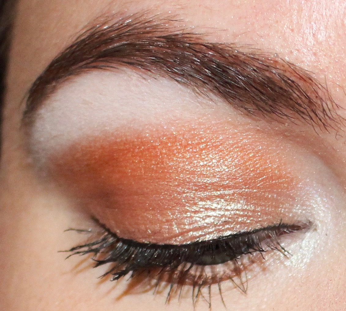


I was really impressed with the quality of this palette when I used if for all of these looks. And I could not wait to break into some of the more comfortable shades. Specifically, I really wanted to use the colors in the third row as there are several that I haven't seen elsewhere.
Now, for full disclosure, as of the time that I am writing this post, I have not used the third row. And that's why the post is more about my decision to buy this palette than an actual "review" of the palette. The reason I haven't used those shadows isn't because I haven't wanted to or haven't made time, it's that I had surgery a couple weeks after getting this palette, can't really wear those shadows to work, and haven't worn any makeup whatsoever since my surgery.
And, yes, I realize that if this post was a true review of the palette, this "review" would be pretty bad considering that I haven't used an entire row. But I don't know how long I will be in recovery from surgery—I suspect for a while still—and it was requested a few times that I write about my decision to buy this palette. So, I didn't want to wait over a month to write this post.
At $68, this is one of the most expensive palettes in my collection. And when I think about the fact that it is a Sephora palette, it is kind of hard for me to believe. The only palettes I have that are more expensive are from Viseart as well as quads from Tom Ford.
When I first saw images of all the new Sephora Pro palettes, I was immediately not interested in the warm or cool varieties, but as I said, I was drawn to this color scheme. I appreciated the vivid oranges, pinks, and purples, and loved that it was paired with turquoise, aqua, lime and teal. (And it's these kind of color schemes that make me wholly uninterested in something like Anastasia Beverly Hills Subculture.) Added to that, the top row had several duochrome shades, and since I love Illamasqua Cascade and Urban Decay Roadstripe as inner corner highlights, I was interested in having pink, green, and yellow ones as well. Finally, the bottom row had some interesting and pretty-looking shimmers. I was intrigued by the gold, orange, antique olive, and rose gold, and was just excited and inspired by the collection of colors together.
I waited for swatches, keeping in mind that they are incredibly deceptive and not always a useful tool. But, I was still surprised to see the amount of pigment in swatches and that the colors seemed much brighter in use than in the pan. And so while I have muted versions of a few of these colors in my collection, the brightness of them made them completely different colors. For example, I would feel very comfortable wearing some of my muted shadows to work, but I would not feel comfortable wearing the same colors in the Editorial palette to work.
But, as we have seen most prominently in the ABH Subculture release, just because something packs pigment and looks good in swatches does not mean it is a great eyeshadow that will blend, stay vibrant, and perform well on the eye.
Typically, I try to wait for reviews to come in before I decide to buy, but unless something is a total flop, I've found that a lot of reviews aren't terribly helpful for me. A lot of people just talk about the color selection, swatch the colors on their arm (sometimes with a finger, sometimes with a brush, sometimes over bare skin, sometimes over primer; most of the time the method is not disclosed), and then show one look that they did with the palette. I find people also use the same key words: pigmentation, blendability, soft, creamy, buttery, blends like a dream, etc. And after a while, it seems almost like there is a formula for an eyeshadow palette review, and I've found that it doesn't really give me the information that's useful to me. (In an attempt to combat this, I've started looking for reviews from people who show several looks they've created with the palette and show themselves applying the shadows on camera.) I also find in general that people don't want to be "negative" or controversial, and so a lot of "honest" reviews are watered down to sound somewhat favorable. And I don't want to know what someone thinks who is trying to stay on PR lists or get invited on launch trips. I want to know what someone who spent their money on the palette and doesn't have an entire career out of talking about makeup thinks about it.
Because of all this, in a somewhat uncharacteristic move, I decided to buy this palette before many reviews had come out and without having gone to Sephora to swatch it myself. (I was recovering from the first surgery at the time and wasn't able to really leave the house. Plus, I don't think any Sephora locations near me had this palette in stock for a while.)
And for all of the reasons I decided to buy this palette (keeping in mind that I haven't used the third row), I am incredibly pleased with my purchase.
However, considering there are 28 pre-selected shadows in this palette, it makes sense that there are some shadows that I won't like. And it's not so much certain colors in this palette that I dislike, but a formula or finish—finish that's filled with chunky glitter. The left two shadows of the first row have this formula, as do the first and fourth shadows of the bottom row. I originally said that I "dislike" these shadows, but the truth is that I "loathe" these shadows. They are essentially useless shadows. I cannot apply them with a natural hair brush, synthetic hair brush, or even with my fingers. There is just no color payoff. And the texture is just terrible. It is so gritty. To make these shadows even worse, the one on the top left just fell out of the palette in a solid chunk the third time I used the palette. And this wasn't after the palette was dropped—it was just from light use. And because of its weird texture, I was able to just press the entire shadow back in with my fingers. But, I don't trust this as a secure way to repress it, and I wouldn't be surprised if it falls out again soon.
When I tried to use one of these shadows all over the lid—the fourth on the bottom row—I found that the shadow essentially ruined my eye look. Despite everything I tried, I could not make it work, until I took it off and applied MAC Coppering all over the lid instead and finished the look with other shadows from the palette:


And I loved the way this look came out. I just wished it could have been accomplished by the entire palette. With that said, these shadows with the awful finish are the least interesting colors in the palette (in my opinion) and colors that I have better duplicates of throughout my collection. And the main colors I bought this palette for have very much lived up to and exceeded my expectations.
But, it's not a perfect palette. If I had it my way, I would make the palette less colors for less money. It's hard for me to say if that price is worth it, because there are several shadows that are unusable. But I do really enjoy the shadows that are.
So while I did not need this palette, I consider it a good purchase. And that's what I'm looking for with all of my purchases. In the oversaturated sea of warm-toned neutral palettes, this one excited me as doing something interesting and different. It inspires me and makes me excited to use it. It sucks that there are some dud shades, but I enjoy the rest of the palette enough to not return or declutter it because of the duds.
I have the cool version of this. I too usually wait for reviews, swatches, looks etc but nearly a year after its release, there really isn't very much out there about this guy (or its siblings). So when I was gifted a $50 Sephora gift card, I bit the bullet and got it - I'm a real cool toned lover and spotting a cool toned palette can seem like a yeti sighting. The only in depth review I saw of the cool palette was scathingly negative, but I was still so attracted to it, and I'm so glad that I did buy it because I really enjoy it. It has a lot of shades that are unique to my collection and are quite interesting and slightly different from colors we're used to seeing everywhere. Honestly, now I have the cool one I want the other 2 (well, other 5. I saw yesterday that 3 new ones are coming out - New Nudes, Editorial 2 and Jewel Tones). I enjoy the formulas (with the exception of the super chunky glittery ones as toy5 pointed out) but $68 is more than I ever spend on a palette, so I better get hoping for more gift cards!
ReplyDeleteI absolutely love the Sephora pro palette. If i want any neon, i go to it. I hate buying palettes in series because i feel like I get the same thing over and over, but the editorial 2.0 was a pleasant surprise for me. I also found the editorial hard to work with alone, bc the 2.0 has all the interesting shimmers i was craving to pair with it. My favorites are The shade wizard, a shifting taupe gold shimmer, feather, a luminous peachy gold duochrome with a light blue shimmer, illusion, a pink aqua shimmery duo chrome, and my favorite all time shadow i think is Phychic, it looks shite in the pan but completely transforms to a glow that shifts blue on the eye. Absolutely in love with these! Sephora really surprised me.
ReplyDelete