
If you're a longtime reader of my blog, you'll know that I don't post many reviews. And there's a few reasons for that. The first is that my blog isn't really about reviewing new makeup — it's about encouraging smart consumerism and breaking down marketing tactics. Another is that I don't buy a lot of new releases and therefore don't have a lot of content for "new product" reviews. And, finally, I don't want to be yet another person who might convince you to buy something you know you don't need.
With that said, I still think the occasional review can be helpful, and today I'm talking about the newest Anastasia Beverly Hills palette — Riviera.

When it comes to ABH, I have to say that I have a pretty unpopular opinion. I hated the Modern Renaissance palette and returned it because the shadows muddied on my eyes and I thought the shimmer color scheme was lacking. After receiving Subculture as a gift, I found that I actually really liked it and didn't think it was as hard to work with as Modern Renaissance — but most people really hated it. Lastly, I thought Prism, Norvina, Soft Glam, and Sultry were all incredibly boring and full of a TON of repeat shades.
When Riviera was released, I wavered on if I wanted to purchase it or not. I didn't have most of the shades in my collection, but I had shades that seemed close. And I wasn't totally sure how cohesive the color scheme would be for me.
But, I kept being drawn to it. There was something about the shimmers, specifically, that excited me. So, I decided to purchase my first ABH palette since Modern Renaissance.
And here are seven looks that I have done with Riviera.
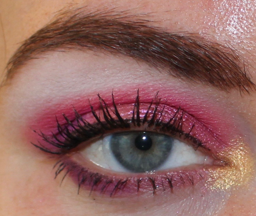
Look 1:


Lid: Mediterranean
Crease: Monte Carlo
Outer corner: Cannes
Inner corner: Inheritance
Brow bone: Sails
Lower lash line: Cannes
Mediterranean was one of the shadows that really called to me, and I think it's one of the standouts in this palette. I don't have any other shade like this one, and I find it to be really versatile. It can be colorful or neutral, and I think it's gorgeous. On the whole, I really liked this entire look. I was thrilled with how Monte Carlo and Cannes applied, and I loved how vibrant the gold looked on the inner corner. Sails is a very stark white, which made it a bit difficult to blend out on my skin tone, but I think it's a shadow that a lot of people would like.
Look 2:


Lid: Seychelles
Transition: Estate
Crease: Cabana
Inner corner: Yacht
Brow bone: Sails
Lower lash line: Palm
I hated this look. In stark comparison to look one, there was little I liked about this one. And that's really disappointing because I was so looking forward to this color combination, and it was a big miss for me. Estate looked like essentially nothing on my skin, and Cabana was quite dull and required several layers to look opaque. Cabana was an especially disappointing shade because, if you've been a reader for a while, you'll know that I love a good mustard. The mustard shade in Subculture (Edge) is my all-time favorite, and I was hoping (expecting) Cabana to be a good alternative. But, nope. Seychelles also required quite a bit of building up, which I didn't like.
Due to my disappointment in Estate, Cabana, and Seychelles, I considered returning Riviera after doing this look. But, I decided to try the rest of the shades first.
Look 3:


Inner lid: Inheritance
Outer lid: Palermo
Transition: Coastline
Crease: Monte Carlo
Brow bone: Salis
Lower lash line: Cannes
I liked this look. I loved working with the mattes, but I was a little disappointed in the shimmers. The gold, which applied gorgeously to my inner corners on my first look, didn't apply on the lid with the same intensity. It really had to be built up. Palermo was slightly easier to work with, but it also required some building.
At this point in the week, I was feeling quite a bit of buyer's remorse.
Look 4:


Lid: Seaside
Transition: Monte Carlo
Crease: Cannes
Outer corner: Cannes
Inner corner: Yacht
Brow bone: Sails
Lower lash line: Mediterranean
I started liking the palette again with this look, but I also realized how difficult Cannes is to blend. It looks worse in photos (with the flash) than it did in real life, but I would have preferred a seamless blend instead of what looks like a stripe. With that said, I love the color scheme of this look, and I especially love the shade Seaside. Like Mediterranean, it was one of the shades that really drew me to the palette, and it did not disappoint. The inner corner shade, Yacht, also really surprised me. I thought it was going to be a classic bronze, but it is like a bronze/rose gold. Yacht made me want to do another look with it as the focus.
Look 5:


Lid: Yacht
Transition: Coastline
Crease: Cannes
Inner corner: Seaside
Brow bone: Sails
Lower lash line: Cannes
I loved this look. Yacht was the wildcard shadow in this palette for me. I thought nothing of it at first, didn't really even notice it, and now it is my favorite shadow in the palette. Cannes was still difficult to blend, but I love the color and truly have nothing like it in my collection. At this point, I no longer wanted to return this palette.
Look 6:


Inner and outer lid: Palm
Center of lid: Yacht
Transition: Estate
Crease: Sydney Grace Cool Brown
Inner corner: Seaside
Brow bone: Sails
Lower lash line: Palm
For this look, I decided to go pretty neutral. I did this for two reasons. One was to use Palm, and the other was to show that even in this "colorful palette," it's possible to get a very neutral look. I liked this look and thought it was dramatic and pretty. It was the only look that required me to bring in another shadow, which was a cool matte brown from Sydney Grace. I could have used Palm in the crease, but I didn't want to go that dark.
Look 7:


Lid: Palermo
Transition: Monte Carlo
Crease: Bahamas
Outer corner: Bahamas and Cannes
Inner corner: Inheritance
Brow bone: Sails
Lower lash line: Monte Carlo and Cannes
For the final look, I wanted to use Bahamas — the hot pink. In most of the reviews I had seen of this palette, people heavily featured this shade. I would guess that's because Bahamas is the brightest shade in the palette, and when you're looking at Riviera as a "bright" or "colorful" palette, this will be the shade you use to showcase that. I have a few colorful palettes and several hot pink shades, so I wasn't in a rush to use Bahamas. But, this ended up being one of my favorite looks I did with the palette, and I received a ton of compliments on it. By this point in the week, I was very happy with my purchase.
Final Thoughts
If you've read through this entire post, you'll see that I really felt conflicted with this palette. Some days I hated it and really regretted my purchase. On others, I was incredibly happy with it. This is generally why I personally don't like "first impressions" review content, because opinions can drastically change the more you use a product.
There are two shades in the palette that disappointed me — Estate and Cabana — which are the peach and mustard shades. Something that I find in a lot of ABH palettes is that the lighter mattes can be a bit chalky and won't work for skin tones deeper than very light. I have a light to medium skin tone, but because I have a warm olive undertone, a number of shades that are traditionally made for "white skin" don't show up on me. And if these shades are lacking on my skin tone, I imagine that they would be lacking on deeper skin tones as well. This is certainly a palette that is more friendly toward deeper skin tones than most releases from ABH, so I was disappointed in these two shades.
Additionally, I don't think this palette needed light shades at all. I think it's disappointing how many brands include these "staple" shades for light skin, and it's also disappointing how many reviewers complain when a palette lacks these shades. There are not equivalent shades for deeper skin tones, and I think it's wrong to include "staple" shades for light skin only.
However, the majority of shades in Riviera can work on a wide spectrum of skin tones, and that is something I appreciate.
Yacht is the standout for me, and Mediterranean, Seaside, Cannes, and Monte Carlo were my other top shades. Seychelles, Palermo, and Inheritance are all decent shimmers, but they didn't stand out too much among other similar shades in my collection. Bahamas and Palm are solid mattes that work well in the palette, but, again, I have other matte hot pinks and matte browns in my collection. I liked Coastline quite a bit, but I don't know how well that shade would show up on diverse skin tones, so I'm hesitant to praise it. Sails is a very stark white, which isn't something that I personally love, but it's a good shade for what it is, and I used it every day.
To me, Riviera is not a "colorful" or "bright" palette. I think this is a different take on what is typically considered neutral. Or, it's a "beginner colorful palette" for someone who is curious to try more color, but doesn't want an entire neon rainbow look. Therefore, while Riviera certainly has less brows than most ABH palettes, if you're looking for a really vibrant and colorful palette, this is not the one I would recommend.
With that said, I personally enjoy the color scheme and find it quite inspiring, and I am ultimately happy with my purchase. I have a sizable eyeshadow collection that I routinely declutter and curate, and there are several shades in this palette that I have never seen before, let alone owned.
This is a palette that I know I will use and enjoy for a long time. But, I don't think Riviera is for everyone, and I don't think it's so special that anyone who doesn't have it is missing out.
I've been hearing from ever increasing sources who own both that the original BH Cosmetics Festival palette is pretty much a spot on dupe for the Riviera. What do you think? If that's truly the case, I think I might give the Riviera a miss even when it goes on sale...
ReplyDeleteThis palette reminds me so much of that Nyx Mochi palette that has similar "neon" tones. It's a pass for me.
ReplyDelete