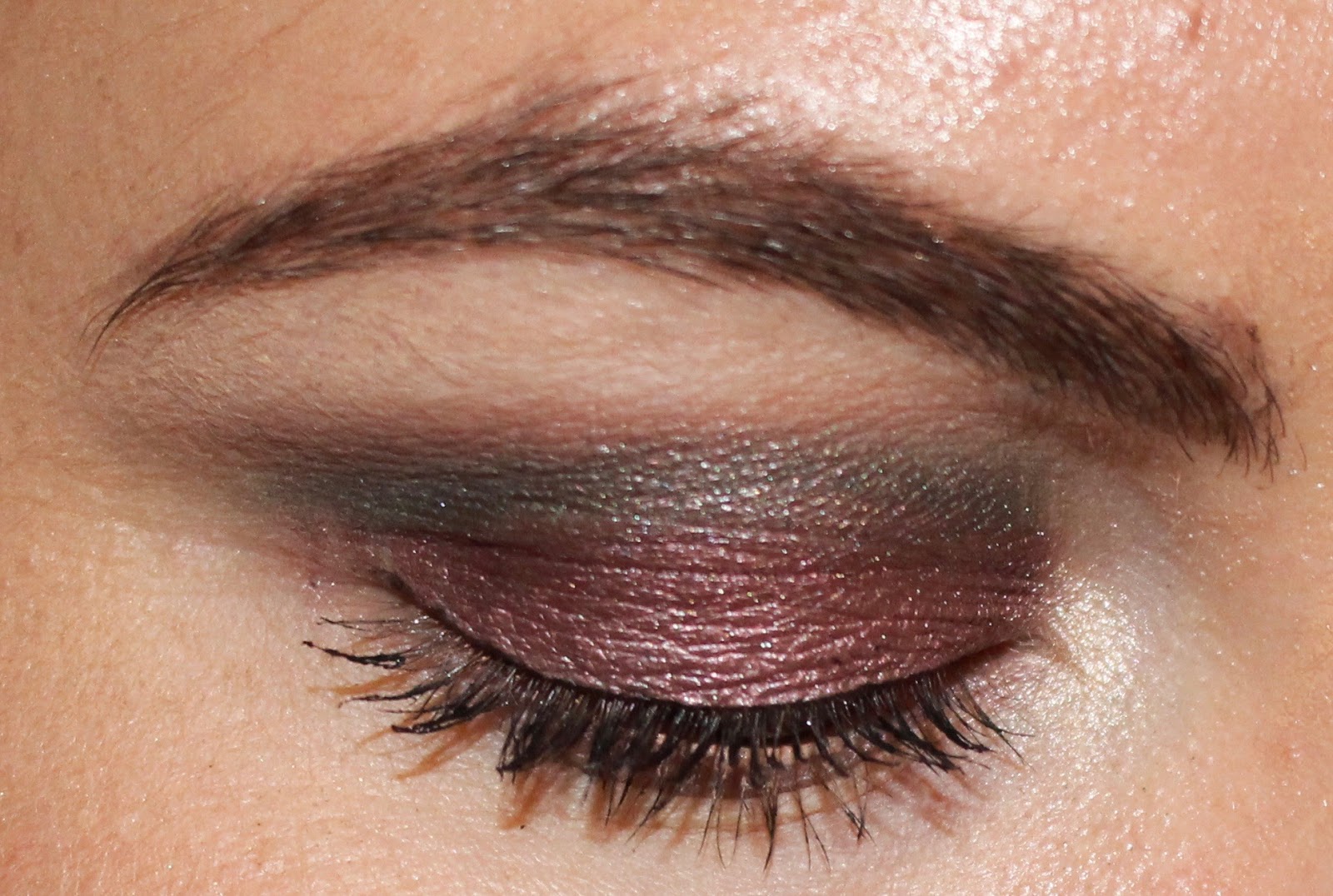
Sunday, January 8, 2017

One Week, One Palette: Laura Mercier Eye Art Artist's Palette


For the fourteenth week of my one week, one palette project, I decided to use the Laura Mercier Eye Art Artist's Palette. This is actually an interesting palette purchase for me because it is what I decided to buy when I returned Modern Renaissance. I had an upcoming two-week trip, and I told myself that I was going to bring Modern Renaissance to force myself to use it. When I realized I really, really didn't want to be left with only that palette for two weeks, I knew I had to return it. I bought this palette instead, brought it on my two-week vacation as my only palette, and loved it!

But that was because I basically only did one eye look the entire time. We will get into that at the end of the post. 

I used every shadow in the palette last week and pulled in Make Up For Ever Pearl only two days. 

Below are five looks I did last week. 

Look 1:


African Violet on the lid, Plum Smoke and Kir Royal blended into the crease, Fresco blended above the crease, Violet Ink padded onto the outer corner, MUFE Pearl on the inner corner, and Vanilla Nuts on the brow bone. Violet Ink on the lower lash line. 

Look 2:


Kir Royal on the lid, Truffle blended into the crease, Fresco blended above the crease, Violet Ink padded onto the outer corner, MUFE Pearl on the inner corner, and Vanilla Nuts on the brow bone. Kir Royal and Violet Ink on the lower lash line. 

Look 3:


Guaca on the lid, Fresco blended into the crease, Plum Smoke blended above the crease, Truffle padded onto the outer corner, Sparkling Dew on the inner corner, and Vanilla Nuts on the brow bone. Truffle on the lower lash line. 

Look 4:


Primrose on the lid, Plum Smoke and Kir Royal blended into the crease, Fresco blended above the crease, Violet Ink padded onto the outer corner, Sparkling Dew on the inner corner, and Vanilla Nuts on the brow bone. Kir Royal on the lower lash line. 

Look 5:


Bamboo on the lid, Truffle blended into the crease, Espresso Bean padded onto the outer corner, Sparkling Dew on the inner corner, and Vanilla Nuts on the brow bone. Truffle on the lower lash line. 

As you might have guessed, the look I did on day 1 was the look I wore for that two-week trip and the look that makes me "love" this palette. This is one of my favorite looks I have ever created, full stop. And African Violet is one of my favorite eyeshadows ever. But this is how my week went:
  • Day one: Man, I love this palette. This is the prettiest eye look ever. No way would I ever get rid of this palette. 
  • Day two: Were these shadows always this hard to work with? I was hoping I would like this better, but maybe this just isn't the right shadow look for me. 
  • Day three: These shadows sure do lack pigmentation. Not sure how I feel about this palette. 
  • Day four: This shadow looks identical to the one yesterday. I think I might actually declutter this palette. 
  • Day five: This look is pretty, but is quite sheer in relation to my other bronzes. It's nothing special. I'm going to declutter this palette. 

So, yes, I have decided to declutter this palette, and that is the reason I didn't do six looks like I typically do. I had already run the gamut with looks to create, and I had used several shadows multiple times. 

I don't typically discuss palettes shade by shade, but I feel it is useful to share my opinions on each shade. 

Sparking Dew: This was so sheer. It was too light for me to want to wear it all over the lid, but packed no punch or interest whatsoever in the inner corner. 

Vanilla Nuts: This was fine as a brow bone shade, but I have suitable duplicates in spades. 

Guava: This color was also very sheer. It looked like a very light wash of pink on my skin and looked identical to Primrose. 

Primrose: This color was also very sheer and looked identical to Guava. Having both shades in the palette felt like a waste. 

African Violet: The powerhouse shade of this palette. This is one of my favorite eyeshadows I have ever used. It's purple, pink, and gold. I absolutely love it. 

Fresco: This was a pretty crease shade, but I have several alternatives or duplicates in my collection.

Plum Smoke: This was a nice crease shade, but I have several that look like it from Lime Crime Venus, Anastasia Beverly Hills (Buon Fresco), Ciate London, Inglot, Too Faced Chocolate Bon Bons, and Becca Ombre Rouge. 

Bamboo: This was also a sheer color. It looks a little more intense in the photos, but it was a sheer bronze. It was a pretty color, and it worked for conservative, professional makeup, but I personally like something that packs more color and payoff. 

Kir Royal: This was pretty to deepen the crease or outer corner, but I felt it was a bit patchy and bruise-like when used on the lid. 

Truffle: This was a pretty crease or outer corner shade, but it tended to skip a little when blended. I like the color, but I have a ton that duplicate it. 

Violet Ink: This was fine to deepen the outer corner. It's not a shade I would use very often and not one that really matters to me.  

Espresso Bean: Like Violet Ink, this was fine to deepen the outer corner. I'm not a huge fan of super dark shadows, and they don't get a ton of use from me, but I have shadows in my collection that perform better than this. 

As you can see, I only really loved one shadow in the entire palette. I liked a few other colors, but really only for how they worked with African Violet. I've heard so many rave reviews of this palette, and I think a lot of that is because of African Violet, to be completely honest. I was extremely disappointed with ALL other possible lid shades; Guava and Primrose are basically the exact shade and both are lacking in pigmentation; Sparkling Dew was a light wash of color; and Bamboo was also sheer. The crease shades were nice, but the quality was not out of this world above others in my collection, and the outer corner shades were nothing special. 

And that is not how I want to feel about any palette in my collection. The way I feel about African Violet is how I want to feel about the entire thing. But I found this palette to be so difficult and uninspiring to work through, and once I had used every color in it, I immediately wanted to stop. 

On the positive side, I think this palette would be great for a makeup beginner who loves purple or for someone who works in an extremely conservative office. I'm still too afraid to wear eyeshadow looks with a little more oomph to them at work (I didn't wear looks one and two to work), and this palette let me pile on the shadow without feeling like I was overdone whatsoever. I know there is certainly an audience for a product like that, but I am not a part of that audience. 

On the negative side, I also have to say that this palette feels very much like it is not only for light skin, but for the fairest of skin tones. I have warm olive undertones, and Sparkling Dew, Guava, and Primrose looked like nothing on me. I imagine someone would need exceptionally fair skin in order to see a distinction in shades. Some of the darker shades would work on medium to deep skin tones, but it's disappointing to see that the majority of the palette is skewed so heavily to extremely fair skin. 

With all that said, last week might have been my favorite week of this project. Obviously that is not because I enjoyed using the palette, but because it was the week I learned the most. Had I not started this project and forced myself to not only use my palettes for a solid week but to use every shadow in the palette, I probably wouldn't have realized that I don't actually like the Eye Art Artist's Palette. Before this project (and this blog), I would reach for a palette when I was feeling a specific eye look. So, every time I wanted to use African Violet, I grabbed for this palette, thought it was beautiful, and had no way of knowing I actually didn't like it. It reminds me of life before iTunes or Spotify when you would spend upwards of $20 to buy a CD because you liked one song on it. And you would convince yourself that you would listen to the entire album and learn to love it, but you never did. You just played that one song over and over until you got sick of it. 

Fact is, I love African Violet so much that I have ordered it as a single shadow. It cost half the price of the entire Eye Art Artist's Palette, but I'm okay with that. I would rather have the one shadow that I want than an entire palette that I actually really dislike. I feel like I've read some people complain that the African Violet that came in their various Laura Mercier palettes was different from the single shadow, and if that's the case, I might depot African Violet from this palette and put it in one of my custom palettes. 

It feels good to get another palette out of my collection, especially since it wasn't a palette that I really loved. I routinely look at my collection and see if there are any items in it that can be decluttered, and the Eye Art Artist's Palette always got a save. It took actually using it to its fullest for me to realize I only liked a tiny portion of it. And just for that one lesson, this has been an incredibly successful project thus far. 

Tuesday, January 3, 2017

What I'm Not Buying: Tarte Rainforest of the Sea Volume 2


Photo: Temptalia 

In keeping with Tarte's latest marketing practice to pump as many products out as possible, they have released yet another eyeshadow palette: Rainforest of the Sea Volume 2. 

And I won't be buying. 

I recently used the Rainforest of the Sea (I guess it's considered Volume 1 now?) in my one week, one palette project, and I remarked how those shadows were my favorite from Tarte. After first purchasing and using the Volume 1 palette, I remember saying that if Tarte ever came out with another palette in that same formula that I would buy it no matter what. 

It turns out I was wrong. And I'm happy for that. 

I shouldn't be shocked by the color selection of this palette. I mean, it's coming from Tarte, and Tarte is anything but unique and innovative, but I have to say that I am actually surprised that this palette is so neutral, so—frankly—boring, and so similar in color scheme to the Volume 1 palette:


Photo: Temptalia 

This is something that I really don't understand and also can't get behind. At least five shades from Volume 1 appear to be very similar to shades in Volume 2, which is pretty ridiculous. I think Tarte failed big time on this one. If you're going to make a volume 2 of a palette—even a neutral one—I think it should be markedly different from volume 1. Because (in theory) no one wants to buy the same palette twice. With a name and theme like "Rainforest of the Sea," Tarte could have really gone wild with creativity. They could have had an entire palette themed around water and seaweed with blues and greens. Or they could have taken advantage of the red/orange craze and created a palette that explored gorgeous hues of coral. The colors could have been inspired by sea creatures. Or anything, really, apart from yet another volume that explores... what? Sand? Sea glass? Even that would have been more interesting than this. 

And, let me be clear. I am not disappointed by the color scheme because I was hoping to buy the palette or had made up my own idea of what the palette would be. I'm disappointed because it feels like Tarte—and the cosmetics industry on the whole—believes it is acceptable to continually pump out the same products but market it to consumers as something new and different. And that's where we need to come in as smart shoppers and call them out on that bullshit. 

With the first palette, there seemed to be a disconnect between the theme, packaging, names of the shadows, and the actual colors. Sure, "sand," "seashell," "cove" and "abyss" work for a ridiculously light neutral palette, but names like "mermaid," "starfish," "reef," and "wave" make me think of anything but light shades of brown. The packaging also worked with the theme and was gorgeous:


Photo: Temptalia 

But it seems as though more thought went into making the packaging fit the theme than the actual shadows. And as I mentioned in my one week, one palette post about this palette, if there was ever a palette I would keep solely for the packaging, it would be this one. I find everything about it to be incredibly elegant, and I view this compact like a piece of artwork.

Despite what I perceive as a disconnect between theme and product, I purchased Volume 1 because I knew I would get use out of every shadow and I liked the formula. That remains true today, which is another reason why this palette won't be decluttered. 

Volume 2, however, doesn't get as much slack from me. On the most basic level, I'm not a huge fan of the packaging: 


Photo: Temptalia 

And I feel like the packaging is even more disappointing/disconnected because, again, the colors could have been inspired by hues of coral. Instead, the colors were inspired by the Urban Decay Naked palette and the packaging got all the attention. 

This palette also doesn't get much slack from me is because I've read that the quality is not quite as good as Volume 1. The formula is the same (or at least similar) and differs from the brand's Amazonian Clay formula, but the colors don't apply as nicely as they did in Volume 1. This tells me that a corner was cut somewhere, likely to save money, and the product suffered as a result. I'd like to note that I've read the quality is far from terrible, I just think it's worth noting that it is not as great as the original. 

A positive that I can give this palette is that it appears Volume 2 would work better (perhaps only slightly) on medium and deep skin tones. I've read that the color payoff is lighter than what appears in the pan (the same is true for Volume 1), so I'm not sure how well they would actually perform on darker skin tones. Nonetheless, I think it is positive that Tarte is moving in a more inclusive direction. 

Still, the color scheme of this palette remains a mystery to me. I can't understand why Tarte would go in what feels like a dated direction when reds and oranges are hot right now. And that's not to say that they should go in that direction; the market is already saturated with those colors. But it seems like going along with what's hot right now is Tarte's modus operandi. 

Instead, they presented a palette with the most basic neutral color scheme. 

It looks like Urban Decay Naked:


Naked Smoky:


Stila In the Light:


Lorac Pro:


Photo: Shameless Fripperies

NYX Smokey Eyes:


And most recently, Anastasia Beverly Hills Master Palette by Mario:


Photo: Temptalia 

What's tricky about this color scheme is that it is both classic and dated. It's classic in the sense that Naked, Stila in the Light, and Lorac Pro are staples in many people's collections and continue to be loved and celebrated. But it is also dated in the sense that the Naked palette has been around for six or seven years, and most people want to see product releases that present something new to the table. In the entire context of the cosmetics industry, I don't think Volume 2 presents anything new, but more than that, I don't think it presents anything new to Rainforest of the Sea. 

It's frustrating for me to see brands churn out product after product, especially when the products are limited edition, because it feels like little thought went into it. If a brand is expecting me to pay upwards of $40 or $50 on an item, I would at least like there to have been some thought and inspiration behind it. I honestly think that's part of the reason people are falling all over Modern Renaissance. Because at the time of its release, only Lime Crime Venus was really similar, and most people either weren't aware of Venus or were boycotting Lime Crime. The color scheme feels inspired, and it was something a little different for most people. But releasing an item that looks so similar to many existing popular palettes and bares a striking resemblance to its predecessor just feels like you want me to collect the Rainforest of the Sea line and give you more money. That's another reason why I'm not a huge fan of serializing makeup items. Because it plays directly into some people's "need" or desire to complete collections. And if you know people will buy something just to complete their collection no matter the quality or how inspired it was, what's the incentive to put effort into making a great item?

Rainforest of the Sea Volume 2 just doesn't do it for me in any way. And Tarte on the whole has become a very unattractive brand to me as it seems they care more about whisking away internet famous people in their twenties to an exotic island in the hopes that they will shill their products than actually producing good quality makeup. This palette feels lame to me and like Tarte didn't even try, and I won't be buying. 

Monday, January 2, 2017

What I'm Not Buying: Kat Von D Pastel Goth


On January 10, Kat Von D will release her newest eyeshadow palette, Pastel Goth. 

And I won't be buying. 

Typically, I like to wait until a palette releases and has garnered some reviews before I make these posts, but on the other hand, because of the current consumerist climate of "buy now, evaluate your purchases later," I think it's important to get my thoughts out there and put things into perspective before products some hyped products are even available. 

Kat Von D is an interesting brand in that pretty much all of her products are ridiculously hyped and the performance is either hit or miss. She has had some huge hits, such as:
  • Shade and Light Eye palette
  • Metal Crush eyeshadows
  • Mi Vida Loca Remix palette
  • Tattoo liner
  • Liquid lipsticks*

And some notable misses, such as:
  • Shade and Light blushes
  • Serpentina palette
  • Liquid lipsticks* 

*There have been serious quality control issues with liquid lipstick batches.

Generally speaking, Kat Von D has more hits than misses, but the brand also has a habit of releasing "permanent" items only to discontinue them at a later date. This includes pretty much all of her eyeshadow palettes, most notably Monarch and Chrysalis. Because of this, it doesn't feel to me personally that Kat Von D is an exceptionally stable brand. But, I think they are trying to move toward that. It was important to Kat Von D that her brand reflect her own vegan beliefs and lifestyle, and she has been working toward making the entire line vegan for over a year now. This could be why the brand has lacked permanent products, but that is only my guess. 

What's intriguing about Kat Von D is that the brand's releases are traditionally really interesting in concept. Kat also does all of the product artwork herself, which gives the brand an additional level of unique and "cool." I find that I am rarely uninterested in the latest launch from Kat Von D, especially when it's an eyeshadow palette. I've mentioned many times that eyeshadow and palettes specifically are my weakness, and Kat Von D releases will always get consideration from me. 

I am, however, getting a little concerned that Kat Von D could be turning into the next Too Faced or Tarte in pumping out products at an alarming pace. Just within the last year, and only in terms of eyeshadow palettes, Kat Von D has released:
  • Shade and Light Eye quads
  • Serpentina
  • Metal Matte
  • Alchemist
  • Pastel Goth 

That's a lot of releases for a brand that traditionally takes a while to develop and release a product, and I'll talk more about why this is a larger problem in a moment. 

I'm disappointed to say that Pastel Goth does not interest me whatsoever, and I feel the entire release is a missed opportunity for the brand. Kat Von D notoriously teases her latest products comically far in advance, so I'm not entirely sure when the concept of Pastel Goth was first introduced, but this was the fist image people were given:


I remember reading when this image was first released that people couldn't wait to buy the palette. And every time I read that kind of sentiment, I have to laugh. We are so well conditioned into wanting to get the latest and greatest that we make up our minds about something without even seeing the product or knowing the price. 

But then we saw the actual palette:


As well as the official "swatches" by Kat Von D:


I'll just say it—these swatches are garbage and clearly not an accurate depiction of the product. This is something that really, really frustrates me about a lot of brands, and Kat Von D in particular. At best these swatches have a ton of product piled onto the skin—far more than would be realistic to apply to one's eyelid—and at worst these swatches look straight-up photoshopped. They especially seem photoshopped since the colors look essentially the same on all three skin tones. And that's the point of swatching colors on multiple skin tones—to give an accurate depiction of how the product will look. 

Because the swatches are so heavy and unrealistic, I honestly don't have an idea of what these colors will look like on the eye. What I can say is that these colors don't look pastel. They actually look quite neon. And I get that a black and white shade fit the aesthetic of "pastel goth," but I also think that the person likely buying this palette already has black and white shadows in droves. I also expected this palette to be heavy on nuanced pastel pink, purple and blue shades, but that very well could be that my knowledge on the pastel goth aesthetic is limited. 

But for a themed palette, these colors seem to be quite... ordinary? Redone? Really, it reminded me most of the matte shades in the Kat Von D 2016 holiday palette, Metal Matte:


Even the ridiculous swatches look similar:


I mean, really, the only difference between Pastel Goth and Metal Matte is that Pastel Goth has a neon blue shade. Other than that, every shade is in the Metal Matte palette. And I'm not actually okay with that. If they were gonna make similar/repeat, why not just make the Metal Matte palette permanent? Or make separate mini metal and matte palettes? Why release a brand new palette with nearly the the exact shades as in a palette released just months earlier, stick a neon blue shade in it, and call it something new?

No, Kat Von D. No. This is dumb. You're selling snake oil at this point. 

And this is what I wanted to talk about before, in how I'm afraid that Kat Von D is the next Too Faced and Tarte in terms of releasing product after product that don't seem to have too much thought behind them and have subpar quality. My thought is—and this is pure speculation—that the bar has been raised in terms of brands needing to have something new to bring to beauty community every few months just to keep up with competitors. When I first started this blog, I didn't think there would be enough new products releasing for me to realistically keep things going on a regular basis, but I was surely proven wrong. And I don't even go looking for products! So far I've only written about items that have popped up in my everyday life and involvement within this community. 

I remember years ago when MAC was queen of the makeup world. People would get excited about MAC's special collections, sure, but most people were mainly talking about MAC's permanent line. And MAC didn't really release new permanent products often, so what people were talking about were products that essentially stood the test of time. And then the culture shifted, and now it is all about having these ridiculous collections, using giant IKEA Alex drawers to store said ridiculous collections, having an entire "beauty room" in one's house, and buying everything that every brand releases. And if the spending culture is to buy literally anything new, the incentive is high for companies to churn out new products at a rapid rate. And when brands are put under pressure to come out with something new as soon as possible every few months, innovation and quality are bound to decline. 

I believe it's ColourPop and Kylie Cosmetics' parent company—Seed Beauty—who essentially said they value rapid production over quality. They were praised in the industry for their marketing and business model, which they said was to churn out as much as possible as quickly as possible—without perfecting formulas—and see after the fact how well products sell and general consumer opinions. So to basically throw everything at the wall and see what sticks (or in this case, sells). They blatantly say they value rapid-fire releases over product quality, and I feel that is a huge middle finger to consumers. 

So now we are in a cycle where brands are churning out a ton of new products and we want to get the new thing everyone is talking about, so we end up spending and spending and amassing these enormous collections that we couldn't even begin to realistically work our way through. And to top it off, these products aren't even that good anymore. And I have to say that it's really disheartening. It's fun to look at new products and get excited by different color combinations and trends—that's how the fashion industry operates—but it takes the fun out of it when the market is flooded and all the products are subpar because production was rushed. 

Getting back to a point I made earlier, from the (likely highly edited) pictures of Pastel Goth that are available, the colors don't look very pastel. In fact, the swatches remind me quite a bit of the Urban Decay Electric Palette:


Photo: Temptalia

Only a little more subdued. 

For other actual pastel options, there's MAC Pastel Times Nine:


And MUA Pretty Pastels:


Photo: FleurdeForce

Overall, I'm really disappointed in this release. I'm disappointed in the color selection, the "pastel" nature of the shades, the similarity/repetition in Metal Matte, the ridiculous and unhelpful swatches, and the general marketing. And I really like Kat Von D as a brand! But this year...
  • The Shade and Light Eye quads underwhelmed me 
  • The Shade and Light blushes were pulled from shelves because of immensely poor quality 
  • Serpentina seemed to have extreme quality control issues with most reviews leaning negative
  • Metal Matte was too large and filled with colors I wouldn't use, and again reviews largely said the matte shades weren't up to other KVD quality
  • Alchemist was exactly like ABH Moonchild except with a fraction of product
  • And Pastel Goth doesn't spark intrigue or joy for me in any way

I'll be curious to see what actual swatches of Pastel Goth look like, especially since pastel shadows are notoriously difficult to work with. Even if the swatches are great (which, honestly, I would be surprised if they were), it wouldn't deter me from my decision to not buy. Maybe the actual colors won't look quite so similar to those in the Metal Matte palette, but on the eye, I assume the difference would be negligible. For $38, I think Pastel Goth just isn't interesting enough. If you look at it as a different take on an all-matte palette, then I suppose there is something intriguing there. Still, there just isn't enough to generate interest from me. 

I'll also be interested in reading reviews of this palette and seeing if the quality is up to par or not. It would be a shame if Kat Von D is the next brand to bite the dust of quality in favor of needing to play the rapid release game. Maybe it's time that consumers change the game a bit and stop playing by companies' rules. If you want me to buy something, it needs to be of fantastic quality and add something more to my comprehensive collection. If you want to throw mediocre crap at me every few months and expect me to buy, you'll lose me as a customer. But who knows, maybe the quality of Pastel Goth is fantastic. Even still, the shades are uninspiring to me and a repetition of shades in Metal Matte. I didn't buy Metal Matte, so there's no reason for me to think differently about Pastel Goth. 

Sunday, January 1, 2017

One Week, One Palette: Viseart Bijoux Royal


For the thirteenth week of my one week, one palette project, I decided to go with Viseart Bijoux Royal. When I first saw this palette announced (in the summer, I believe), I remember Christine from Temptalia mentioning that the bottom row looked like Christmas. I agree, and the right side of the palette also reminds me of Hanukkah. Because of the people in my life, I celebrate both holidays, so this palette seemed like the obvious choice for the holiday week. 

As I mentioned last week, I recently started a new job in a conservative workplace. I received a wonderful comment suggesting how to introduce my eyeshadow in a way that gives my colleagues time to slowly adapt to it, and I really appreciated it. It was such a bummer for me to think about only wearing neutral washes of color for the majority of the week, so I'm excited that all hope is not lost. 

With that said, I actually had last week off from work for the holidays, so I wanted to take advantage of the time off and use Bijoux Royal.  


Top row, from left: 1, 2, 3, and 4
Middle row: 5, 6, 7, and 8
Bottom row: 9, 10, 11, and 12

Since this is a palette made up entirely of shimmer shadows, I paired it with MAC C'est Chic, which is an all-matte palette:


I used MAC Drawing a Blanc on the brow bone every day. 

Below are six looks I did last week. 

Look 1:


5 on the lid, MAC Soft Brown blended into the crease, 6 padded onto the outer corner and blended into the crease, and 2 on the inner corner. 11 on the lower lash line. 


Look 2:


7 on the lid, 9 blended into the crease, 10 padded onto the outer corner, and 2 on the inner corner. 10 on the lower lash line. 

Look 3:


3 on the lid, 6 blended into the crease, 9 padded onto the outer corner and blended into the crease, and 1 and 2 on the inner corner. 6 on the lower lash line. 

Look 4:


10 on the lid, 11 blended into the crease, MAC Choc-ful blended above 11, and 1 on the inner corner. MAC All's Rosy on the lower lash line. 

Look 5:


8 on the inner and outer lid, 4 on the center of the lid, MAC Corduroy and Embark blended into the crease, and 1 on the inner corner. 12 on the lower lash line. 

Look 6:


3 on the inner lid, 4 on the outer lid, 8 blended into the crease, 12 padded lightly onto the outer corner, and 1 on the inner corner. 12 on the lower lash line. 

So, I'm having some feelings about my makeup collection this week. For the first time in this project, I felt really overwhelmed by the sheer amount of palettes in my collection. And I think that's because I added some palettes to my collection over the holidays. I did not start this blog because I did not want to buy anything ever again. I like makeup too much to just stop buying everything. I also like makeup too much to not be actively involved in the community and learn about new products. The goal of this blog is to personally be a smarter shopper and to hopefully inspire others to evaluate one's collection and shop more shrewdly as well.  

With all of that said, I don't want to add more to my collection, at least not for a long while. What I have learned in the thirteen (!) weeks of this project is that I want to use every single one of these palettes more. The first palette I chose for this project was my custom palette with MAC and Makeup Geek singles, and I remember being so disappointed that the week was over because I wanted to keep using it. And I haven't been able to touch it in twelve weeks because I've been getting through the other palettes. I remember having a similar feeling when I used my Inglot palette, my Juvia's Place palettes, and the Venus palette, just to name a few. And since I've added palettes to my collection, I still have over a month (close to two months) of this project remaining. 

And the thing is, I'm brutal with decluttering, and I declutter on a regular basis. But what this project has shown me more than anything is that I truly love the palettes that I've used and decided to keep. So decluttering what I have right now would be decluttering something that I love. And I don't want to do that, but I also don't want to have so many palettes that I can never properly enjoy any of them. So, I feel conflicted. 

That aside, I really enjoyed using this palette last week. Typically, I like to have a shimmery lid with matte colors through the crease and padded onto the outer corner, but since this palette was so rich in color, I decided to run shimmers through my crease almost every day. And I actually really loved how it turned out. Some shimmers worked better in the crease than others, but I really enjoyed the majority of my looks. 

Viseart is an interesting brand, and I find that I don't typically agree with the majority opinion of them. But also keep in mind that I don't like the mattes in Lorac Pro or Anastasia Beverly Hills palettes, and most people swear by those. I like Viseart mattes, but for me personally and my specific skin, I don't think they are substantially better than other mattes. I love my Kat Von D Shade and Light Eye palette, have fallen back in love with my MAC C'est Chic palette, and really love mattes from Makeup Geek, Zoeva, and Inglot. I don't think Viseart mattes are high and above all of these, and in some cases, I prefer other formulas. 

As far as Viseart shimmers, I've heard people say they are subtle and like a light wash of color. I don't necessarily agree. I have three Viseart shimmer palettes, and I find that the colors vary in terms of depth. Some colors are sheer and other pack a huge punch of color. So I usually land somewhere in the middle of people who think the shimmers are sheer and crappy and others who think the palettes perform like a dream. Generally speaking, I enjoy Viseart shadows (and I should since I own five Viseart palettes!), and Bijoux Royale definitely has my favorite combination of colors. 

I used every shadow in the palette, and it is no surprise that my favorites were the cranberry/raspberry shades. I know I've said it so many times, but this was another palette that reminded me of why Modern Renaissance didn't work for me. I have always loved pink/red shadows, but I just think the tones and finishes (shimmer!) are prettier in other palettes. I also really loved the antique gold shade as well as the bronze shades. I had some trouble really falling for the blues and greens at first, but I think that's only because I was in the mood for some bright colors, and these were darker and more subdued. I received compliments while wearing the cooler blue looks, however, which made me feel better about them. 

Looks 1 and 2 were my favorite of the week, but I also really enjoyed looks 3 and 6. What got me started on the above tangent about the size of my collection is that this is a palette I would really love to continue using, but I still have to make my way through everything else. Thinking about this also makes me feel a little stressed about how long it will take to get my colleagues comfortable with my eyeshadow and thinking it is professionally acceptable. (For reference, the office is predominately female, and I noticed only three women who wore makeup. One wore mascara only, one wore top eyeliner only, and one wore winged eyeliner with light shadow.) Thinking the looks I did last week wouldn't be appropriate for work (for a while, at least) sort of bums me out. I just want to be able to use and enjoy more of my collection more frequently. 

Overall, I think Bijoux Royal is a gorgeous palette. It's definitely my favorite Viseart palette, and I would love to see it paired with Viseart Dark Matte. If I was doing a one month, one palette project, I would have had time to use it in conjunction with Dark Matte, but since I try to use every color in a palette each week, it makes it challenging to bring in other shades. Viseart palettes, however, are designed to work with each other, so I think it would have been really great to see how these palettes worked together. Bijoux Royal also leans more cool than warm, so it was fun to be able to play with some cool-toned looks when my preference is typically for warmer ones. Each day I desperately wanted to use the pink/red shades, and I had to actively force myself away from them. But I ended up really enjoying playing with the blue and silver shades as well. I think this palette just has a really interesting color scheme, which is inspiring to me in finding new and different color combinations.  

Had I not been a little distracted with the new palettes that came in over the holidays, I think I would have been a little heartbroken to move onto another palette. Because Bijoux Royal is a beauty. I am, however, feeling a little fatigued with the project overall, and that's simply because I have so many palettes that it's taking me a while to get through everything. I would love to be able to go back to my Inglot palette or either of my Juvia's Place palettes, but I also want to finish at least one round of the project and really get to know all of my palettes. The sheer length of this project is teaching me the most about why it's important to make smart choices when buying. I would love to be able to continue using Bijoux Royal for another week, but I've got more palettes waiting in the wings.