I'm still unable to get myself to stop using my custom "Just Peachy Mattes" palette, and I wanted to use NYX Air again and get a better sense of how the overall palette performs. This has been a really good week for me getting back into the swing of regular blogging, and it has made me really happy to receive many messages from people saying that they are enjoying the regular content.
It's a pretty gross day here in New York City, and usually when that happens, I am drawn to putting all the color possible all over my face to bring a little brightness into an otherwise dreary day.
Here are two looks I did this weekend.
Look 1: Notoriously Morbid Paradise Island


Paradise Island (over Pixie Epoxy) on the lid, Colourpop The News blended into the crease as a transition shade, Colourpop Slim Fit and Stay Golden blended into the crease, and Colourpop 143 padded onto the outer corner. Marc Jacobs highliner in Whirl(pool) on the waterline.
Look 2: NYX Air


8 on the inner lid, 6 on the middle lid, 4 on the outer lid, 5, 3, and 4 blended into the crease as transition shades, 11 blended into the crease on top of 5, 3, and 4, and 9 padded onto the outer corner.
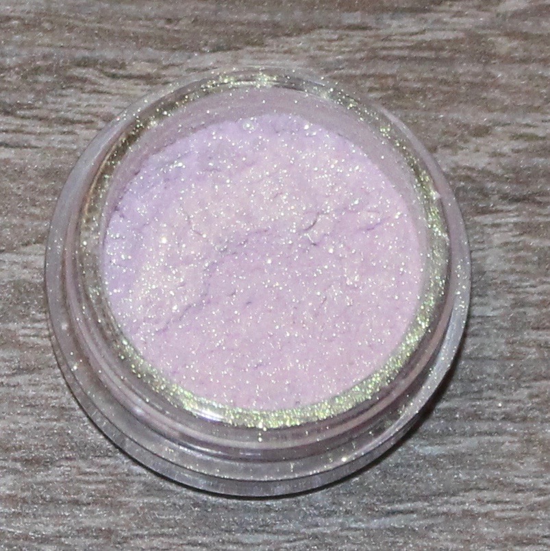
Notoriously Morbid Paradise Island
Status: Love
I purchased this shadow a long time ago when the Wonder Woman collection was in stock, but I hadn't had an opportunity to wear it until now, which is a shame because it's a stunning color. Using this color reminded me of how much fun it was when I was first exploring indie eyeshadows, because the colors are truly unique. I don't remember why I had such a personal stigma against indie shadows for the longest time (maybe because most influencers don't talk about them?), but that was certainly my loss. I absolutely loved Wonder Woman (and this is coming from a person who doesn't like most comic book/superhero movies) and even asked several men in my life, "Is this what it felt like to grow up as a boy and have all these badass characters to look up to?" So when I saw that Notoriously Morbid had a Wonder Woman collection, I was interested to see what kind of shades they would come up with. And I love this one. It is such a unique shade as it can look icy blue, green, or purple. I paired it with my duped Just Peachy Mattes because because I literally can't go more than a day it seems without using it, and I have to say that I really love this color combination. Typically, I would have been tempted to pair a color like Paradise Island with other purples or dark greens in my collection, and I probably would have used my Viseart Dark Matte palette, but since I've been so inspired by the peachy palette, I decided to see what it would look like with bright corals. And I loved this look. Putting Colorpop 143 on the outer corner proved to be the only difficult part of this look, and that was because it is very similar to the purple shift of Paradise Island, so I had to really build up that shadow to look distinct and intentional. Overall, this is certainly a favorite look.
NYX Air
I can't decide if I really like this look or if I think it's a hot mess. This look also slightly changed the way I feel about the Air palette, which is why I wanted to try out more than a few shades before giving a proper opinion on it. I used seven shadows in this look, and I was impressed/happy with the vast majority of them. The biggest problem-makers were the shadows I used on the lid. Before I started this look, because I knew I was going to be working with pastel shades, I wanted to put down a base of NYX Milk to really help the shadows pop. But more than that, I wanted to see how the shadows would perform on their own. So, I think what might be most helpful is if I walk through the look and how each shadow performed.
- First, I applied the blue shade, 5, into my crease as a kind of transition shade. This color packed an impressive amount of pigment, especially considering that I applied it with a fluffy blending brush and wasn't going for intense pigment.
- Next, I applied the light peachy shade, 3, above the blue shade to warm up the transition area. I've used this shade before, and even though it is a very light color, I still think it performs nicely as a transition.
- I then applied 8, which is a pinky/lilac duochrome onto the inner part of my lid. These kind of shades are always a little tricky because since they are duochrome, depending on the light, they completely disappear. It's a similar color to something like Urban Decay Roadstripe (which I used on my brow bone and inner corner) or Makeup Geek Phantom, or the violet shade from the Kat Von D Alchemist palette. This is a pretty color, and it was more visible on my lid than in the photo (which, again, makes sense given the duochrome), but it did require a couple layers to build up.
- Next, I applied 6, which is the mint shade, in the center of the lid. This is the least impressive shade that I have used thus far, but at the same time, I have never met a truly impressive pastel mint. (If you know of one, please let me know!) This required several layers, and I still don't find it all that impressive. I think it would have really popped with Milk as a base, and I'm looking forward to trying it out again and seeing if it performs differently.
- I then applied 4, which is a purple sheen (not shimmer), to the outer corner. This is also a shade that I think could pack a little more pigment, but I am also not disappointed with it. I then blended this shadow lightly into the crease, just to give the blue a more purple tint.
- Then I blended 11 in the crease, which is the hot pink. I really love this color. It packs a ton of pigment and doesn't require any building up. It worked beautifully in the crease and blended well with the blue and purple shades to make the crease more purple. I also like that this color peaks through between the shades on the lid and the purple crease.
- Finally, I applied 9, which is the peachy orange shade, above all the other crease colors. This is a great shade. I love the tone, pigment, and how it blends. It think it added a nice amount of warmth to the look.
There are still three shades in the palette that I have yet to try, which is 1 (looks like it will be pink, but when swatched, it looks like a green duochrome), 2 (the pale yellow), and 10 (light purple sheen). I feel like I have a pretty good sense of the palette now, though I still wouldn't say I have a full, complete opinion. However, at this point, I don't think this palette is worth $30. I paid $20 for this palette through an Ulta sale, and I think that is a more appropriate price. (Please note, I think the NYX Fire palette is worth the $30, but Colourpop Yes, Please! is a fantastic alternative for $16.)
Without a white base, I don't know how well this palette would work on multiple skin tones. I have light to medium skin with a warm olive undertone, and with some of the lighter shades, I feel like they almost disappear into my skin and have to be built up quite a bit. It's hard for me to imagine these shades would perform really well on darker skin tones without some kind of a base.
At the same time, I also acknowledge that pastel shadows perform like this. Kat Von D Pastel Goth, for example, performs similarly, though those shadows have a darker base. Again, these aren't my final thoughts on the palette as I would like to try them out with a white base, but on the whole I do enjoy this palette.