Showing posts with label Femme Fatale. Show all posts

Sunday, July 9, 2017

Recent Looks: Urban Decay, Femme Fatale, Ardency Inn, Stila, and Colourpop


Hi all. I haven't made one of these posts in a very long time, and that's because, as I've mentioned, I've been recovering from major surgery. It has almost been six weeks since my surgery, and I am just now finally getting back into the swing of things in my life, including putting on makeup and writing these posts. In a few weeks I will have another surgery, so these posts will be on hiatus again. 

What's included here is a mishmash of things I've worn in the last few weeks. To be completely honest, I don't remember exactly when I wore all of these looks, but here they are, all the same. 

Look 1: Urban Decay Jean-Michel Basquiat Palette*


Boom on the lid, Bobbi Brown Camel blended into the crease, and Untitled padded onto the outer corner. Exu, Boom, and Untilted on the lower lash line. 

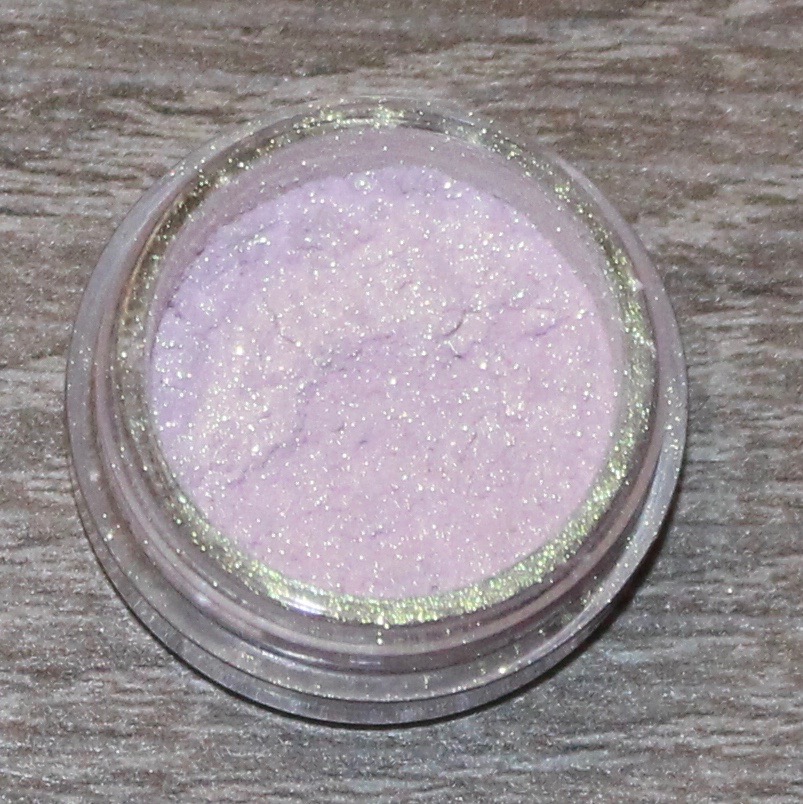
Look 2: Femme Fatale Watery Grave


Watery Grave (over Pixie Epoxy) on the lid and Costal Scents Fine Wine blended into the crease. 

Look 3: Urban Decay Electric Palette, Colourpop Cannonball, and Kat Von D Pastel Goth


UD Savage on the lid, Colourpop Cannonball blended into the crease, and Kat Von D Star blended over Cannonball. Star, Cannonball, and Savage on the lower lash line. 

Look 4: Colourpop High Strung and The News


(High Strung: Row 3, Column 2; The News: Row 1, Column 4) 


High Strung on the lid and The News blended into the crease. 

Look 5: Ardency Inn Royal and Melt Love Sick


Royal on the lid and Love Sick blended into the crease. 

Look 6: Stila Magnificent Metals Glitter and Glow: Next to Notte


Next to Notte on the lid and Zoeva Substitute for Love, Costal Scents Oktoberfest, and Lime Cime Muse blended into the crease. 

Look 1: Urban Decay Jean-Michel Basquiat Palette

*Upfront, I want to address that there is controversy surrounding this palette and collection from Urban Decay. One controversy is the question of if Basquiat would have been supportive of this kind of a collection. I don't really like it when people speak for someone else, so I am choosing to not offer an opinion of if Basquiat would have approved. I will say, however, as someone who worked in fine art at a major museum, that using artwork for profit feels in line with what a lot of art is. The second controversy, in my opinion, is quite significant. And that is that Urban Decay chose to have Ruby Rose model for the collection instead of a black model. This, I feel, was incredibly tone-deaf on Urban Decay's part. I know this decision disappointed a lot of people, myself included. Separately, I want to add that this palette was given to me as a gift. 

Status: Keep

With all of that said, I did enjoy using this palette, but I have not used it outside of this look. The teal color, Boom, is absolutely gorgeous, and I loved it paired with the navy and lime green. I am not the biggest fan of the quality of Urban Decay palettes, but find I do really enjoy their colorful shadows. I'm interested to see how the rest of the palette performs.

Look 2: Femme Fatale Watery Grave
Status: Keep 

I really enjoyed this shadow, and it reminds me a lot of Fyrinnae Illusionary, but a touch darker. I paired this with Fine Wine from Costal Scents and really enjoyed how it looked. I feel like cooler tones (maybe?) might be the next trend with everyone a little burnt out on all the warm-toned palette releases, and I think purples like this with depth are unique cool tones.

Look 3: Urban Decay Electric Palette, Colourpop Cannonball, and Kat Von D Pastel Goth
Status: Love

This look was entirely inspired by this look from KathleenLights. I'm not a person who watches many tutorials, but I thought this look was just so gorgeous. I wore it on the Fourth of July and I loved it. This was also the first time that I've used Star from the Pastel Goth palette, and I was really pleased with how bright and pigmented it is. (One of my major complains about that palette is that the shadows can be very pale.) Wearing this look reminded me of how much I love color and how much I wish it could be considered work-appropriate. (On a separate note, why the hell is makeup work-approbate or not? I can understand wearing clothing that is not revealing and having some level of decorum, but if I want to wear hot pink eyeshadow, I feel like I should be able to.)

Look 4: Colourpop High Strung and The News
Status: Keep

I really enjoyed this look as a normal, "work-appropriate" look. It's funny. Last year, this would have been a more "out there" look for me, but ever since I discovered color (thanks to my one week, one palette project), these looks are pretty tame for me. Nonetheless, both of these Colourpop shadows were really pretty, blended well, and I enjoyed using them.

Look 5: Ardency Inn Royal and Melt Love Sick
Status: Favorite

Oh, man. I loved this look. Maybe it's obvious to other people, but purple and red is not a color combination that immediately comes to mind for me. The only reason I discovered it in the first place is because of the Melt Love Sick Stack, and during my one week, one palette project, I paired the purple shade from that stack (Promiscuous) with the deep red Love Sick shade. This was my first time wearing Royal, and I have to say that I absolutely love all of my Ardency Inn shadows. I don't know why more people aren't talking about them. Love Sick blended seamlessly into Royal, and I just thought this look was so cool and pretty.

Look 6: Stila Magnificent Metals Glitter and Glow: Next to Notte
Status: Love

My love affair with the Stila Magnificent Metals continues. A glittery red shadow isn't one that I ever thought I would love, but here we are. I've read some reviews of this that say the color is actually purple, but that kind of perplexes me because mine is very red. I paired it with some of my warmer shadows and thought the look came out really pretty. I asked someone today (when I wore this look) if my makeup was "too much," and they said, "Surprisingly, no." That's something that's nice about Next to Notte. I think it packs the same amount of glitter and shine as the other Magnificent Metals, but because the color is so deep and opaque, it doesn't scream, "RED GLITTER!" in your face. Not that I would be opposed to that.

Sunday, May 7, 2017

April Favorites


April was a really fun month for makeup. I started an indie shadow project where the majority of my eye looks were all indie shadows; I discovered some new favorites, and I got a lot of good use out of my products. 

Melt Rust Stack:


When I used the Melt Lovesick Stack in my one week, one palette series, I concluded that Melt Stacks were fine, but not really worth the money. When the Rust Stack came back into stock (it was out of stock for a very long time), I very hesitantly purchased it. I didn't think it was a reckless purchase, but I am surprised that I pulled the trigger. And I am so glad that I did because this is my favorite neutral companion palette in my collection. In fact, this palette might make me able to declutter my Kat Von D Shade and Light Eye palette. And I say that because the shadows in the warm quad in the KVD palette are ones I use the most. Since getting Rust, I have used Shade and Light a couple of times, and it was to use the cooler quads. This is the absolute perfect collection of warm neutral shadows for me, and I found myself reaching for it consistently all month. I highly doubt I will be tempted by another set of warm matte shadows because this is very honestly perfect for me and my skin tone. Added to that, the quality of these shadows are incredible, and much nicer than Lovesick. 

Bobbi Brown Camel:


This is probably my favorite brown shadow in my collection and that I have ever used. It looks really similar in the pan to Rubbish from the Melt Rust Stack, but Camel is more of a mustard, which I love. This really is a unique shade to my collection, and it is an incredibly versatile shade. I wish it would not have taken me so long to pull the trigger on it, but this is also one of those makeup discoveries that only comes after you really know yourself and your makeup preferences. I realized that there was a color "lacking" from my collection, and I knew exactly what it looked liked. When I was younger and didn't know much about my makeup preferences, I wouldn't have realized this was a shadow I really wanted and "needed."

Chanel Soleil Tan De Chanel:


This is a product that I have heard about for years but only recently purchased. I was never much of a bronzer person until about a year and a half ago, so this product was never something I was interested in. The reason I started loving bronzer was because I applied it in the winter. I am from the Southwest originally, and my skin always had a natural bronze to it because of all the sun exposure, and when I moved to NYC, between winter and the buildings just blocking any sun at all, I completely lost that bronze. I tried bronzer that winter and was amazed that it made my skin look like it used to. I have Seasonal Affective Disorder, so I get really sad during the winter, and using bronzer in a way tricked my brain into thinking it was warmer. And ever since then, I have worn it. 

I bought this specific bronzer because my skin was looking really powdery for a period of time, and I thought it might have been my bronzer. I knew this was a warm-toned bronzer, so I thought I would try it. And, man, I love it. This is a great shade for my skin tone, but I think it is really crappy that Chanel does not offer this in other tones. I later realized that it was the power I was using to set my foundation that made my skin look so caky, and layering a light bronzer on top of this gives my skin a really healthy glow. 

Physicians Formula Butter Bronzer in Light Bronzer:


As a bronzer for the majority of the year for me, this product sucks. It is so light that it is barely a face powder for me. And I have a light to medium skin tone. This is also the warmer-toned Butter Bronzer, so the slightly darker shade, Bronzer, would be too cool on my skin tone. I bought this when I was in vacation in California last summer (because of the hype and because of the smell), and when I realized that it did not show up on my skin, I put it in the declutter pile. When the winter rolled around and my normal bronzers were getting a little dark for me, I decided to pull this out. It was still too light for me, but it provided a tiny hint of color. I started using it more and more, and when I saw Jacquelyn Lovene start her "Build Pan Not Walls" project and saw that she included her PF Butter Bronzer, I decided to join that project as well and include this product. I've used this bronzer every day for a few months now, and as you can see, I've hit the pan in two places. As the weather is (finally) starting to warm up, this bronzer really won't cut for me anymore, buy layered over Chanel Soleil Tan De Chanel, it is really beautiful. 

Indie Shadows

Fyrinne Illusionary:


Femme Fatale Candied Apple:


Notoriously Morbid Philosophoscope:


It should really come as no surprise, especially after completing indie month, that indie shadows would be in my favorites this month. There were some ups and down with the project, and I learned that not all shadows are created equal, but for the most part, the project was a success for me and has really taught me the value of single shadows and unique shadows. I've included my three favorites above, but since I talked about each of them in their own posts, I feel I would only be repetitive here. Suffice to say they are all incredibly beautiful and unique and are three of my favorite shadows that I own.

Saturday, April 29, 2017

This Week's Looks: Femme Fatale, Notoriously Morbid, Hello Waffle, and Shiro Cosmetics


This was the last full week of indie month. I have not grown fatigued at all with using indie shadows, and in fact, this is the most fun I have had with makeup in a long time. For one, single shadows are totally my preference (a fact I did not know about myself until I started my one week, one palette project), and two, the colors are so unique and special. 

With every new release that has come out, I find myself thinking that all of those shadows don't hold a candle to my collection of single shadows, especially indie shadows. And for this revelation, I am grateful. I love feeling in control when a new palette releases and thinking that most of everything is an easy pass. 

And that's really interesting for me because when I watch a lot of people's makeup collection videos or declutter videos, I've noticed that most people don't have a ton of single shadows. Or they say how they never use their singles because palettes are just so much better. And I wonder if that phenomenon happens because most people genuinely feel that way or if it's because we continue to hear people hype palettes. When's the last time you heard about a collection of single shadows be hyped? And not in the sense that you can buy a ton of them and pop them into a custom palette. So, this excludes MAC, Makeup Geek, Make Up For Ever, Colourpop pressed shadows, etc. When's the last time people seriously hyped a single shadow that came in it's own distinct packaging? 

Or is the reason that singles are not hyped because we all have become so conscientious of saving space and putting everything into palettes because we have all accumulated so much?

Whatever it is, I'm happy I found singles again and am even happier I have a beautiful collection of unique indie shadows. 

Here are five looks I did this week. 

Look 1: Femme Fatale Faerie Fire and Shiro Cosmetics There's No Such Thing As Magic


Faerie Fire on the lid (over Pixie Epoxy) and There's No Such Thing As Magic blended into the crease.

Look 2: Shiro Cosmetics He Loves His Hammer


He Loves His Hammer on the lid (over Pixie Epoxy) and Kat Von D Shade and Light Quad in Plum blended into the crease. 

Look 3: Hello Waffle Furry Godmewther and Shiro Cosmetics Little Bird


Furry Godmother on the lid (over Pixie Epoxy) and Little Bird blended into the crease. 

Look 4: Femme Fatale Candied Apple


Candied Apple on the lid (over Pixie Epoxy) and Melt Rust Stack blended into the crease. 

Look 5: Notoriously Morbid Fight for Beauty


Fight for Beauty on the lid (over Pixie Epoxy) and Kat Von D Meow blended into the crease. 


Femme Fatale Faerie Fire
Status: Keep

I enjoyed this shadow, I just think that I am a bit over the duochromes that mainly look white or gold on the lid. I do like those shadows, but I have used a lot of them in this indie month challenge, and they are not always all that flattering on me. With this color, it looks so pink in the pot, but when applied to my eyes, it was lime green. It was a really cool color, and I'm glad that the camera picked up the duochrome of it. I think for work, it wasn't my favorite color, but it is certainly a color that I will wear again and enjoy. 

Shiro Cosmetics There's No Such Thing As Magic
Status: Love

I paired Faerie Fire with this shadow, and I really loved it. This was a lovely pink satin color that looked more matte than satin. I don't have a ton to say about nice mattes other than they are nice and I enjoy using them. And that's how I feel about this shadow. I don't think this is a "must have" if you have other mattes in your collection that you enjoy, but it is certainly a nice shadow. 

Shiro Cosmetics He Loves His Hammer
Status: Love

This color really took me by surprise. I have mentioned a lot during indie month that many of the colors in the pot have surprised me when applied to the lid, but it is usually in a slightly negative way. The opposite was true for this color. I actually avoided using this color for a long while because it looked so gray and dark in the pot. I just wasn't excited to use it. I finally forced myself to use it this week, and holy cow, was I surprised. It is a gorgeous taupe purple color, and may be one of my favorite taupes in my entire collection. 

Hello Waffle Furry Godmewther
Status: Love

I just love this color. This is definitely one of the best performing shadows from Hello Waffle that I've tried. It is a bit cool-toned for me, but I still love it. I think it gives that perfect soft, pretty color. I paired it with a pink in my crease, and I thought the look was really pretty. I would love to try this color with some of the shades in my Kat Von D Shade and Light Eye Quad in Plum as well as some of the purple shadows from the Viseart Dark Matte palette. And I really appreciate that this shadow is one that can be versatile in that way while still being very unique. 

Shiro Cosmetics Little Bird
Status: Love

I liked this color a little more than There's No Such Thing As Magic, but I think both are really great. This was a shadow that was highly recommended, and I can see why. I have a few matte pinks in my collection, but they payoff is not as good as from this shadow. I thought it paired so beautifully with the shadow from Hello Waffle, and I imagine since it is a satin finish, that it would also be very lovely all over the lid. 

Femme Fatale Candied Apple
Status: Favorite

This was the biggest surprise of not only this week, but probably all of indie month for me. When I was researching which colors I wanted to buy in exploring these different indie brands, I kept hearing about this shadow from Femme Fatale. And I actually ordered it in a large size (most of the shadows I've purchased have been mini sizes) because of all the glowing recommendations. When it arrived and I swatched it on my hand, I was so, so disappointed. It looked just like any green-brown duochrome shadow, like MAC Club or the shadow from Wet N Wild Comfort Zone. And as I've mentioned before, I am actually not a huge fan of that kind of shadow. I think it looks interesting when swatched, but I just don't like how it looks on my warm olive skin. I was so sure that I was going to declutter this shadow, and it was also one that I put off wearing. I finally decided that I had to wear it in the last week and that I could just live with wearing a shadow that I didn't really like for one day.

But, oh my gosh, I was so wrong. I love this shadow. I think what's so special about it is that it is really soft, bight, and shiny. I don't know how else to describe it. The "brown" undertone in it is essentially not brown at all, and is more pink. And I guess that's what I didn't see when I swatched it for the first time. This shadow reminds me a lot of the concept of Femme Fatale Faerie Fire, but is much more successful (in my opinion) in application. I love this shadow and I could not be happier that I have it in my collection.

Notoriously Morbid Fight for Beauty
Status: Enjoy

This shadow was the one I was most looking forward to using this week. When I swatched it on my hand, I couldn't believe how stunning it was. It was a perfect light blue and pink duochrome that didn't seem to sacrifice on either color the way I feel a lot of duochomes do (like Faerie Fire). However, when I applied it onto my lid over Pixie Epoxy, It came of very heavily blue, but the concentration of color was also quite patchy, if that makes sense. It wasn't a smooth duochrome. Some areas looked blue and others looked pink instead of the color shifting. I don't know it that was due to user error, and maybe this is a shadow that doesn't work with Pixie Epoxy. I'm not sure. I liked it enough that I am happy to keep it in my collection, but I didn't fall as hard for it as I was expecting, and that is always a little disappointing.