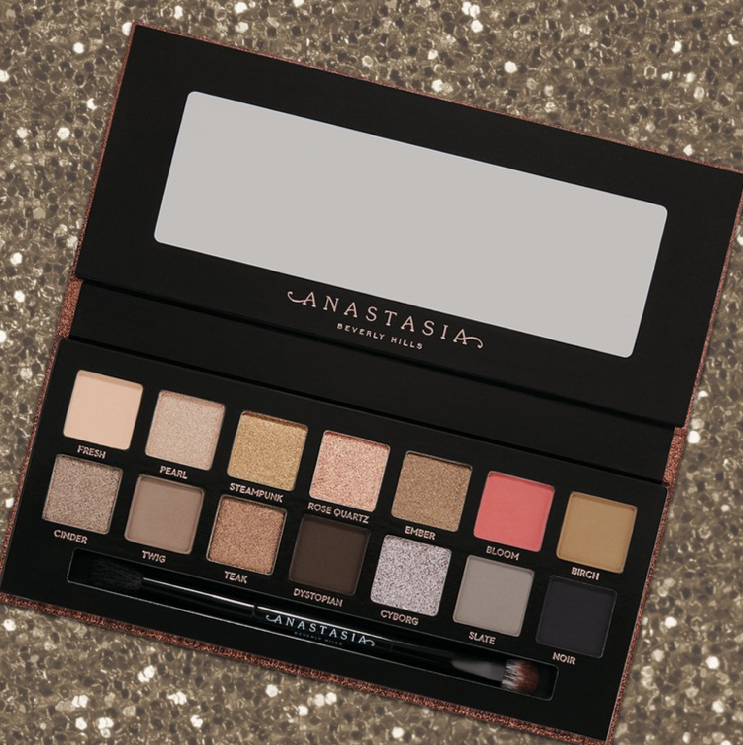
A few days ago, I asked on Instagram stories for readers to choose my next anti-haul post. While ABH Sultry had the most votes (you can see that anti-haul here), the Huda Beauty Obsessions Precious Stones collection came in close second.
Huda Beauty has expanded their Obsessions line of mini 9-pan palettes with a precious stones collection: Topaz, Sapphire, Emerald, Amethyst, and Ruby.
And I won't be buying.
Well, I mostly won't be buying. I did buy one of these palettes—Emerald—but we'll get to that in a bit.
Unlike the other Huda Beauty Obsessions palettes, these follow a gem/precious stones theme. This is showcased on the packaging, which has a diamond made up of each shade in each palette:

In my opinion, the least interesting of Huda Beauty's new Obsessions palettes is Topaz:


This palette looks slightly more interesting than most neutral palettes, and I appreciate that it is more inclusive than palettes like the Tartelette Toasted:

But it is ultimately still just a normal neutral palette, like Juvia's Place Warrior:

Colourpop I Think I Love You:

And Jaclyn Hill x Morphe Armed & Gorgeous:

I also think that Ruby is kind of uninteresting:


Like Topaz, while I find the Ruby color scheme generally better than other red-toned palettes, it is still one that is just too played out at this point.
There's Jeffree Star Blood Sugar:

Lime Crime Venus:

ABH Modern Renaissance:

Huda Beauty's own Rose Gold palette:

As well as the Mauve Obsessions:

Lime Crime Venus XL:

Viseart Nuance:

And Viseart Siren:

Among many, many others.
Chances are, if you're interested in Ruby, you likely already have most, if not all, of these shades already. Ruby is just more red-heavy and doesn't have "filler" neutral shades, so it gives the appearance of being slightly more unique. But so many color schemes over the past few years have centered on red shades, and the market is now just as saturated with them as gold and brown palettes.
To me, Amethyst is a little more interesting:


Amethyst is the most purple of all the "purple" palettes I've seen recently, which typically tend to be neutral palettes with a few pops of purple colors. But there are still many palettes that follow this color scheme.
There's Lime Crime Venus II:

Viseart Amethyst (I mean, it even has the same name):

Natasha Denona Lila:

And Jaclyn Hill x Morphe Bling Boss:

Sapphire and Emerald, I think, are when the color schemes become much more unique.
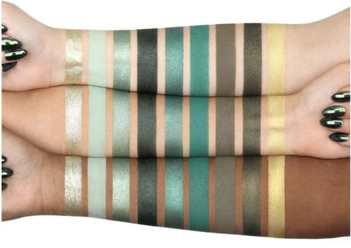
Sapphire, as the name would suggest, follows a blue color scheme, though it does have random yellow and silver shades, which I think were included to give the palette some variety and depth.


When I first saw Sapphire, I immediately thought of Tarte's fake palette, Icy Betch:

If you're unfamiliar, Icy Betch is something that Tarte put together in Photoshop as an April Fool's joke. Why they thought this was funny or a good joke is unclear, but it completely backfired on them when people thought it was a real palette and loved it. Tarte is known as a brand that caters solely to light skin tones and puts out the same palette multiple times a year, so for them to put out a colorful palette full of blue, green, and teal shades that is slightly inclusive was really exciting for people. But then Tarte had to tell people that this palette was fake and that it was all a bad April Fool's joke (that doesn't even make sense). It was very curious to see a brand clearly have zero concept of what consumers actually wanted.
So other brands, Huda Beauty included, have come out with similar blue-toned palettes that are more inclusive. Most of the other brands that replicated Icy Betch are indie and I'm not too familiar with them, so I tired to think of more "mainstream" brands that have blue palettes. And I honestly couldn't think of many.
There's NYX Water:

And NYX Wind:

As well as the very old Wet N Wild Blue Had Me At Hello:

But I couldn't think of many others.
The main the reason I chose not to buy Sapphire, however, is that I actually have quite a few blue eyeshadows, which you can see in an older version of one of my custom palettes:

I also don't wear blue eyeshadow very often, so it didn't make sense to me to have an entire blue-themed palette. I like wearing blue shadow, but I already have more than enough blue shades to satisfy any want I have for a blue look.
And, finally, we have Emerald:

As I mentioned at the top of this post, this was the one palette from this collection that I bought. This is a color scheme that I personally haven't seen before, which felt like an impossible feat. I like that this palette encompasses sea green, royal green, and olive green, and I feel like there are a lot of color combinations that can come from such a monochromatic color scheme. Green is also a color that I really enjoy and wear often, and these are green tones that I didn't already have.
The only palette that I could think of with a somewhat similar color scheme is Viseart Absinthe:

In terms of my experience with Emerald, I have used it twice and used all shades. Here is my palette:

And here are two looks that I've done.
Look 1:


Inner and outer lid: 3
Center of lid: 1 (applied wet)
Transition: 2
Crease: 6
Inner corner: 9
Lower lash line: 5
I have some complicated feelings about this look. To be blunt, I kind of hated it, but that was solely because of the crease. The mint and royal green shades just completely clashed with my skin tone. And that's interesting to be because I have a shimmer mint from City Color Cosmetics (called Hint of Mint), and it is one of my favorite shadows.
While I'm not really scared of color or being "too loud," this look was actually too loud for me. I think I would have loved the colors on my lid, inner corner, and lower lash line with a different shadow in the crease, and I honestly don't know of a look where I could incorporate the matte mint and royal green shades in a way that I would like. I personally don't like to wear matte shadows on the lid all that often, and they really didn't flatter me in the crease. I could try the royal green shade on the lower lash line, but I'm not confident that will turn out great. The mint shade also took a while to build up, so I don't think that would be a good lower lash line color either.
Shade 1 was the color I was most excited for, and I was disappointed to learn that it's a chunky glitter shade. I did not use a glitter glue primer with this look, and I had to wet that shade for it to have any kind of opacity. I enjoyed the other shades in the look.
Look 2:


Lid: 9
Crease: 7
Outer corner: 8
Lower lash line: 4
This was a much simpler look than the first one I did, and I have to say that I think it looks a lot better in person than it does in pictures. Of the two looks, I much prefer this one, but it's also one that I could have created (mostly) with shadows already in my collection. I have a matte olive shade in my Viseart Dark Matte palette, and I have plenty of gold shadows. I really enjoy the shimmery dark olive that I put on the outer corner of my lid, though it doesn't appear in photos well.
Overall, since I have only used this palette twice, I don't have a very firm opinion on it, but I am happy that I now have most of these shades. I'm still unsure what to do about the shades that didn't flatter my skin tone, but I'm willing to use them again and see if I can't figure something else out. It might just be a matter of grounding the look with a brown in the transition area.
Emerald was the most unique palette to me out of the Precious Stones collection, but if you're only semi-interested in green shades, I think this palette can be a pass and you can instead buy some singles.
To round out this post, I wanted to talk about some palettes that incorporate many of these color schemes and put them together in one place.
Immediately, a palette that came to mind is The Emily Edit: The Wants. However, if you've read my review of that palette, you know that I don't recommend it because the quality is very poor. Because I loved the color scheme, I duped the palette with shades in my collection, and I think this palette is almost like a highlight reel of the Huda Obsessions Precious Stones collection, minus Sapphire.

This palette has browns (Topaz), reds (Ruby), purples (Amethyst), and greens (Emerald—though the tones are completely different).
Viseart Dark Matte also has similar colors to all the Precious Stones palettes:

As well as BH Cosmetics Weekend Festival:

And Urban Decay Born to Run:

To end this post I will say that I now own two Huda Obsessions palettes: Emerald and Coral (which is not part of the Precious Stones collection). I think Coral has a better formula, and while I wouldn't say that the formula is bad, I have worked with better ones that are easier to blend. Unless you've been absolutely craving an entire 9-pan palette of different tones of one specific color, I would say it's safe to pass on this entire collection. Instead, buy a few single shadows that you like and use them to complement what you already own.
I would also like to add that if you don't see yourself wearing orange, red, purple, blue, or green looks often, then this collection is also an easy pass. Each of these palettes cost $27 before tax and shipping, and while that is less expensive than other mid-range products, it is still a lot of money to spend on shadows that you feel you will only occasionally wear.
Added to that, as much as these palettes seem like they are unique, there are still so many palettes that are comparable. And chances are, as with all of the new makeup that is being launched, you likely have something similar enough that you don't really need to add to your collection.
I certainly have more than enough brown/orange, red, purple, and blue shades, and I don't need to add individual palettes in all of those colors to my collection. In terms of Emerald, I'm mostly happy with the palette and the purchase, though this might end up being more of a companion palette for me than something standalone. With that said, I also won't be surprised if this is a palette that ends up returned or decluttered. The quality is not quite what I hoped and expected it to be, and if I find that it's not quite working for me, I won't hesitate to get rid of it.
***
For notifications on my latest posts and to vote on future posts, follow me on Instagram: @antihaulblog