Showing posts with label antihaul. Show all posts

Saturday, December 15, 2018

What I'm Not Buying: Jeffree Star Alien Palette


I conducted a poll on Instagram (a while ago at this point) to see what people wanted to see in my next anti-haul post. Readers selected the latest Jeffree Star palette, called Alien. 

And I won't be buying. 

As I've said before, I have talked about Jeffree's problematic behavior in other posts, so I'm not going to discuss that here. I will say that since I've written my other Jeffree Star posts, his series on Shane Dawson's YT channel came out (and let's call that was it is—a positive PR campaign), which changed a lot of people's opinion on him. I honestly think that all people who have associated with Jeffree are unreliable and manipulative, and I'm just tired of it all, so I have actively stopped reading about any drama surrounding all of these people. I would rather try to buy from brands with way less drama, but that is becoming an increasingly difficult task. 

Let's talk about this palette. 


Obviously everyone has different preferences, but a close friend of mine saw my poll on Instagram, and to this palette, she said, "Those colors are hideous." It made me laugh out loud, and she hit on something so obvious that I just couldn't articulate for myself. I agree. I think this is an ugly color story. And I typically love color schemes with mustard and green shades. But not this one. 

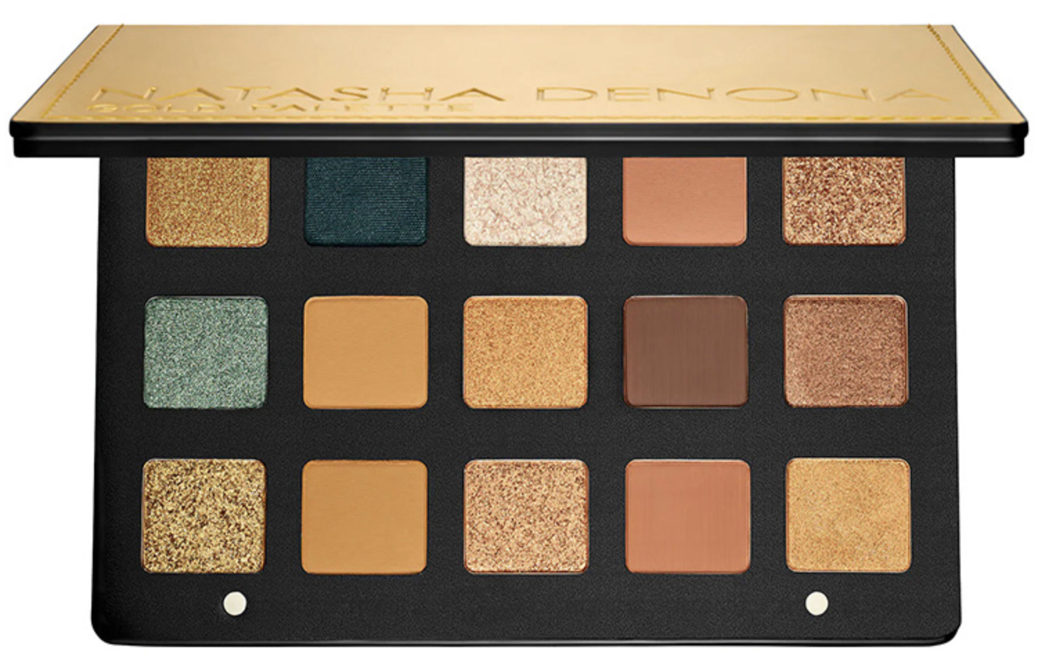
For example, I love Viseart Dark Matte:


I was gifted ABH Subculture, and have come to really like it:


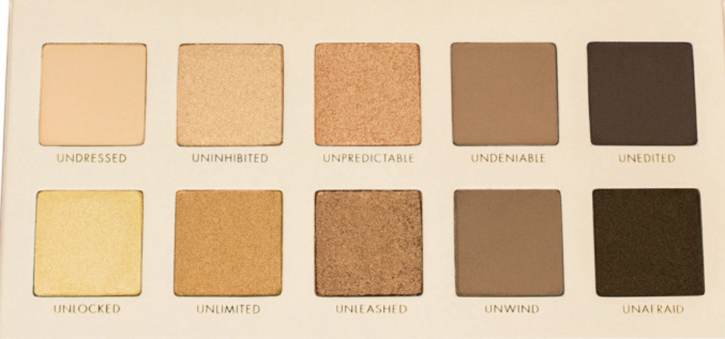
And I recently purchased NYX Grind, which is also a palette that I love:


For me personally and my tastes, these are three palettes with this kind of color scheme that I like and think work. 

And Alien feels like a dull, unsuccessful, and clashing version of it. 

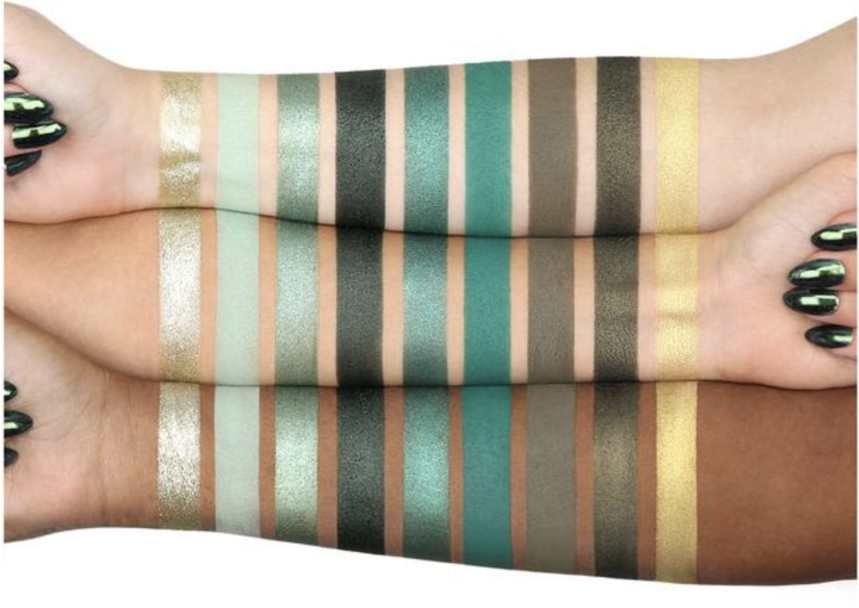
I thought about trying to dupe the palette, but I couldn't with the singles I have in my collection. For some of the shades, like the green ones, while I don't have them a singles, they are all in the Huda Emerald Obsessions palette:


Another reason why I can't fully dupe this palette is because these are not colors that I like. I haven't purchased them—because I don't like them. And I still don't like them, even when they are in a palette. 

This is something that I used to talk about a lot on my blog, and I feel like it's worth mentioning again. Earlier, in my makeup obsession days, I would look at shadows and swatches in the new "it" palette of the moment. And I would give each shadow a "yes" or "no" answer when asked the question: "Would I wear that?" If the palette had mainly "yes" answers, I would buy it. 

Now, when I look at a new palette, I still look at shadows and swatches, but this time, I ask: "Do I have this color already?" 

See, with my old method, if a palette had a matte cream or matte light warm brown, it would make me more likely to buy it because it had two shades in it that I knew I would wear. I wouldn't factor in that I owned at least five of these exact shadows already. But now, if a palette has those shades, I'm less likely to buy it because I have so many of those colors already that those are essentially wasted shadows. 

When considering a palette purchase, I also ask: "Would I buy this color as a single?"

This is a big one for me because if a palette has a significant number of shadows that I would not purchase as singes—either because the color is not my favorite, I already own one like that, or it just is not special enough—then I absolutely shouldn't buy those shadows in a palette. Just because shades that you don't like are grouped together with a few shades that you do like or already own doesn't mean you're going to like those same shades any more. You're won't. Because you don't like them. 

If you find yourself still wanting to buy a palette even after deciding that you wouldn't spend the money to buy the colors as singles, you have to ask yourself: "Why do I want this palette?" And if the answer is because I'm bored or I saw it on YouTube and want to be included or I look up to the brand owner and want to support them or I'm unhappy and this will make me happy—you may want to reconsider the purchase. 

In Alien, the only shades I would buy as singles are the matte mustard yellow and purple. Otherwise, I already have those shadows or I don't like the colors. 

But, assuming I did like the general color scheme of this palette, I still don't think it's worth the $52 (plus tax and shipping) price tag. The palette has 18 shadows, but several of the shadows will look the same when applied to the eye—like the three gray/black shadows; the white, cream, and pink; and the three shimmy golds. On darker skin tones, the differences between a lot of these colors will be subtle or too light altogether. 

Another big negative, at least to me, is the packaging: 


Personally, I don't like bulky packaging. I don't like cumbersome shadow layouts that don't serve the consumer and only serve the packaging. The shape of this palette is awkward, and depending on how you store your palettes, this will be awkward to store. It also bothers me that the layout has three rows of four shadows and then it tapers down. It doesn't feel like a natural tapering, and I just don't like the way that it looks. 

I also dislike the packaging because I honestly feel like this is the laziest and least creative way to approach an alien design. The only thing that sets it apart from every other basic alien design is that it's pink, but even then, the colors on the inside match that same basic design. There are endless ways to imagine an alien, and when it's your inspiration for a makeup product, at least put a little effort into making it look intriguing. But this is just the basic shape with the basic bug eyes. It's not cool, it's not inspired, and it's not interesting. 

I also think that the packaging is very impractical for everyday use, which suggests to me that this palette isn't meant for that. It feels much more like a "Jeffree Star fan collectible" than a functional makeup item. And I say that, especially, because this palette looks a lot like another Jeffree Star palette, Androgyny:


Like Alien, Androgyny has:
  • A shimmery yellow gold
  • A matte gray
  • A matte mustard
  • A shimmery bronze
  • A yellow-green
So, if you're a diehard Jeffree Star fan—which, let's face it, that's clearly the target demographic here—you already have five shades in Alien that you have in Androgyny. 

I did not purchase Androgyny for many reasons, one of which is that I already owned Viseart Dark Matte, which is one of my favorite palettes. But, when compared to Alien, I much prefer the color scheme of Androgyny. I feel like it is more diverse, and even though there are less colors, it feels like Androgyny offers the potential for more looks than Alien. 

Something positive I can say about Alien is that it has a color scheme that I haven't seen a dozen times over, and it leans cooler instead of warm, which, again, is slightly different.

With that said, when you factor in tax and shipping, Alien costs upwards of $60 domestic, and I just feel that is too much to spend on a gimmick. And the reason I call it a gimmick is 100% because of the packaging. 

I've said this before, but the current trend in makeup seems to be "disposable" makeup that is on trend or has some other gimmick that will make people buy until they get bored with it and buy something new. Alien seems to fit right into this disposable trend. Green and yellow–based palettes are "in" right now, so what sets this palette apart from the others is that it's shaped like an alien head. It's a novelty item. 

And when you look at a brand like Colourpop, which sells "disposable" makeup at lower prices, it makes the $60 cardboard alien head feel like a ripoff. This palette was not meant to be a longtime staple in anyone's collection, but it is priced like one. A lot of that cost goes toward the packaging, which makes the boring design that much more disappointing. 

I don't think this is going to be a palette that people will talk about for very long, and maybe people have already stopped talking about it by now. It isn't meant for longevity—it's meant for diehard fans to collect. 

Personally, there just isn't anything that appeals to me about this palette, from theme to design to color selection. I don't want to pay mid-range prices that swing toward high-end for a palette that I can't even swatch in stores with tacky packaging. I think an alien theme could have been really cool, but this is about the laziest way it could have been approached. I don't like this palette and am frankly tired of internet brands, so I won't be buying. 

Tuesday, November 13, 2018

What I'm Not Buying: Morphe X James Charles


Morphe "I can't sell anything without influencers shilling it" Cosmetics has teamed up with influencer James Charles, who is utterly adored by 12-year-olds. And they have created a palette that they are marketing to children. 

And I obviously won't be buying. 

To start this post, I want to say that I am very much not in James Charles's target demographic. So, absolutely nothing about him appeals to me. While I'm sure people of all ages watch his content, his main demographic is very young girls who don't find it mind-numbing, immature, and painfully gimmicky that he calls quite literally everything "sister." But, I've been 12 before, and I remember desperately wanting to be like Mary Kate and Ashley Olsen, so I'm not trying to make fun of his young audience who are literally children acting like children.  

But I do find most makeup marketing to be incredibly manipulative, and influencer marketing—especially to young children—is downright predatory. 

At 19 years old, James Charles himself is barely not a legal child. He rose to popularity by Photoshopping an outtake from his high school yearbook photos, and became extremely popular when he was dubbed the first male Covergirl. 

And this is a tangent that I absolutely need to explore. The VAST majority of makeup and beauty CEOs are men. In a market that is largely dominated by women consumers, there are very little women in power. When James Charles became the first male Covergirl, I was not excited. Yes, men wear makeup. And yes, a significant percentage of the men who wear makeup face an incredible amount of hatred and bigotry for doing so. And yes, we can all agree that men look fantastic in eyeliner. However, makeup companies market toward women. Women are the majority of consumers. And yet, in makeup, the few men who are involved rise to success at a much more rapid rate than women. 

So, no. I don't think that a teenage boy who was trying to get famous was a great choice for "Covergirl" over other women who had been working for a significantly larger period of time. 

I also don't care for James Charles because of the way he treated Marlena Stell, founder and CEO of Makeup Geek. Marlena made a comment about working with Netflix, and James made a really dumb and immature response:


Recently, Marlena exposed that some influencers charge upwards of $60,000 to feature a product in their video, and for some reason it surprised a lot of people to learn that influencers are only in this for the money and are incredibly manipulative. 

With that said, Makeup Geek has been failing for a few years at this point, largely due to unsuccessful, unoriginal, and inconsistent releases. Marlena has openly discussed her many personal issues, and it seems obvious that all of those issues negatively impacted her business. Makeup Geek was founded on duping/copying MAC shadows and selling them at a fraction of the cost, but whenever Makeup Geek has had to come up with original makeup, they've failed. 

But, James is an immature kid, and Marlena did build a once-successful international brand. Saying she "knows nothing about the industry" is delusional and really speaks to his young age, lack of tact, and lack of experience. 

And if you need any more proof that he is an attention seeker who just wanted to be famous:


So that's why I don't like James Charles. And if you've been reading my blog for a while now, you'll know that I also don't like Morphe and think they are one of the worst offenders in manipulating consumers. 

Let's look at the palette:


There's a lot going on here. This is a 39-pan eyeshadow palette, and it has a lot of colors. There are greens, yellows, blues, purples, mauves, golds, pinks, and browns. Personally, this palette just doesn't excite me. It looks like the colors have been somewhat divided into quads, which helps the color scheme from feeling too overwhelming, but it's just not one that speaks to me. 

I don't like the layout of this palette, and I really don't like when a brand makes different sized eyeshadow pans because they are essentially telling the consumer what shades they will use the most. I think if you're a young person who doesn't own much makeup, a color scheme like this can be really good. There are a lot of options, and there is a lot of opportunity to explore and be creative. Given his exact audience, I think this is a good color scheme. 

But given that it's Morphe and the quality is very likely not good, this palette should be more in the range of $15, not $40. Because for $40, you can get a mid-range palette of actually good quality. For $20, you can buy the BH Cosmetics Zodiac palette, which is of fantastic quality. Spending that much money on a mediocre palette is so unnecessary, especially when the people buying it are children who have little to no money. 

This palette looks like the Sephora Pro Editorial:


Juvia's Place Masquerade:


Too Faced Chocolate Gold:


Urban Decay Born to Run:


And for the young people Morphe fans, it has a lot of similarities with the Jaclyn Hill palette:


And the 39A:


Honestly though, writing this post feels a bit like a fruitless endeavor. Because the main people who will buy this palette are the James Charles fans who will buy anything that he attaches his name to. 

Hell, the palette hasn't even launched, and it already has a 5-star rating at Ulta:


Not surprisingly, the "reviews" are all from James Charles fans who are likely incredibly young:


And, as I've said before, there is not much that can stop a preteen fandom. 

But, this is a very expensive palette of mediocre quality. There are better palettes with these same shades. No, that palette won't have James Charles's name on it, and if that's the one thing that matters most to you, there's not much else I can say. 

For everyone else, if you are susceptible to hype, I'll warn you now that you will likely see a lot of influencers using and shilling this palette in the coming weeks. And that is only because people want to stay on people's "good side," and there is a lot of stroking egos that happens. But that doesn't mean you also need to have this palette. You already have colors that look like this, and if you don't, that's because you haven't wanted to buy them. So, don't make hype the reason you do now. And if you truly do want to try these colors, buy them in a palette with better quality. You'll still be spending the same amount of money, but you'll be getting more for it. 

But, on a different note, as a consumer and member of the beauty community, I am just really sick of all of this. I'm sick of Morphe palettes that are low quality and overpriced. I'm sick of all influencers. I don't want to see another influencer collaboration or influencer brand. I'm tired of lackluster makeup releases that are lazy because companies know that people will just buy them because of social media culture. 

I'm also tired of the makeup industry leaning younger and younger. Every person ages. And there are some industries, like the toy industry, that have to stay within their targeted age group. But the makeup industry has long been associated with adult women. And that's because there's a lot of cultural and misogynistic roots in the cosmetics industry. 

Wearing makeup—for a lot of women—has long been about needing to look attractive to men at home, in the workplace, and in the world at large. Some women believe they are ugly without makeup. Some women say they won't even leave the house without—at the very least—foundation and mascara. Some women won't wash the makeup off their face before they go to bed because they don't want their husbands to see them without makeup. 

There is a certain expectation that women will wear makeup and that women need to wear makeup. And if they don't, they are either deemed ugly, plain, a "tomboy," or a weaponized version of "feminist." 

This is something that I personally struggle with. I love doing my makeup, and it feels creative and fun for me. But sometimes, when I really think about it, I ask, "Why am I painting my face?" If the answer is "I want to look more attractive," that's not something that I am comfortable with for myself. But, my answer is usually, "Because it's fun and I like playing with colors."

Given how layered the relationship between women and makeup is, it is especially disappointing that most brands are owned by men, that men in makeup are easily given opportunities that women in makeup are not, and that the marketing is now leaning so much younger. 

Makeup, in a lot of ways, ages and sexualizes children. Kat Von D had a red lipstick called "Underage Red," and when people criticized the inappropriate name, she said she named it that because she would wear red lipstick to appear older to get into clubs. 

So having a lot of makeup themed around unicorns, mermaids, My Little Pony, and Disney—and having packaging that looks like play makeup or literal toys—sends a very complicated and potentially dangerous message. 

Relating all of this back to James Charles, I don't think he tells his young audience that they need to wear makeup to make themselves more attractive to men. If anything, I'm sure his channel celebrates having fun and playing with colors, which is what I myself like about makeup. But he is so young, and he has been on YouTube since he was an actual child. And the main people watching him are actual children. 

And he is a man—with an audience of mainly female children—who sought out the makeup community for fame and attention and who actively puts down other women in beauty. 

So, as an adult woman, I find it really disheartening that this is the direction the industry is currently heading. I would much prefer women getting these kind of opportunities, especially women of color. The beauty industry doesn't need an overpriced, poor-quality palette with colors we've already seen targeted at children. It needs to give opportunity to those who have been consistently shut out and excluded. 

Preying off of a preteen female fandom to make money isn't new—just look at the Justin Beiber line of perfumes. Because I'm so sure that 17-year-old Justin was truly passionate about selling a fruity scent called "Girlfriend." And I can guarantee that if Titanic-era Leonardo DiCaprio or Justin Timberlake came out with an overpriced, crappy makeup palette, I would have begged my parents to buy it too. But just because it isn't new doesn't mean that it isn't predatory. And James Charles promising to be everyone's best friend and wanting everyone to "support" him and buy his palette while sitting in his mansion isn't any less predatory. 

And while this is Morphe, which is only a thing at all because of influencer shilling, and I don't expect anything more from them, I hope this is a trend that the beauty community at large—and the adult women who make up 99% of the consumer base—are able to break. 

I'm not in James Charles's target demographic, so no one is trying to sell me this palette. Nonetheless, there is not much about it that I like or would want to support. So, I'm not buying. 

* * *

For notifications on my latest posts and to vote on future posts, follow me on Instagram: @antihaulblog

Friday, November 9, 2018

What I'm Not Buying: Huda Beauty The New Nudes Palette (with Dupes)


Huda Beauty has released their newest palette, which is called the New Nudes, despite the fact that the shades are neither new or inclusive of nudes. 

And I won't be buying. 

Before we get into that, I just want to say that if you've been reading this blog for two years, you'll know that the last US election really hit me hard. And I am still reeling from the recent one. While there is much to celebrate and be happy about, I don't think elections will feel easy or uncomplicated for me for a while. So in an effort to get my mind off of things, I wanted to talk about this palette and why you don't need it. 

But because I'm reeling from this election and my general disgust for a large portion of my country, this palette especially pisses me off for its lack of inclusivity in color story and name. 

Let's start with the name. The "new" nudes. 

So, this is a new color scheme? This is a new play on "nudes" that we haven't seen before?

Cool. Okay. 

But... what about the BH Cosmetics Carli Bybel palette?


Or the Lorac Unzipped that's been around forever?


The Lorac Mega Pro 3?


What about the Urban Decay Naked 3, the name of which seems to imply a "nude" color scheme?


Or that really non-inclusive Too Faced palette, aptly called White Peach?


But those are older releases! This is a NEW take on repetitive rose-toned "nudes."

Oh, so you mean like the new Charlotte Tilbury Stars in Your Eyes palette?


Or the Urban Decay Naked Cherry?


So, yeah. Calling something "new" doesn't make it new. Sorry to break it to you, Huda Beauty, but rose-toned palettes have been around forever. Just because you've got some chunky glitter shades thrown in doesn't mean you've made anything "new."

And, while we're talking, Huda Beauty, calling something "nude" seems to imply a skin color. And having a really light palette that is called "nude" is not only wrong, excluding, and insulting to literally every other skin tone, but that's also not "new." Brands have been making this gross misjudgment since before you were even relevant. In 2018, especially, this is a bad look. 

I could tell you about how repetitive this color scheme is and how you most definitely already have these shades already (and I guess I did by displaying the many similar palettes above), but I thought it would be better to show how easy it is to recreate this palette with shadows you already have. 

So, I did. I duped it. 

As a small disclaimer, I based my shadow selections off of these swatches, which are very clearly heavily applied and therefore not really indicative of true colors:


And I went from this:

To this:


Row 1: Colourpop Say I Do, Colourpop High Strung, BH Cosmetics matte peach, MAC Cranberry, Coloured Raine Ladyship, and Lime Crime Venus

Row 2: Colourpop Silver Lining, ABH Pink Champagne, BH Cosmetics matte mauve, ABH Rosette, Ardency Inn Rose Gold, and Viseart shimmery magenta

Row 3: Coloured Raine Heir, ABH Dusty Rose, Coloured Raine Moments, Makeup Geek Bitten, Make Up For Ever shimmery bronze, and Makeup Geek Cocoa Bear

Now, if you're going to argue that this duped palette doesn't have those chunky glitter shades, I would say to use any Stila Glitter and Glow shadows you might have. 

Like Rose Gold Retro:


Or Smoky Storm:


Here is a look I created with my dupe palette and Stila Rose Gold Retro:


Lid: Ardency Inn Rose Gold and Stila Rose Gold Retro
Transition: BH Cosmetics matte peach
Crease: Colourpop Silver Lining
Outer corner: ABH Rosette and Makeup Geek Bitten
Brow bone: matte white
Inner corner: Urban Decay Roadstripe
Lower lash line: ABH Rosette

Similarly with how I felt when I duped the Natasha Denona Gold palette, my duped New Nudes palette left me really underwhelmed. I think I made a version that is more friendly toward people of color, but there still feel to be too many light shades. Some of these shadows barely show up on me, and I have a light to medium skin tone. So how will those perform on people with a darker skin tone?

The New Nudes also feels utterly monochromatic. All of these palettes feel that way. Naked Cherry, Naked 3, Charlotte Tilbury Stars in Your Eyes—they're all one note: rosy. And if I'm going to spend upwards of $70 on a palette, it sure as hell better be more than one note that I've seen over and over.

And for the record, yes, I think promotional pictures of this palette look really appealing. I like pastel shades, and I like pinks and purples. But when I look at the duped palette with my shadows that aren't new to me, I'm just not that excited. And that's because it's the newness of products that really have the big pull over us, even when we know we already have those shades in our collection. And if I don't want to use my own shadows within this color scheme, why should I pay $70 for new versions of these same colors?

This palette just doesn't have anything exciting to offer—other than it's a new palette, and that newness excites people. It's a palette that a lot of brands have done, and it continues to be a palette that is not inclusive. It is meant for white people and others with a light skin tone. And if there is ANYTHING that the makeup community doesn't need, it's exactly that. It continues to astound me how many brands do not prioritize diversity and inclusivity, and I'm disappointed in this latest offering from Huda. 

For me, I have owned the Naked 3 and decluttered it, owned Loraz Unzipped and decluttered it, owned the Carli Bybel palette and decluttered it, and can dupe this palette with shadows in my own collection—the combination of which doesn't excite me. This color scheme is one that I don't feel I can get too many diverse looks from, and I just have other palettes within my collection that excite me more. 

There's nothing new about The New Nudes and nothing that makes me want to buy it. So, I won't.

* * *

For notifications on my latest posts and to vote on future posts, follow me on Instagram: @antihaulblog

Sunday, October 21, 2018

What I'm Not Buying: Natasha Denona Gold Palette (with Dupes)


Despite the fact that it's October and the holidays are still months away, the holiday season product rollout has begun, and I wanted to talk about one palette that gave me some strange, complicated feelings: Natasha Denona Gold. 

I won't be buying. 

But, to be honest, it took me a beat to come to that decision. When I first saw the palette, my eyes rolled into the back of my head. This is your holiday offering, Natasha Denona? This?? Who the hell doesn't have gold and brown eyeshadows? 

But then a few shades got to me, most notably Dijon (the mustard) and Lime Chrome (the lime/gold duochrome). So then I started reasoning with myself. 

Would I use all the shadows in it? 

Yes. 

Would the looks complement my eyes?

Absolutely. 

Do I literally own all of these colors already?

Oh. (sigh) Yes. Of Course I do. 

And that was what snapped me back into reality after being sucked in by a mustard shade and a lime/gold duochrome, both of which I already own. 

What's interesting about this momentary dilemma is that these facts about me haven't changed:
  • I think Natasha Denona is overpriced and not worth the hype.
  • The packaging of ND products is laughable when considering the price.
  • I like ND shimmers, but not more than others in my collection. 
  • I don't like ND mattes and have plenty of neutral mattes that I love. 

So why was I lusting after this palette?

Because it's gold! And gold looks really good on my skin tone and against my eye color. 

Since I didn't want this to turn into a $129 mistake, I did the only sensible thing I could do. 

I duped it. 


My duped palette:


Row 1: Colourpop Tea Garden, Juvia's Place Chi, Ardency Inn Heaven, Makeup Geek Creme Brulee, and MAC Amber Lights
Row 2: Costal Scents Lake Shore, Makeup Geek Desert Sands, Colourpop Two Birds, Coloured Raine Duchess, and Make Up For Ever bronze shimmer
Row 3: Colourpop Rosé All Day, Viseart shimmery warm brown, Coloured Raine Your Majesty, Makeup Geek Cocoa Bear, and Coloured Rain Super Star

There are a few notable differences in my palette. One is that I replaced the dark teal shade with a shimmery deep royal blue. Another is that I replaced the shimmery white "shadow topper" with a shimmery white gold, which I felt was more appropriate for the theme of the palette. Otherwise, even though the colors don't necessarily match up in these two photos, according to swatches I've seen, this is a pretty accurate dupe. 

And you know what's really interesting about this exercise of duping this palette? I am not inspired by it AT ALL. Normally, when I dupe a color story, I immediately want to jump into using the palette. But with this one, I feel zero desire to do so. Because it's just a bunch of golds and browns with two blues thrown in. It's not exciting or inspiring to me, and I have no idea why I even had a moment where I thought I might want the one from Natasha Denona. 

Let's look at swatches:


As we all know, swatches provided by the brand are misleading and inaccurate. The swatches in the above picture make the palette look, in my opinion, a lot more diverse than it actually is. In my quest to find accurate swatches, I came across a YouTube video (linked here) of someone doing eye swatches of this palette. I highly recommend watching this video if you're still on the fence about buying this palette as the swatches really showed me personally how average these shadows really are. 

And when something is average, I'm not spending $129.

Another thing that's worth noting is that the Gold palette isn't very gold. In the above swatches, it looks like only one or two shadows are actually gold, and there appear to be a lot more browns and bronzes. 

So, despite knowing that this palette is filled with the most simple color scheme imaginable, that it's not actually all that gold, and that we likely all have the ability to dupe this palette with shadows in our collection, why do we want it?

Because it's $129

and

People hype Natasha Denona. 

This strange culture exists, especially in beauty and fashion, that if something has a high price tag, there must be some reason for that. There must be something about that product or handbag or coat to warrant such an insane price tag. And sometimes there is. But most of the time, there's not. 

I'll use Pat McGrath as an example as I feel her products are often mentioned in conversations with Natasha Denona because of the similarity in price. I own two Pat McGrath palettes. One is the Mothership IV, and it is one of the most spectacular makeup products I have ever seen. The color selection is gorgeous, the quality is top notch, and the packaging is on an entirely other level from any other brand. That palette, to me, is worth $125.

I also own the Pat McGrath Platinum Bronze palette. The color selection is muted and a little bland, the quality is average, and the packaging is just okay. I don't think it's worth $55.  

But there is certainly a feeling in the beauty community that if you spend a lot of money on one item, you have to convince yourself that it's worth it. If I just wanted the shadows in the Mothership IV palette, I wouldn't say it's worth the money. But when you include the packaging and the prestige of Pat McGrath, that makes the price climb. 

All of these elements are missing in the Natasha Denona palettes. So, for me, I'm paying a ton of money for nice shimmers that are comparable to the formula in the Jouer Skinny Dip palette and average mattes. 

That's not to say that the people who rave about Natasha Denona are fooling themselves or blatantly lying. I just personally think that there's a certain amount of justifying that a lot of people do to make it "okay" to spend so much money on average eyeshadows in crappy packaging. 

The Gold palette looks like a less diverse version of ABH Subculture:


And Too Faced Chocolate Gold:


And also looks like the Lorac Unzipped Gold:


But it really looks like the left side of the Natasha Denona Star palette:


As well as the Natasha Denona mini Star palette:


One thing that I can say about the Gold palette is that there aren't many other palettes that I could think of that share a similar color scheme. And that's largely because the Gold palette is very one note. It's not very diverse, and I think it's the kind of palette that a lot of people will get bored with in a short amount of time. 

I know that several years ago, I would have seen this palette and HAD to have it. I love the way that gold eyeshadows look on me, and I would have loved a palette full of them. But, even though I would say that gold looks the "best" on me, I'm so bored with neutral looks that I don't gravitate toward gold shades, and I certainly don't want to pair them with browns. I like using color, and I like finding interesting color combinations. The Gold palette feels about three to five years too late to me because there's nothing about it that makes it that much better than what people have already owned for years. 

This is also a palette that I imagine people will forget about and move on from fairly quickly. I don't really predict seeing people rave about golds and browns for more than a few weeks because they've been around forever. If Too Faced or Tarte released this palette, no one would be talking about it. The only reason it has any discussion is because of the high price. 

This is a great palette to reinforce the idea that you really don't need to rebuy what you already own. And this can be an excellent palette to try and dupe from your own collection. This was especially valuable for me because when I duped the palette, I realized I didn't want to use it. I'm just not inspired by the color scheme. I'm especially grateful for this because it could have been a really expensive mistake for me to make, and I can easily see this palette being one that I bought, used for two days, and pushed to the back of my collection. And what a waste of money that would have been. 

I don't need this palette, and it turns out that I don't really even like it, so I won't be buying. 

Sunday, September 23, 2018

What I'm Not Buying: Huda Beauty Obsessions Precious Stones Collection


A few days ago, I asked on Instagram stories for readers to choose my next anti-haul post. While ABH Sultry had the most votes (you can see that anti-haul here), the Huda Beauty Obsessions Precious Stones collection came in close second. 

Huda Beauty has expanded their Obsessions line of mini 9-pan palettes with a precious stones collection: Topaz, Sapphire, Emerald, Amethyst, and Ruby. 

And I won't be buying. 

Well, I mostly won't be buying. I did buy one of these palettes—Emerald—but we'll get to that in a bit. 

Unlike the other Huda Beauty Obsessions palettes, these follow a gem/precious stones theme. This is showcased on the packaging, which has a diamond made up of each shade in each palette: 


The main appeal, I think, to most of these palettes is that they follow a pseudo monochromatic color scheme and look different enough when compared to most other palettes on the market. But, for a lot of these palettes, they really aren't all that unique. They just seem to be because most palettes (for the exception of neutral brown palettes) don't follow monochromatic color schemes.

In my opinion, the least interesting of Huda Beauty's new Obsessions palettes is Topaz:


This palette looks slightly more interesting than most neutral palettes, and I appreciate that it is more inclusive than palettes like the Tartelette Toasted:


But it is ultimately still just a normal neutral palette, like Juvia's Place Warrior: 


Colourpop I Think I Love You:


And Jaclyn Hill x Morphe Armed & Gorgeous:


I also think that Ruby is kind of uninteresting: 


Like Topaz, while I find the Ruby color scheme generally better than other red-toned palettes, it is still one that is just too played out at this point. 

There's Jeffree Star Blood Sugar:


Lime Crime Venus:


ABH Modern Renaissance: 

Huda Beauty's own Rose Gold palette:


As well as the Mauve Obsessions:


Lime Crime Venus XL:


Viseart Nuance:


And Viseart Siren:


Among many, many others. 

Chances are, if you're interested in Ruby, you likely already have most, if not all, of these shades already. Ruby is just more red-heavy and doesn't have "filler" neutral shades, so it gives the appearance of being slightly more unique. But so many color schemes over the past few years have centered on red shades, and the market is now just as saturated with them as gold and brown palettes. 

To me, Amethyst is a little more interesting:


Amethyst is the most purple of all the "purple" palettes I've seen recently, which typically tend to be neutral palettes with a few pops of purple colors. But there are still many palettes that follow this color scheme. 

There's Lime Crime Venus II:


Viseart Amethyst (I mean, it even has the same name):


Natasha Denona Lila:


And Jaclyn Hill x Morphe Bling Boss:


Sapphire and Emerald, I think, are when the color schemes become much more unique. 

Sapphire, as the name would suggest, follows a blue color scheme, though it does have random yellow and silver shades, which I think were included to give the palette some variety and depth.


When I first saw Sapphire, I immediately thought of Tarte's fake palette, Icy Betch:


If you're unfamiliar, Icy Betch is something that Tarte put together in Photoshop as an April Fool's joke. Why they thought this was funny or a good joke is unclear, but it completely backfired on them when people thought it was a real palette and loved it. Tarte is known as a brand that caters solely to light skin tones and puts out the same palette multiple times a year, so for them to put out a colorful palette full of blue, green, and teal shades that is slightly inclusive was really exciting for people. But then Tarte had to tell people that this palette was fake and that it was all a bad April Fool's joke (that doesn't even make sense). It was very curious to see a brand clearly have zero concept of what consumers actually wanted. 

So other brands, Huda Beauty included, have come out with similar blue-toned palettes that are more inclusive. Most of the other brands that replicated Icy Betch are indie and I'm not too familiar with them, so I tired to think of more "mainstream" brands that have blue palettes. And I honestly couldn't think of many. 

There's NYX Water:


And NYX Wind:


As well as the very old Wet N Wild Blue Had Me At Hello:


But I couldn't think of many others. 

The main the reason I chose not to buy Sapphire, however, is that I actually have quite a few blue eyeshadows, which you can see in an older version of one of my custom palettes:


I also don't wear blue eyeshadow very often, so it didn't make sense to me to have an entire blue-themed palette. I like wearing blue shadow, but I already have more than enough blue shades to satisfy any want I have for a blue look.

And, finally, we have Emerald:


As I mentioned at the top of this post, this was the one palette from this collection that I bought. This is a color scheme that I personally haven't seen before, which felt like an impossible feat. I like that this palette encompasses sea green, royal green, and olive green, and I feel like there are a lot of color combinations that can come from such a monochromatic color scheme. Green is also a color that I really enjoy and wear often, and these are green tones that I didn't already have. 

The only palette that I could think of with a somewhat similar color scheme is Viseart Absinthe:


In terms of my experience with Emerald, I have used it twice and used all shades. Here is my palette:


And here are two looks that I've done.

Look 1:


Inner and outer lid: 3
Center of lid: 1 (applied wet)
Transition: 2
Crease: 6
Inner corner: 9
Lower lash line: 5

I have some complicated feelings about this look. To be blunt, I kind of hated it, but that was solely because of the crease. The mint and royal green shades just completely clashed with my skin tone. And that's interesting to be because I have a shimmer mint from City Color Cosmetics (called Hint of Mint), and it is one of my favorite shadows. 

While I'm not really scared of color or being "too loud," this look was actually too loud for me. I think I would have loved the colors on my lid, inner corner, and lower lash line with a different shadow in the crease, and I honestly don't know of a look where I could incorporate the matte mint and royal green shades in a way that I would like. I personally don't like to wear matte shadows on the lid all that often, and they really didn't flatter me in the crease. I could try the royal green shade on the lower lash line, but I'm not confident that will turn out great. The mint shade also took a while to build up, so I don't think that would be a good lower lash line color either. 

Shade 1 was the color I was most excited for, and I was disappointed to learn that it's a chunky glitter shade. I did not use a glitter glue primer with this look, and I had to wet that shade for it to have any kind of opacity. I enjoyed the other shades in the look. 

Look 2:


Lid: 9
Crease: 7
Outer corner: 8
Lower lash line: 4

This was a much simpler look than the first one I did, and I have to say that I think it looks a lot better in person than it does in pictures. Of the two looks, I much prefer this one, but it's also one that I could have created (mostly) with shadows already in my collection. I have a matte olive shade in my Viseart Dark Matte palette, and I have plenty of gold shadows. I really enjoy the shimmery dark olive that I put on the outer corner of my lid, though it doesn't appear in photos well. 

Overall, since I have only used this palette twice, I don't have a very firm opinion on it, but I am happy that I now have most of these shades. I'm still unsure what to do about the shades that didn't flatter my skin tone, but I'm willing to use them again and see if I can't figure something else out. It might just be a matter of grounding the look with a brown in the transition area. 

Emerald was the most unique palette to me out of the Precious Stones collection, but if you're only semi-interested in green shades, I think this palette can be a pass and you can instead buy some singles. 

To round out this post, I wanted to talk about some palettes that incorporate many of these color schemes and put them together in one place. 

Immediately, a palette that came to mind is The Emily Edit: The Wants. However, if you've read my review of that palette, you know that I don't recommend it because the quality is very poor. Because I loved the color scheme, I duped the palette with shades in my collection, and I think this palette is almost like a highlight reel of the Huda Obsessions Precious Stones collection, minus Sapphire.


This palette has browns (Topaz), reds (Ruby), purples (Amethyst), and greens (Emerald—though the tones are completely different). 

Viseart Dark Matte also has similar colors to all the Precious Stones palettes:


As well as BH Cosmetics Weekend Festival:


And Urban Decay Born to Run:

To end this post I will say that I now own two Huda Obsessions palettes: Emerald and Coral (which is not part of the Precious Stones collection). I think Coral has a better formula, and while I wouldn't say that the formula is bad, I have worked with better ones that are easier to blend. Unless you've been absolutely craving an entire 9-pan palette of different tones of one specific color, I would say it's safe to pass on this entire collection. Instead, buy a few single shadows that you like and use them to complement what you already own. 

I would also like to add that if you don't see yourself wearing orange, red, purple, blue, or green looks often, then this collection is also an easy pass. Each of these palettes cost $27 before tax and shipping, and while that is less expensive than other mid-range products, it is still a lot of money to spend on shadows that you feel you will only occasionally wear. 

Added to that, as much as these palettes seem like they are unique, there are still so many palettes that are comparable. And chances are, as with all of the new makeup that is being launched, you likely have something similar enough that you don't really need to add to your collection. 

I certainly have more than enough brown/orange, red, purple, and blue shades, and I don't need to add individual palettes in all of those colors to my collection. In terms of Emerald, I'm mostly happy with the palette and the purchase, though this might end up being more of a companion palette for me than something standalone. With that said, I also won't be surprised if this is a palette that ends up returned or decluttered. The quality is not quite what I hoped and expected it to be, and if I find that it's not quite working for me, I won't hesitate to get rid of it. 

***

For notifications on my latest posts and to vote on future posts, follow me on Instagram: @antihaulblog