Wednesday, May 30, 2018

What I'm Not Buying: Melt Cosmetics Gemini Palette


Melt Cosmetics has come out with a new palette, the first of which is not in stack form.

And I won't be buying.

To be completely honest, I did not think I was going to make this post. Because I really, really want the buy this palette. In fact, until last night, I had fully committed to the idea that I was going to purchase this palette, and I was perfectly okay with that because this is the kind of palette (I thought) I had been waiting for.

It's completely different from the majority of releases, and it's got a great color scheme that is also pretty neutral. At least that was what I was telling myself.

As I'm sure you've noticed, I have not been too active on the blog recently, and there are a number of reasons for that. The major highlights are that I've been working on some things for the blog behind the scenes, I've recently moved and my world has been in a certain amout of disarray, and I've been experiencing some health issues. But more than anything else, there just haven't been many releases that I've felt inclined to write about.

Many YouTube personalities have recently launched their own brands, and I am so far interested in none of them. Colourpop is coming out with more of the same; Urban Decay is pumping out a ton of products that I'm not interested in and can't even keep up with; and Too Faced is literally launching the third version of packaging on their same boring neutral palettes.

So there just hasn't been a lot for me to write about.

But then Melt announced the Gemini palette, and I became excited about makeup for the first time in months.
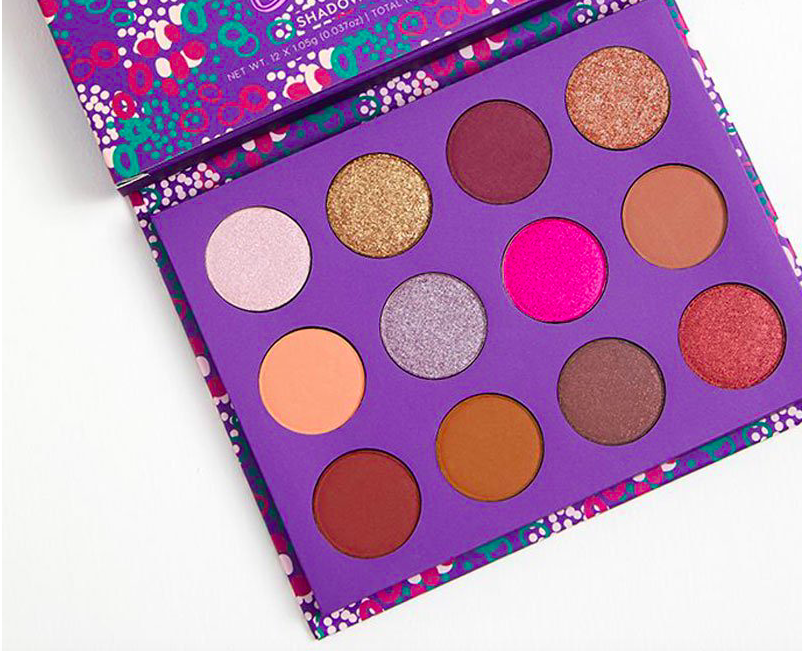
Let's look at it:


If you've been a longtime reader of my blog, you'll know that I am a huge lover of the Melt Rust Stack. This one stack replaced every single neutral matte palette in my collection because none could compare to it. I have also owned the Love Sick Stack, but ended up only keeping the color Love Sick. I really love Melt's matte shades, and while the shimmers aren't awful, I just don't like them nearly as much. 

Gemini is Melt's first palette not in stack form, and I think that makes a lot of sense from a practical standpoint. The stacks are truthfully a pain, and they are so delicate that it makes traveling with them difficult. Additionally, the stack format really only allows for four or five shadows, so having a typical palette format allows the brand to come out with something with 10 shadows. 

Most longtime readers will also know that I am a complete sucker for a good mustard shadow. My favorite mustard is Bobbi Brown Camel, but Melt Rubbish is a close second. So you can only imagine my joy when I saw that Melt has created yet another mustard with a much stronger yellow base. And that was the starting point of my brief love affair with Gemini. 

Let's look at the shadows as pigments:


Typically, I use images like this as a tool to show me how much I don't actually like or need a palette. However, in this case, this photo just reinforced how much I wanted this palette. It is perfect, I thought, and I am definitely going to buy it

But I'm not going to. Mainly because of the price. 

Gemini retails for $58. Melt only offers free shipping on orders over $75, which means that if you buy any of their stacks or this palette, you still won't qualify for free shipping. Shipping is $7 domestically and $10 internationally, which makes Gemini $65 to $68 before tax. 

When you compare the cost of Gemini to other Melt Stacks, it actually seems like a great deal. (The Rust Stack is also $58 before tax and shipping and only has five shadows.) However, Gemini looks to come in cardboard packaging, which is considerably less expensive than the stack packaging. Gemini also doesn't have the "gimmick" factor of the stack packaging, so it puts the palette in direct competition with other brands that make similarly sized palettes. When compared to those palettes, Gemini is pretty overpriced. 

For me, the price was especially too high because when I really looked Gemini, I was most attracted to the four shadows on the right. When I considered the rest of the palette, I realized:
  • I hardly ever use black shadows
  • I have plenty of brow bone/transition shadows
  • I have a ton of warm browns, oranges, and dark browns

So, really, I just wanted the shimmery green, forrest green, olive, and mustard. 

Buying Gemini for only four shadows would mean that I have not learned any of the lessons I have discussed on this blog, especially (and here's the kicker) when I own all four of these shades already

Yep. There you have it. I was lusting after a palette for four shades that I already own. 

Upon this realization, I thought about why I didn't see that I already owned these shadows when that's usually the first thing I notice in other palettes. And I think it's because this is a palette that has a somewhat unique color scheme (as you will see further in this post it is really not that unique at all), and my brain just hasn't been trained yet to see that even these "unique" palettes are still filled with shades I already own. 

Let's look at swatches:


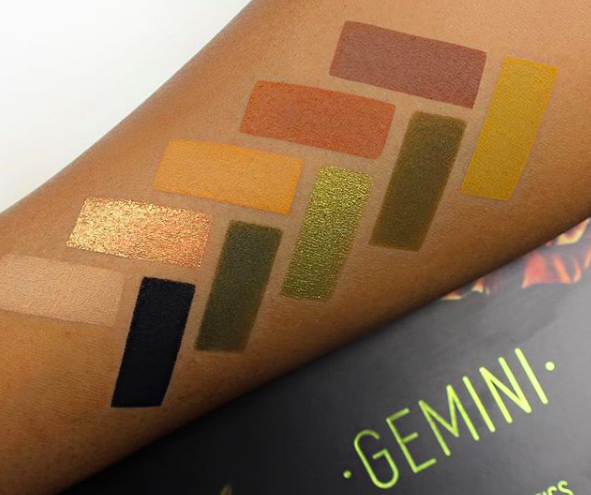
When I first saw these swatches, it felt like the air had been let out of my "I must buy this palette" mentality. There was absolutely no denying at this point that I already owned these shadows, and, frankly, that they just weren't as special as I thought they were by looking at promotional photos. 

Gemini is Anastasia Beverly Hills Subculture:


And the Bad Habit dupe of Subculture, Retro Love:


It's Lime Crime Venus II:


Those greens I was lusting after are in Viseart Dark Matte:


Gemini also looks a lot like Jeffree Star Androgyny:


And Zoeva Matte Spectrum:


And Makeup Revolution Reloaded Iconic Division: 


Really, Gemini is not especially unique. In fact, I think the biggest audience for it are people who wanted Subculture but decided not to buy because of the horrendous reviews. 

As for me, I once owned Venus II but decluttered it years ago because I was not in a place with my makeup preferences to really appreciate those tones. I've owned Viseart Dark Matte for years and absolutely love that palette. And if that's not enough, before I moved, I was gifted Subculture (though I am still undecided if I want to keep it). And that's not even counting all of my single shadows. 

For the exception of Viseart Dark Matte, all of these palettes are considerably less expensive than Gemini, which will cost you upwards of $70 with tax and shipping. And I think $7 per shadow is too high. 

I know I made this post mainly about me, but I did so to demonstrate that being more conscious about consumerism and training your brain to think more critically about purchases is a constant work in progress and something that takes time. Despite everything that I have learned and all the time I have devoted to thinking critically about why I'm not going to buy products, I still had a moment of "Pretty! Different! I'm gonna buy!" And had I purchased Gemini, I would have applied the shadows to my lids and had the sinking realization that these shades were not, in fact, different from what I already owned. 

Looking at the promotional photos of Gemini, I still think it's a gorgeous palette. And I'm glad to see more brands branching out from the boring and overdone neutrals and shades that are only geared toward light skin tones. It's exciting to see something different, especially something that is still cohesive and what most people would consider "wearable." But that doesn't mean that I need to spend $70 on a palette full of colors that I already own. 

The best way I can describe this feeling is to share a story about some palettes that I have recently purchased. I received a few requests to test some "dupe" palettes and form an opinion on the quality of the shadows. Traditionally speaking, I'm not a huge fan of brands that "dupe" popular palettes because I do think that it is an infringement on one's creative and intellectual property. But due to the requests, I did purchase some palettes from Hush to test. When the palettes arrived, I was drawn to these beautiful (but familiar) color schemes and was excited to work with the palettes. And do you know what happened? With every single look that I created (even though these were "new" palettes), I found myself so bored because they were looks that I've created a dozen times over with a dozen different palettes. 

Obviously in this example these are "dupe" palettes, so the entire idea is to be similar to existing ones, but there is also only so much that you can do with an entirely red-toned or orange-toned palette. And even if a palette is new, the look is not. And if you're able to create that exact look from shadows you already have in your collection, what's the point

I think I'm just at a place where the "new factor" isn't enough anymore. I need a product to actually be different, not just new. And Gemini would not be different for me. 

If you're someone who has considerably less makeup than I do (first of all, good for you!), have nothing like these colors in your collection, and are very drawn to this palette, Gemini may actually be a great purchase for you. I still think it is overpriced compared to other palettes of similar size and quality (especially since Melt is an online brand and you can't try the products in-store), but if this is the exact color scheme you want, I can see it being a good purchase. If you're like me and own at least one of the above palettes as well as singles, it may be a good idea to take a step back and think about why you're really lusting after this particular palette and evaluate what, if any, value it will add to what you already own. If you're drawn to only a few colors, I would also recommend instead buying some single shadows from brands like Colourpop and Makeup Geek.  

Personally, I think that I may need to accept that I have almost every single possible shade (that I would want) already in my collection. There may be no new product that my collection can't duplicate. And that's okay. Because I can still love makeup and participate in the hobby without buying every new product.

Gemini, while beautiful, is just not something I need to add to my collection. It doesn't bring anything new to me, and it's very expensive to be the same as what I already have. I absolutely don't need Gemini, and I won't be buying.

Wednesday, May 9, 2018

What I'm Not Buying: Kat Von D Anniversary Palette


To celebrate their 10th anniversary, Kat Von D has come out with an anniversary collection, which includes a palette. 

And I won't be buying. 

I've received a lot of requests to write about this palette, but I have to say that I'm a little cautious to do so because I have ended up with three Kat Von D palettes for which I have written anti-haul posts. 

Those include Pastel Goth, and my reason for purchasing can be found here:

Saint and Sinner, which I received as a gift:


And Metal Matte, which I also received as a gift: 


Out of all of these palettes, Pastel Goth is my favorite, and I am happy that I own it. However, I also find Pastel Goth to be very light (same with some of the matte shades in Metal Matte), which can make it difficult to work with. 

So even though I have no plan or desire to buy the anniversary palette, I also didn't have plans to own the above three palettes, and we can all see how that played out. However, I really can't see myself buying the new Kat Von D palette because it just looks so much like most Kat Von D palettes that have released in the past few years.

Let's take a look at it:
I think we can all agree that this is a beautiful palette, and I think (in promotional images) it looks like it was curated quite well. It has a mix of warm and cool tones as well as neutrals and colors. It feels evenly balanced. Unlike so many palettes releasing right now, it's not a neutral palette with one or two pops of color. It offers a really complementary color scheme. Even better, the colors are on trend, but aren't too trendy that they are essentially disposable. And, because it's Kat Von D, the artwork on the packaging is also gorgeous:


If I didn't own so many palettes, this would definitely be something that I would consider purchasing. But I do. And my guess is that if you're interested in this palette and have found your way to my blog, you probably do too. 

Let's look at swatches:


Lately, when I've seen swatches provided by a brand, it has made me want the palette less than I did before. But with these swatches, I have to admit that I am tempted. However, we all know by now that brand swatches are incredibly misleading. And I have to say that Kat Von D has always been one of the worst offenders with this. 

When I compare the above swatches to those provided by Instagram user @vspinkmelissa, there is quite a difference:


Image credit: @vspinkmelissa

I would assume that the bottom swatches were applied without primer, and I have said many times that I believe swatches to be generally unhelpful in terms of evaluating performance and quality, but I do think it's interesting to compare the way the actual colors looks. 

The swatches will of course look more complex and exciting in promotional images, but these two pictures, I think, are a great example of "expectations versus reality." That's not to say that the colors in the bottom swatches are't great; they just look different from the ones being advertised. 

When I look at the swatches in the bottom photo, I have to admit that there are not any that I don't already have or like enough to want to buy again. 

It makes sense to me that an anniversary palette would be filled with "classic" Kat Von D shades. But, this palette claims to have 16 new shades. And herein lies the "issue" with buying Kat Von D palettes: very often, if you buy one, you have the basic color scheme of many moving forward. 

At this point, I own several Kat Von D palettes:
  • Mi Vida Loca Remix
  • Metal Matte
  • Pastel Goth
  • Saint and Sinner

And have also owned but since decluttered:
  • Shade and Light Eye
  • Shade and Light Eye Quad in Plum
  • Monarch

Between all of these palettes, I definitely feel like I have covered the entirety of the anniversary palette color scheme a few times over.

In addition to the palettes listed above, this also looks like Serpentina:


And Star Studded:
As well as Colourpop Dream St.:


Juvia's Place Nubian 2:


Jaclyn Hill X Morphe:


Kylie Cosmetics Blue Honey:


Juvia's Place Festival:


And Elf Jewel Pop:


To name a few. 

The anniversary palette is a whopping $52 before tax, which feels steep. To put that into perspective, the anniversary palette has 16 shadows compared to Saint and Sinner, which had 24 shadows and cost $60. So for an additional $8, Saint and Sinner had eight more shadows. Saint and Sinner has one-third more shadows, and by that measurement, it seems like a more appropriate price for the anniversary palette would be $40.  

But the thing that the anniversary palette has going for it that Saint and Sinner didn't is that the color scheme flows nicely and there seems to be some "sense" to it. When I first saw Saint and Sinner, I was not drawn to it whatsoever because the colors felt so random and unorganized. Even now, after being gifted Saint and Sinner, I find it difficult to look at it and feel inspired. I typically get too overwhelmed and don't even know where to start. So the fact that the anniversary palette is "curated" is certainly a positive, but that doesn't mean that the shades are not repetitive. 

Out of all of the Kat Von D palettes that I own, the ones that I think are the most unique are Mi Vida Loca Remix and Pastel Goth. Unfortunately, both of these palettes were limited edition, and it doesn't appear at this time that they will make another appearance. 

And this is another point I would like to make. The overwhelming majority of Kat Von D eyeshadow palettes are limited edition. At the time of the writing of this blog post, Kat Von D has seven eyeshadow palettes for sale at Sephora. They are:
  • Shade and Light Eye—permanent 
  • Shade and Light Glimmer—permanent 
  • Alchemist—permanent 
  • Shade and Light Eye Quads—on sale; discontinued 
  • Metal Matte Mini—limited edition 
  • I Am Divine—limited edition
  • 10-Year Anniversary Palette—limited edition

Nearly half of the palettes available are limited edition, and one palette/group of palettes has been discontinued. That means the brand only has three permanent palettes. Two of them are incredibly neutral and matte/shimmer versions of each other, and the other is only a quad of duochrome shadows that all have a white base. 

What's interesting about this is that when I personally think of Kat Von D as a brand, I think of bold colors, not the neutrals in the permanent line. That's because nearly every Kat Von D holiday release is a large palette filled with interesting color combinations. For years, while every other brand was trying to reinvent brown, Kat Von D was giving color. So it's curious, then, why the brand doesn't have a permanent colorful palette. And it's frustrating as a consumer that whenever the brand does release a "signature" colorful palette, it is limited edition. 

But let's talk about that. When a brand releases a limited edition product, it is for two main reasons:
  1. They don't think it's a product that will be a bestseller if it was permanent and people had as long as they wanted to make a decision on whether to buy.
  2. They know people WILL buy it if there is a perceived scarcity to it.
With Kat Von D specifically, they continue to release the same palette, just packaged slightly differently. And I think this is why they don't have a permanent colorful palette. Because if they did, people would be less likely to buy their limited edition colorful palettes. Added to that, Mi Vida Loca Remix is on most people's list of "one that got away" palettes. And because of this, people are more likely to buy limited edition Kat Von D palettes so that they don't have to feel they have missed out yet again. But I can't help but to think that Kat Von D could just bring back Mi Vida Loca Remix and make it permanent. I know that Kat Von D has become a vegan brand since that palette was for sale, so some of the shadows would need to be reformulated, but knowing how high the demand is for that palette, it baffles me why the brand doesn't just give consumers what they want. 

And my guess is that they don't rerelease that palette because then not as many people would buy the latest limited edition palette. Also, there's this strange phenomenon in taking pleasure in owning something that other people can't. I'll never forget watching a YouTube video where a woman was lamenting how the Too Faced Sweet Peach palette was ruined for her when Too Faced released it again. She said the main reason she liked it so much was because she felt special for owning an item other people wanted but couldn't have. (This same woman is thrilled that she owns Mi Vida Loca Remix and considers it one of her prized makeup products.) Now, there is a lot of honesty in what she said that I don't think many people would admit to. At the same time, it seems kind of petty to me to feel so elitist about a makeup item. The point of makeup is to give people confidence and inspire creativity. So to feel so great about owning a product specifically because other people can't seems a bit counterintuitive to me.  

Also, makeup is a moneymaking industry. So tactics that brands employ are always going to be in their best interests. As consumers, the best thing that we can do is just be critical with our thinking and smart with our purchasing decisions. I don't need another limited edition Kat Von D palette. Sure, I won't have the "10-Year Anniversary Palette," but I have other versions of it. And more versions are undoubtedly coming in the future. This is a palette of the moment, and when the moment passes, no one will talk about it anymore. If you want proof of that, think of how many people currently talk about the original Metal Matte palette. 

Although there is a lot about this palette that's interesting and appealing, I just don't need it, full stop. I have these colors already many times over, and I don't need any special "10th anniversary" packaging. For me, this palette would be a waste of $52 because, ultimately, it would just sit and get lost in the shuffle of all the other palettes that I already own and love. I don't need this palette, so I won't be buying.

Tuesday, April 24, 2018

What I'm Not Buying: Lime Crime Venus 3


Weeks after releasing the Venus XL, Lime Crime has released yet another version of the Venus palette, Venus 3. 

And I won't be buying. 

I was tagged by many people letting me know about this palette, and I wanted to thank everyone who did. It's always helpful for me to know the products that you all are most interested to hear about, and I appreciate the engagement around the ideas of the anti-haul and smart shopping. 

Despite everything that I know about Lime Crime (I won't be getting into their past in this post, but if you're interested, I detailed that information in this post), I still can't help but be excited and interested when they announce a new shadow palette. That's not to say I can't wait to buy these new products, but I'm excited to just see them. And that's because the Venus and Venus 2 palettes were years "ahead of their time" or ahead of trends. 

Venus was an entire palette of warm pink and red tones years before Anastasia Beverly Hills Modern Renaissance entered the scene. Likewise, Venus 2 debuted long before ABH Subculture. Neutrals were still the focus of most palette releases when the Venus palettes came along, and I remember thinking they were too "out there" for me. Now, shadows from Venus are some of the powerhouse shades in my favorite custom palette, and I have fallen hard for the mustard tones that first appeared in Venus 2. 

Lime Crime is certainly not without an unfavorable history, but they have traditionally been the indie brand to watch in terms of innovative color stories and new trends. (Lime Crime Cashmere certainly put the "greige" lip color on trend.) And I guess that's why Venus 3 leaves me really disappointed. 

You see, unlike so many of Lime Crime's earlier palettes, we have definitely seen color schemes like this before. 

Let's look at the palette:


We've got a palette full of purple, pink, and taupe tones. Now, that's not incredibly surprising since the Pantone Color of the Year is Ultra Violet, and I expect that we will see many purple-toned palettes in the coming months. But it's also not like we haven't seen purple-toned palettes before. 

When I first saw Venus 3, I immediately thought, Oh, this is Viseart Amethyst Theory:


This palette released about a year ago, so it's curious to me that Lime Crime would come out with this palette at least a year late to the game. When this palette launched, many people raved about there finally being a purple palette, but, really, there's only two purple shades in it. And there's really only two purple shades in Venus 3 as well. 

Let's look at swatches:


Looking at these swatches, there's:
  • A matte cool pink
  • A shimmery pink
  • A shimmery pink champagne
  • A shimmery white-pink
  • A matte cool brown
  • A matte fuchsia/purple
  • A matte warm pink
  • A shimmery taupe

It's interesting because Beam (second shadow on the top row) looks like a shimmery violet in the pan, but in the swatch it looks like a shimmery pink. And that was one of two shadows that looked somewhat purple. So now, this "purple" palette that only had two purple shades only really has one, and it's fuchsia at that. 

Truthfully, Venus 3 is not ahead of trends, it's not unique or interesting, and it is not something that we haven't seen before. It's a collection of pink shadows that look more interesting in the pan than they do in performance. Added to that, it doesn't appear to be a very versatile palette. There are four shimmery shadows, but I would guess that they don't look too distinct from each other when applied to the lid. And that's half the palette. You can make a pink look, violet look, and taupe look. Other than that, the colors are very monochromatic, which doesn't usually allow for multiple options. 

In addition to Viseart Amethyst Theory, Venus 3 looks like Huda Beauty Desert Dusk:


Natasha Denona Lila:


Kylie Cosmetics Purple Palette:


Colourpop Element of Surprise:


Zoeva Love is a Story:


Dose of Colors Marvelous Mauves:

And Coloured Raine Queen of Hearts:


These are all palettes that have been available for some time, and while they all don't have the exact color scheme as Venus 3, they certainly embrace the idea of neutral shadows with a couple pops of fuchsia or purple. 

I'd like to take a moment to talk about the marketing of this palette. This is something that I talked about a lot in the early posts on this blog, but it bears repeating. These were the "first images" Lime Crime released of Venus 3:


I cannot tell you how frustrating I personally find this kind of marketing campaign. All these pictures are saying is:

Look, we have a new palette! We are going to tell you absolutely nothing about it, other than the fact that it exists and will be released at some point in time, but we fully expect you to be excited by this! Look, it's a picture of nothing! Get excited!

I understand that brands need to market their products, but they are looking out for their own best interest. As consumers, we should be looking out for our own as well. Many brands are guilty of this particular marketing tactic, where they try to drum up hype and excitement just on the idea of a new product. And just the idea of something can be incredibly powerful. 

We saw this most clearly in the Too Faced Sweet Peach palette release. Too Faced released the name of the palette, Sweet Peach, and images of the packaging. And that was all that consumers needed to fill in the gaps for themselves. It was going to be a peach palette! There were going to be so many different shades of peach! Then people made the decision—without even seeing the palette—that they were going to buy it. When the palette was finally shown, people were incredibly disappointed. Where's the peach?! Still, they had already made the decision to buy, and it was difficult to change that mindset because they also had fear of missing out. Too Faced intentionally released low stock, the palette sold out immediately, and then it became a frenzy of people trying to buy this palette they didn't even like. 

It was a complete disaster from a consumer standpoint, but it was an incredibly effective marketing tactic. Soon after this, Too Faced was able to sell the company for over $1 billion, which was a culmination of expert marketing tactics over a few years and several key product releases. Other brands took notice, and this is now an almost universal marketing tactic. 

This brings me back to my earlier point that Venus palettes in the past have been exciting because they brought something new to the table. But this marketing tactic, which is just like so many others, puts Lime Crime squarely in the space of "following" the trends rather than setting them. They were banking on the assumption that consumers would see this nothing image, see that it was an eyeshadow palette in the same packaging as the Venus palettes, and make the decision to buy based on the previous two Venus palettes. The tactic is based on riding the coattails of their previous, successful palettes. 

The reason I bring all of this up is that it's important as a consumer to recognize this tactic and not buy into it. If you saw Venus 3 and felt it was incredibly exciting and just the palette you were looking to add to your collection, that's great. But if you saw the nothing marketing images and felt the impulse to buy without even knowing what it looked like, that might be something to keep in mind before your purchase. As consumers, we should be buying products because they excite and inspire us, or even better, if they fulfill a purpose. 

Personally, I have never considered myself to be a "makeup collector," and I like for everything in my collection to have a place and purpose. I am not passing judgement on people who do collect makeup because everyone is different. But for me, buying the Venus 3 palette "because I want to have the entire Venus collection" is not a good enough reason to spend upwards of $40 on eyeshadows I already own.  

If you're interested in this color scheme, I would recommend taking a look at Coloured Raine Queen of Hearts instead. Queen of Hearts is a more inclusive palette, and it can create a multitude of looks. I own Queen of Hearts, in addition to a slew of other palettes and single shadows, so there is absolutely no reason for me to buy Venus 3. I was disappointed to see that Lime Crime didn't bring anything new or innovative to the table with this product, and I'm not personally too excited to see a collection of colors that I've seen done again and again in the past year. 

There's nothing drawing me to the Venus 3 palette, and there is not a single shade in it that I don't already own a few times over. I don't need this palette, so I won't be buying. 

Thursday, April 12, 2018

What I'm not Buying: KKW Beauty X Mario Palette

Following in the footsteps of her younger sister, Kim Kardasian started her own makeup brand, and she recently teamed up with her makeup artist to produce a neutral eyeshadow palette with a blue shadow. 

And I won't be buying. 

I'm sorry that I have been absent on the blog for a while. I've been incredibly busy with several projects (including for the blog), and, frankly, there weren't many new items released that were too hyped or that I personally felt excited about. 

And then I learned of the KKW Beauty X Mario Palette. 

Now, there are two very big reasons that this is a hyped palette that sold out very fast:
  1. It has Kim Kardashian's name on it
  2. It has Mario Dedivanovic's name on it. 

That's it. 

If you don't know, Mario Dedivanovic is Kim Kardashian's longtime makeup artist, and a few years ago, he collaborated with Anastasia Beverly Hills on the Master Palette by Mario. KKW Beauty claims that with this palette, you will be able to create any of Kim Kardashian's makeup looks. Naturally, young Kim Kardashian fans are probably very interested in this palette because they want to look like Kim and now think they actually can as long as they buy this collection of incredibly neutral shadows. 

So, I'm just going to say it: there is absolutely nothing special about this palette, except for the fact that it has those two names attached to it. 

Let's look at it:


This is, without question, one of the most boring palettes I have seen in a long time. It is a collection of beiges and brows with a blue and a color that can lean berry or brown. If you remove those two shadows, you've got a very basic beginner's palette. 

Let's break down each shade. There is:
  • A shimmery white
  • A matte cream
  • A shimmery champagne
  • A matte terracotta 
  • A matte warm brown
  • A shimmery berry
  • A shimmery white gold
  • A shimmery blue
  • A matte deep brown
  • A shimmery yellow gold/bronze

Let's look at the colors as pigments:


And as single shadows:


I would encourage everyone to look at these shadows and ask yourself if you would buy each one individually as a single. If you wouldn't because you know you already have those shadows already, you absolutely don't need to buy the entire palette. And if you wouldn't because some of the shadows just aren't all that interesting to you, then you don't need to buy the entire palette. 

When I think about these shadows in relation to what is in my own collection, I would not buy any of them. Not even one. Because I have every single one of these shadows at least five times over, if not more. And if I owned absolutely zero eyeshadow, I still would only buy:
  • The matte cream
  • The shimmery gold
  • The matte warm brown
  • The matte terracotta
  • The shimmery bronze

That's it. 

And for $45, plus tax and shipping, I would want more than just five shadows that are pretty ordinary and I could get for cheaper elsewhere. 

What's (semi)interesting is that this palette reminds me a lot of the ABH Master Palette by Mario:


Of course that's not exceptionally surprising since both palettes were made by Mario Dedivanovic, but I also find it odd that he would choose to create a palette so similar to his last one.

The Master Palette by Mario was (and still is) an incredibly hyped palette, and people talk about it like it was this incredibly special, one-of-a-kind, "one that got away" palette. And I just frankly don't understand why. Like the KKW Beauty palette, it is just a collection of browns with a green and a blue. 

Those same people who lament "missing out" on the Master Palette by Mario have said that they will buy the KKW Beauty palette no matter what so that they don't miss out again. But, really, there's little point in buying something just to make up for the fact that you "missed out" on the item that you actually wanted. And buying the KKW Beauty palette is not going to give you the Master Palette by Mario. The palettes are similar, but it won't fully satisfy your desire to own the exact product that you didn't buy. You can, however, take comfort and solace in the fact that you didn't buy the ABH palette for a reason, and that reason is most likely still valid. The Master Palette by Mario isn't that special, so if you didn't buy it, chances are you didn't need it. 

This palette also reminds me of the Kylie Cosmetics Peach palette:


And Zoeva Cocoa Blend:


And basically every other neutral palette available. 

For slightly more interesting color schemes that are also inclusive, there's Juvia's Place Nubian 2:


And Coloured Raine Cheers to the Beauty:


I'll be blunt. For $45, the KKW X Mario Palette is absolutely not worth the money. You are paying for the names attached to this palette and nothing else. And I can absolutely guarantee that you can find comparable quality from much more affordable brands. Even so, like I said earlier, if you have any eyeshadow at all, you likely already have most, if not all, of the colors in this palette. And at that point, you are just spending $45 to give money to Kim Kardashian to have her name on a piece of cardboard. 

This palette is also not very inclusive. It looks like it was made for people with light to medium skin tones and not much deeper. And I'm sure a lot of people can make excuses for the lack of inclusivity. 

It's Mario's palette; these are the colors he wants. It's the colors Kim Kardashian actually wears. They can do whatever they want. 

But here's the thing: that's not acceptable anymore. It never should have been acceptable, and it's important to only more forward and be better. Coming out with a palette like this, that is half light neutrals, is not helpful. And when you look at Juvia's Place Nubian 2 and Coloured Raine Cheers to the Beauty, it's very evident how easy it is to work with a similar color scheme but make the product inclusive. 

This palette is also another example of the false scarcity tactic, which is something that always sours me to a product and a brand. The palette is currently sold out, which means that the people who passed on the initial launch may now be thinking that the product is clearly so great and that they need to buy it the next time it restocks. But this is simply a marketing tactic to drum up this exact reaction and hype. The reality is that even if the product was poor quality, it was going to sell because of the two names attached to it. Everyone involved would have known this, and they would have known an appropriate amount of palettes to manufacture to meet the demand. Instead, they released a small quantity to ensure that it would sell out and would then pressure more people into buying it. 

This exact marketing tactic is what made Kylie Cosmetics so successful, despite the fact that her lip kits were Colourpop products that were only repackaged and triple the price. Of course, these aren't the only brands that employ this tactic—it's something that almost every brand does. They feed off of consumers succumbing to hype, simply because they don't want to feel like they are missing out on some great product that "everyone else" has. 

But the truth is that when you wear this palette, no one is going to know that it was from Kim Kardashian. If you were to wear the same colors from Wet N Wild, no one would know the difference. These are basic neutrals, and you can absolutely create the same looks from shadows outside the KKW Beauty palette. 

There is just nothing interesting or exciting about this palette. It adds absolutely nothing to the makeup conversation in terms of innovation, inspiration, or creativity. If this came out maybe seven years ago when I was first interested in makeup, I could see this being a product that would have intrigued me. But even so, I would have preferred to buy something from a store so that I could have seen and tested it in person. The only "benefit" to buying this palette is having something with a celebrity's name. But that's a fleeting feeling of satisfaction, and as I said, no one except you will ever know. There is just nothing about this palette that I need or want, so I won't be buying.