Weeks after releasing the Venus XL, Lime Crime has released yet another version of the Venus palette, Venus 3.
And I won't be buying.
I was tagged by many people letting me know about this palette, and I wanted to thank everyone who did. It's always helpful for me to know the products that you all are most interested to hear about, and I appreciate the engagement around the ideas of the anti-haul and smart shopping.
Despite everything that I know about Lime Crime (I won't be getting into their past in this post, but if you're interested, I detailed that information in this post), I still can't help but be excited and interested when they announce a new shadow palette. That's not to say I can't wait to buy these new products, but I'm excited to just see them. And that's because the Venus and Venus 2 palettes were years "ahead of their time" or ahead of trends.
Venus was an entire palette of warm pink and red tones years before Anastasia Beverly Hills Modern Renaissance entered the scene. Likewise, Venus 2 debuted long before ABH Subculture. Neutrals were still the focus of most palette releases when the Venus palettes came along, and I remember thinking they were too "out there" for me. Now, shadows from Venus are some of the powerhouse shades in my favorite custom palette, and I have fallen hard for the mustard tones that first appeared in Venus 2.
Lime Crime is certainly not without an unfavorable history, but they have traditionally been the indie brand to watch in terms of innovative color stories and new trends. (Lime Crime Cashmere certainly put the "greige" lip color on trend.) And I guess that's why Venus 3 leaves me really disappointed.
You see, unlike so many of Lime Crime's earlier palettes, we have definitely seen color schemes like this before.
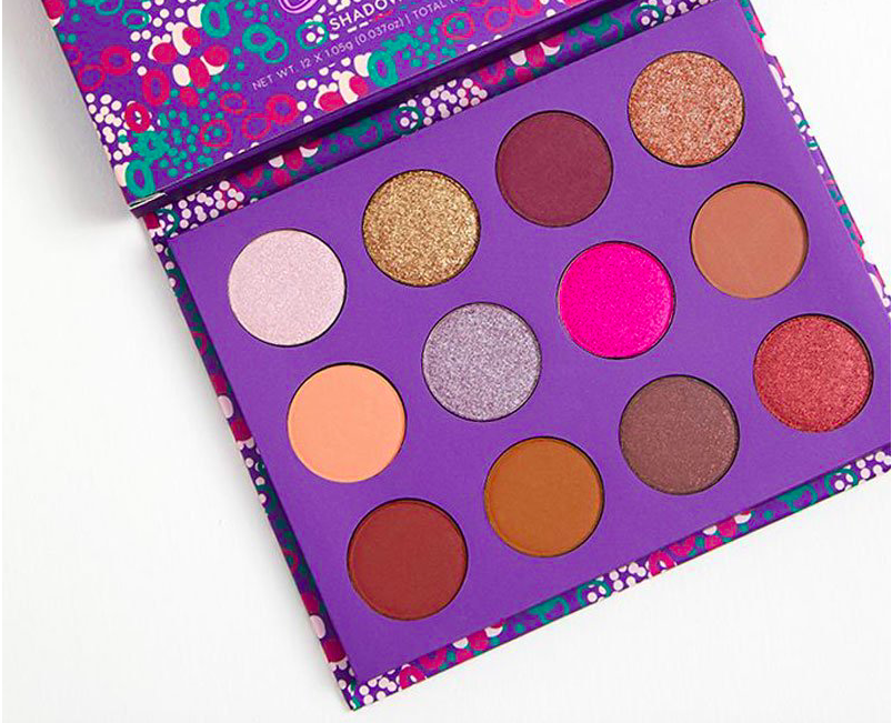
Let's look at the palette:

We've got a palette full of purple, pink, and taupe tones. Now, that's not incredibly surprising since the Pantone Color of the Year is Ultra Violet, and I expect that we will see many purple-toned palettes in the coming months. But it's also not like we haven't seen purple-toned palettes before.
When I first saw Venus 3, I immediately thought, Oh, this is Viseart Amethyst Theory:

This palette released about a year ago, so it's curious to me that Lime Crime would come out with this palette at least a year late to the game. When this palette launched, many people raved about there finally being a purple palette, but, really, there's only two purple shades in it. And there's really only two purple shades in Venus 3 as well.
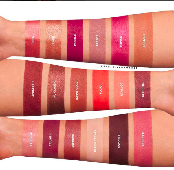
Let's look at swatches:

Looking at these swatches, there's:
- A matte cool pink
- A shimmery pink
- A shimmery pink champagne
- A shimmery white-pink
- A matte cool brown
- A matte fuchsia/purple
- A matte warm pink
- A shimmery taupe
It's interesting because Beam (second shadow on the top row) looks like a shimmery violet in the pan, but in the swatch it looks like a shimmery pink. And that was one of two shadows that looked somewhat purple. So now, this "purple" palette that only had two purple shades only really has one, and it's fuchsia at that.
Truthfully, Venus 3 is not ahead of trends, it's not unique or interesting, and it is not something that we haven't seen before. It's a collection of pink shadows that look more interesting in the pan than they do in performance. Added to that, it doesn't appear to be a very versatile palette. There are four shimmery shadows, but I would guess that they don't look too distinct from each other when applied to the lid. And that's half the palette. You can make a pink look, violet look, and taupe look. Other than that, the colors are very monochromatic, which doesn't usually allow for multiple options.
In addition to Viseart Amethyst Theory, Venus 3 looks like Huda Beauty Desert Dusk:

Natasha Denona Lila:

Kylie Cosmetics Purple Palette:

Colourpop Element of Surprise:
Zoeva Love is a Story:

Dose of Colors Marvelous Mauves:

And Coloured Raine Queen of Hearts:

These are all palettes that have been available for some time, and while they all don't have the exact color scheme as Venus 3, they certainly embrace the idea of neutral shadows with a couple pops of fuchsia or purple.
I'd like to take a moment to talk about the marketing of this palette. This is something that I talked about a lot in the early posts on this blog, but it bears repeating. These were the "first images" Lime Crime released of Venus 3:


I cannot tell you how frustrating I personally find this kind of marketing campaign. All these pictures are saying is:
Look, we have a new palette! We are going to tell you absolutely nothing about it, other than the fact that it exists and will be released at some point in time, but we fully expect you to be excited by this! Look, it's a picture of nothing! Get excited!
I understand that brands need to market their products, but they are looking out for their own best interest. As consumers, we should be looking out for our own as well. Many brands are guilty of this particular marketing tactic, where they try to drum up hype and excitement just on the idea of a new product. And just the idea of something can be incredibly powerful.
We saw this most clearly in the Too Faced Sweet Peach palette release. Too Faced released the name of the palette, Sweet Peach, and images of the packaging. And that was all that consumers needed to fill in the gaps for themselves. It was going to be a peach palette! There were going to be so many different shades of peach! Then people made the decision—without even seeing the palette—that they were going to buy it. When the palette was finally shown, people were incredibly disappointed. Where's the peach?! Still, they had already made the decision to buy, and it was difficult to change that mindset because they also had fear of missing out. Too Faced intentionally released low stock, the palette sold out immediately, and then it became a frenzy of people trying to buy this palette they didn't even like.
It was a complete disaster from a consumer standpoint, but it was an incredibly effective marketing tactic. Soon after this, Too Faced was able to sell the company for over $1 billion, which was a culmination of expert marketing tactics over a few years and several key product releases. Other brands took notice, and this is now an almost universal marketing tactic.
This brings me back to my earlier point that Venus palettes in the past have been exciting because they brought something new to the table. But this marketing tactic, which is just like so many others, puts Lime Crime squarely in the space of "following" the trends rather than setting them. They were banking on the assumption that consumers would see this nothing image, see that it was an eyeshadow palette in the same packaging as the Venus palettes, and make the decision to buy based on the previous two Venus palettes. The tactic is based on riding the coattails of their previous, successful palettes.
The reason I bring all of this up is that it's important as a consumer to recognize this tactic and not buy into it. If you saw Venus 3 and felt it was incredibly exciting and just the palette you were looking to add to your collection, that's great. But if you saw the nothing marketing images and felt the impulse to buy without even knowing what it looked like, that might be something to keep in mind before your purchase. As consumers, we should be buying products because they excite and inspire us, or even better, if they fulfill a purpose.
Personally, I have never considered myself to be a "makeup collector," and I like for everything in my collection to have a place and purpose. I am not passing judgement on people who do collect makeup because everyone is different. But for me, buying the Venus 3 palette "because I want to have the entire Venus collection" is not a good enough reason to spend upwards of $40 on eyeshadows I already own.
If you're interested in this color scheme, I would recommend taking a look at Coloured Raine Queen of Hearts instead. Queen of Hearts is a more inclusive palette, and it can create a multitude of looks. I own Queen of Hearts, in addition to a slew of other palettes and single shadows, so there is absolutely no reason for me to buy Venus 3. I was disappointed to see that Lime Crime didn't bring anything new or innovative to the table with this product, and I'm not personally too excited to see a collection of colors that I've seen done again and again in the past year.
There's nothing drawing me to the Venus 3 palette, and there is not a single shade in it that I don't already own a few times over. I don't need this palette, so I won't be buying.