Showing posts with label holiday 2016. Show all posts

Thursday, October 27, 2016

What I'm Not Buying: NARS Give in Take Dual-Intensity Eye and Cheek Palette Holiday 2016


For the holiday season, NARS has released an eye and cheek palette in their dual-intensity formula that contains six eyeshadows, two blushes, and a highlighter.

And I won't be buying 

When I first became interested in makeup over seven years ago, NARS was one of my favorite brands. I was ALL about their eyeshadows (they were my luxurious, expensive shadows) and would only wear their blushes. More recently, I've enjoyed the eyeshadow primer and absolutely love the Audacious lipsticks. So on the whole, I am a NARS fan. 

But I don't think they ever do palettes well. At all. 

When the dual-intensity shadows released, I was really interested in trying them. Swatches seemed a bit hit or miss though, and for $29 each, that was too much money for me to spend on a gamble. Including the dual-intensity eyeshadows in a palette always felt like the best way to try the shadows, however, I'm always so disappointed by the quality and color selection. 

And this palette is no different.  

The eyeshadow portion of the Give in Take palette:


Photo: Temptalia

Looks exactly like the NARS And God Created Woman palette:


Photo: Makeup and Beauty Blog

The And God Created Woman palette came with a small brush and deluxe sample of the eyeshadow primer and it cost $59. That is a staggering price tag for shadows this small. It's hard to tell in this photo, but this was a tiny palette. On the whole, the And God Created Woman palette did not receive favorable reviews, and many people have included it in their product regrets. The quality and size, they said, were not worth the high price. 

Let's talk about the positives. 

Like the And God Created Woman palette, the Give in Take palette is $59, but the shadows are 0.07 ounces, which is actually more product than a traditional Dual-Intensity eyeshadow at 0.05 ounces. The Give in Take palette also includes three face products at 0.12 ounces each. So, in terms of NARS's previous offerings, this palette actually is a good price. 

Like all NARS holiday offerings, the packaging of the Give in Take palette is lovely. 


But the palette itself doesn't make a ton of sense to me. 


Photo: Temptalia 

The eyeshadows in this are very cool-toned, but the blushes are warm. It's hard for me to imagine a nice smokey eye with a warm peach or warm pink blush. 

Personally, these colors are just not for me. They remind me of the shimmery version of the Urban Decay Naked 2 Basics palette:


The colors in the Give in Take palette feel too similar to me. It seems like there are only three distinct colors in it. There's the light wash of color, the brown, and the gray/black. As a warm-toned eyeshadow lover, this color selection makes the palette an easy pass for me. Nonetheless, even if I liked cool-toned eyeshadows, swatches of this palette did not impress me. The Dual-Intensity eyeshadows are supposed to be sheerer when applied dry, but then intensify when used wet. The colors seemed to be especially sheer in the dry swatches, which is a little disappointing. 

It could be argued that most eyeshadows perform in this "dual-intensity" way, and there are plenty of formulas where the shadows still work great dry. I'm not a huge fan of wetting my eyeshadows. Taking that extra step is annoying for me, and if you spray water directly into the eyeshadow pan, your eyeshadow is likely to develop hard pan and become unusable. So thinking I could only get nice pigmentation out of the shadows if used wet is a huge con for me. 

Despite being disappointed yearly at NARS's holiday offerings, I still look forward to seeing what they will put out each year. On the one hand, warm eyeshadows have dominated the market for the last couple years, so it's nice to see a brand put out cool-toned shadows, but on the other hand, these colors are so plain and basic that they become uninteresting. Adding warm-toned blushes just makes this palette feel oddly disjointed. While I applaud NARS for making an actual value palette, I'm left disappointed overall. Hopefully they will release a palette in the future that's filled with unique colors that perform great. Until then, I won't be buying. 

Saturday, October 15, 2016

What I'm Not Buying: Lancome Audacity in London Palette


Lancome has released a limited edition eyeshadow palette, Auda[city] in London, for the makeup holiday shopping season that was inspired by the streets of London and created by celebrity makeup artist Lisa Eldridge. 

And I won't be buying. 

I'll admit when I heard this was created by Lisa Eldridge—even though I know she is Lancome's Global Makeup Creative Director—I immediately wanted to buy it. Lisa Eldridge is the quintessential woman to me. She is gorgeous, successful, sophisticated, and incredibly talented. I have watched her videos on YouTube for years and always find her knowledge, experience, and talent refreshing. 

Added to that, this palette was inspired by London, which is one of my favorite cities. I used to live in the United Kingdom, and going to London was always so exciting for me, so I like the London connection. Thankfully, however, I've never been someone to have sentimental attachments to names of cosmetics, so that's not really an issue for me here. 

But I have to say, despite my admiration for Lisa Eldridge, this palette really disappoints me. Lancome traditionally isn't celebrated for the quality of their eyeshadows, and the Audacity line especially is known for its high price tag and lackluster quality. 

I couldn't help but feel that would be the case with this one as well, and after seeing swatches on Temptalia's blog, am convinced that the quality is just not there, especially for the price. 

In addition to the quality, the color selection here feels really uninspired to me. 

Photo: Tempalia 

On the positive side, I think this palette incorporates a broad selection of colors that range from warm brown/orange, pink, green, and smokey. It also feels obvious that a makeup artist designed this palette since the color selection seems as though it would work best for a makeup artist. This is something that I think is important to remember and keep in mind. A lot of palettes (especially contouring palettes!) are not meant for the average consumer who only does makeup on herself. Palettes have traditionally been made for makeup artists who need a variety of colors to complement different skin tones. Parts of the Audacity in London palette could work on a true array of skin tones (which is awesome), but if you're only using it on yourself, there are bound to be colors in here that you just don't prefer. 

Personally, I know I would never touch any shade right of the purple. So anything green and after would not get use from me. The colors are simply too cool for my skin and my preference. As far as the shades I would use—the warm browns, oranges, pinks, and mauves—I have those shades in spades in my collection. 

Let's talk about price. This palette is a whopping $69, which is incredibly high for an eyeshadow palette. There are 16 shadows, which is a nice selection, and 0.58 ounces of product. To put that into perspective, Too Faced's Chocolate Bar palette also contains 16 eyeshadows, but has 0.62 ounces of product, and costs $49. And I can only assume the Chocolate Bar is of superior quality to the Audacity in London, making this palette overpriced by at least $20. 

The value of the Audacity in London palette went even further down for me when I thought about palettes with similar color selections. 

If you put CoverGirl's The Roses and The Goldens together, you get this palette:


Wet N Wild's Comfort Zone palette also bears a strong resemblance: 


Photo: Temptalia

The CoverGirl palettes have been praised for their quality, and Comfort Zone is the drugstore iconic equivalent of the Naked palette. I have owned The Roses and Comfort Zone (both have been decluttered) and was incredibly happy and impressed with their quality. Having seen the swatches of the Audacity in London palette, I'm inclined to think it is on par with (if not worse than) the quality of these very inexpensive palettes from the drugstore. 

I think $69 is far too much to pay for an eyeshadow palette of "meh" quality. Especially when there are so many options that are incredible at lower prices, even in the drugstore! Since Lisa Eldridge is Lancome's Global Makeup Creative Director (and has been for a while), it wouldn't surprise me if the Audacity in London palette is marketed as her creation simply to sell more product when they know the quality isn't on par with other mid-range and high-end brands. Given her title, I would think she has a hand in creating most of what Lancome produces, so it's a little odd to me that this palette is specifically marketed with her name on it. 

Either way, this palette was just uninspiring for me in every way. The color selection was bland and overdone, it's not cohesive enough to be used fully outside of makeup artistry, and the quality left much to be desired. And I won't be buying. 

Monday, October 10, 2016

What I'm Not Buying: Ciate London Chloe Morello Beauty Haul

For the makeup shopping holiday season, Ciate London has collaborated with YouTube personality Chloe Morello for the "Beauty Haul" collection, which includes a 15-pan eyeshadow palette, mini mascara, mini matte liquid lipstick, and a makeup bag. 

And I won't be buying. 

To start off, I should say that I really, really like Ciate London's eyeshadow formula. I don't ever hear people talking about them, but their Pretty Palette is my go-to travel palette and one of my all-time favorites. I loved that palette so much, in fact, that I tracked down their Smokey Suedes limited edition palette that was made in collaboration with Olivia Palermo. 

Pretty Palette

Smokey Suedes

The Pretty Palette is one of the few palettes in my collection that I would consider a "perfect palette." At least, it's perfect for me. There are three perfect shimmery lid shades for me that suit a variety of different looks for different occasions, a perfect inner corner highlight, my two favorite transition colors, a dark purple and charcoal to deepen things, and a perfect brow bone highlight (this shade doesn't look true to color in the above photo). 

I bought the Pretty Palette as an impulse buy in May, right after I finished my final class and assignment of my rigorous graduate program. While I certainly didn't need a makeup reward for finishing, it's a purchase that I've been really happy with. And it's one of the few palettes in my collection that shows some wear. 

The Smokey Suedes palette includes my two favorite shadows from the Pretty Palette (the gold and champagne) as well as a light and deeper version of the mauve shade I love, and also includes a gorgeous rose gold, forrest green, and shimmery mocha.  

So when I saw that Ciate London was releasing an even bigger palette, I was so excited. But when I saw it, I wasn't all that excited anymore. 


I will say, I still think this is a really gorgeous color selection. But, I already have all these colors. And I have a few of them two times over in Ciate London's other palettes. I was also disappointed to see that the palette layout has changed. Something that I really love about the other Ciate London palettes is that they fit in the palm of my hand. They are so sleek (again, perfect for travel) but also hold a ton of product. The Chloe Morello Beauty Haul palette just looks like any other palette to me. 

Again, sometimes I find it most helpful to look at the shade selection as just pigments outside of their packaging and presentation. 

When I look at the colors like this, I can see that I absolutely already have all of these shades. They also don't look all that special to me, which is sometimes what I need to see in order to let go of wanting to buy something new. 

Another point I would like to discuss is price. This entire collection retails for $49. Typically, for a 15-pan eyeshadow palette of good quality, I wouldn't really think much of this price. However. Ciate London is claiming that this is a $219 value. And I absolutely disagree with that. 

The Ciate London Pretty Palette has 0.56 ounces of product, nine eyeshadows, and costs $35. The shadows break down to roughly .062 ounces per shadow. The shadows, however, vary in size due to the layout of the palette. 

The Beauty Haul palette has 0.76 ounces of product, fifteen eyeshadows, and costs $49. The shadows breakdown to roughly 0.50 ounces per shadow. 

So, the shadows in the Beauty Haul palette are slightly smaller than those in the Pretty Palette. Now, I am not necessarily upset over the price of the Beauty Haul. There are six more shadows in this palette than in the Pretty Palette, so even though there is less product per shadow, the jump from $35 to $49 is not unreasonable, especially when you factor in that this is a collaboration and the collaborator also needs to be paid, which increases prices. 

But what I want to know is how the other products in this collectiona mini (sample-sized) mascara and mini matte liquid lipstick plus a makeup baghave a value to Ciate London of $170. Is this makeup bag from Coach or something? 

There is just no way that this collection has an actual value of $219, and I find it really annoying when brands try to sell you on a value that is not real. This is an eyeshadow palette that includes two sample products and a gift-with-purchase makeup bag. That doesn't make it a $219 value. That makes it probably around a $49 value. 

As far as quality is concerned, if this palette is anything like the Pretty Palette, the quality will be great. I would be curious, however, since this is a limited edition product and also a collaboration, to see if Ciate London changed the formula of the shadows to something slightly cheaper to manufacture. I certainly hope that's not the case, but it's an unfortunate reality with a lot of limited edition and collaboration products. 

Personally, if you are interested in this palette, I would recommend checking out the Pretty Palette as well. The quality is great, it has a wonderful color selection, and the price is very reasonable. 

But it's also worthwhile to take a look at this palette and the rest of your collection critically if, like me, you already have all of these colors in your collection already. 

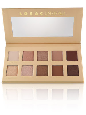
The color scheme is very similar to the Lorac Unzipped:


As well as the Violet Voss Holy Grail:


And is extremely similar to the new Lorac Mega Pro 3:


It's exciting to me that a brand I like so much that I don't usually hear people talking about is expanding their eyeshadow palette range. However, I do feel that a lot of their releases have been quite similar, and the Beauty Haul is no exception. 

It's a pretty palette, but it's not any different from so many things I already have, and I won't be buying. 

Friday, October 7, 2016

What I'm Not Buying: Too Faced Grand Hotel Cafe

The Grand Hotel Cafe is another holiday offering from Too Faced that offers three mini eye/face palettes and a mini mascara housed in a cardboard hotel box. 

And I won't be buying. 

This setup--three mini palettes within a cardboard box--is something I've seen Too Faced do in previous holiday seasons. And I really don't get it. I've heard people mention that it would be a great grift to divide among three different people, but then so much of the cost is going to the packaging and presentation of the items, so it doesn't seem the intent is to break them up. 

It makes more sense to me from a practical standpoint to put all the shadows and cheek products together into one palette, like their other holiday offerings. The shadow selections of each palette feel as though they have been designed to work together, but it seems unreasonable to think the cheek products included with each palette would be the best option to accompany that eye look for every skin tone. So I imagine people would need to pull at least two if not all three of these palettes out to create a look, which seems like an unnecessary hassle. 

Overall, I honestly feel that this is again another gimmick from Too Faced. And the biggest draw here seems to be the packaging and its resemblance to Wes Anderson's The Grand Budapest Hotel. 


Grand Budapest Hotel

To add to the gimmick, all three of these mini palettes are scented. 

Now, this is something that is starting to annoy me. With the release of the Chocolate Bar palettes, it was a nice addition, like whipped cream on a sundae, to have the shadows chocolate-scented. It felt like a little special something, like when a department store would put a spritz of perfume on the tissue paper as they packaged your products. 

But, it's not a lasting addition. My Chocolate Bon Bons palette, which I purchased less than three months ago, has already lost most of its chocolate scent. My original Chocolate Bar was much more heavily scented than the Bon Bons, so I would imagine there has been some change in the formulation of scenting the makeup. 

Now that the chocolate scent has dissipated, the lingering scent isn't very pleasant. It smells like badly perfumed makeup. (And yes, I purchased my Bon Bons palette directly from Sephora, so I don't have a counterfeit product.) The same happened with my Peanut Butter and Jelly palette. The palette originally had a hazelnut chocolate scent, but now has a faint and unpleasant scent. 

Several people reported that the smell of the Sweet Peach palette was nauseating, and I haven't heard great things about the scents in the Grand Hotel Cafe either. The mini palettes are scented with peppermint mocha, gingerbread cookie, and eggnog latte, and I've specifically heard from several people that the eggnog palette smells like play dough. 

More than anything, again, I feel as though more thought and effort was put into the packaging than the product itself. And sure, the packaging is cute, but how many people are going to keep it on display? How many people are going to want Christmas trees displayed throughout the year?


As far as the product itself, I find the mini palettes to be rather boring. 


There aren't any shades in this collection that I don't already have, and on the whole, the palettes seem to lean pretty cool-toned. As I've mentioned before, Too Faced is known for having lackluster holiday and limited edition products with quality that doesn't match up to the permanent line. The preliminary reviews I've seen of this product are no different. The eyeshadows lack pigmentation and blendabilty, and the face products are patchy. 

The Grand Hotel Cafe costs $49, but Too Faced boasts that this is a $292 value. I'm not exactly sure how they arrived at that number. The Grand Hotel Cafe has 18 eyeshadows, and the Chocolate Bon Bons palette has 16. Bon Bons costs $49 as well, so I wonder why two additional eyeshadows, two blushes, one bronzer, and one mini mascara equals $243 to Too Faced. 

Frankly, the Grand Hotel Cafe is not a $292 value. It's not even a $49 value. This is a marketing tactic that brands employ to make it seem as though there is this one-time great deal to get these products for super cheap. ("Because if you don't buy now, this would cost you $292, so you better buy now!") But in reality, they are not worth that high price tag, and with the poor quality, they are not even worth the "discounted" cost. 

The only appeal that I see in this collection is the presentation and packaging. And as I've said before, that can get a little hazy. If brands know that people will shell out money for mediocre products and cute packaging, what incentive is there to make the product great? If their margins will still be the same as long as there is a cute gimmick, why bother making an innovative and excellent product? 

I really feel the target audience for something like the Grand Hotel Cafe is as a holiday gift for someone new to makeup. The presentation is fun for a gift, and there are enough products for someone to play with and potentially develop and understanding of what they like and what works for them. Even still, I think money would be better spent buying a permanent item with better quality. 

As much as I loved the Grand Budapest Hotel and would love to have a mini version of it on my vanity, $49 is too much to spend on cardboard packing, the impracticality of three mini palettes, and mediocre quality. And I won't be buying. 

Wednesday, October 5, 2016

What I'm Not Buying: Anastasia Beverly Hills Ultimate Glow Kit


Anastasia Beverly Hills is incredibly hot right now. They recently released the Modern Renaissance palette to tremendously positive reviews, a stick foundation in an expansive and inclusive shade range that every brand should pay attention to, and the Master Palette by Mario that people are already raving about. And now they are releasing the Ultimate Glow Kit for the holiday season. 

But, I won't be buying.  

As I've mentioned before, an unpopular opinion of mine is that a highlighter is a highlighter is a highlighter. Typically, when you've got one great highlighter, it doesn't matter how many more you have as they will all generally look the same once applied and sheered out onto the skin. The entire point of a highlighter is to look like a glow or sheen on the skin, not a thick stripe of color. Because of this, I do feel the market is oversaturated with these products as there is only so much a highlighter can do.

With that being said, there are sometimes highlighters that seem special or different enough that I can justify the purchase and be really happy with. But this palette isn't that for me.

What I like about this palette is that I think it would look really lovely on darker skin. So many highlighters cater to lighter skin, so it's always exciting to see something more thoughtfully curated to be inclusive to all customers. I also think this palette would easily work for lighter skin tones, and I commend Anastasia Beverly Hills for creating products that fit diverse populations.


There's no denying that the colors in this palette are really beautiful, but I just simply don't need it. I already have two Anastasia Beverly Hills Glow Kits in Gleam and Sun Dipped. And I love them. I think they give a really beautiful foiled look to the skin, and I love that I can dip my brush between colors to create a myriad of different finishes. Truthfully, I really don't notice a significant difference in most of the colors once they are applied, but I'm okay with that. The Gleam kit makes me ever so slightly pink and cool-toned, where Sun Dipped gives a nice warm glow. 

With that being said, I think it's important to consider the price and really evaluate the use you would get out of all the shades in the palette. That's the tricky think about palettes--when brands try to include all skin tones, typically every shade won't work for every person. So for some people, the lightest shade, "Snow," will be their most used and the shade they will probably use up before really touching the other colors. And for others, "Snow" might look ashy on the skin and may not be used at all. So, while it can be nice to have the variety, it is important to be realistic about how many shades you will wear the most.

The Ultimate Glow Kit costs $45 for six pans at 0.16 ounces a piece. I think that's a much more reasonable price when compared to other highlighter palettes released for this holiday season, but I think a regular Glow Kit is a much better value at $40 for four pans at 0.26 ounces a piece.

If you're interested in the color scheme of this palette, I would recommend checking out the Glow Kits in That Glow (only available on the Anastasia Beverly Hills website) and Sun Dipped.


That Glow

Sun Dipped

If, like me, you don't see a discernible different between highlighters when applied to the skin, and you just want one excellent product, I love Becca's highlighters. The two that I have (that also keep me from buying the Ultimate Glow Kit) are Moonstone (my favorite) and Opal. 


Moonstone

Photo: Temptalia

Opal

Based on Anastasia Beverly Hills's other recent releases, I imagine this palette will be hyped and celebrated, but I also don't think it is unique enough to be really exciting. Their Moonchild palette (which I am still lusting over) was really an exceptional release. It is a beautiful, unique palette that is wearable but still different enough to be intriguing. Not everyone wants a face highlight with a blue, green, or purple shift, however, so it makes sense that their holiday offering would be something more neutral that could reach a wider audience. 

I just simply have too many highlighters at this point to welcome more of the same into my collection. I also don't find this palette different enough from their other Glow Kits to be all that interesting. And I won't be buying.  

Saturday, October 1, 2016

What I'm Not Buying: Too Faced and Kat Von D Better Together


We've seen cosmetics brands collaborate with a celebrity, and we've seen collaborations with "influencers" or YouTube personalities, but the Better Together collaboration between Too Faced and Kat Von D is the first I can recall of two cosmetic brands collaborating together. 

But I won't be buying. 

When I first hear about this collaboration, I was so excited. As I've mentioned before, Kat Von D's Shade and Light Eye palette is one of my all-time favorites, and I also really love the Monarch palette as well as her metal crush eyeshadows. Too Faced I can sometimes be a little iffy about, but I can't deny that above all other brands, they probably excite the beauty community the most with their upcoming launches. 

I couldn't wait to see what these two major players in the beauty community were going to come up with, and after seeing the packaging in the above photo, I got even more excited. While in general I'm not entirely excited by heart-shaped things, I do quite like the aesthetic of pink and black, gold and silver. 

But when I saw the inside, all my excitement quickly dissipated. 


As far as the actual shadows... I don't know. I guess I just feel a little bored? There certainly aren't any interesting colors here, and the color scheme on the whole doesn't feel very cohesive. I don't see the point in having three gray/black shades (two in the Kat Von D side, one in the Too Faced side), two shimmery taupe shades, and two white/cream shades. It almost feels as though the creators didn't actually collaborate with each other to think of how to make colors unique to each brand and also cohesive overall. 

This palette also leans far too cool for me and my tastes. I hardly ever use gray or black shadows, and I would have no crease or transition colors here. I would therefore need to pull in another palette to get some peachy and warm tones. I also wouldn't get much use out of the red shade, and for the shades I would use, I already have several duplicates in my collection. 

Another negative, and this is a pet peeve of mine, but booking at this palette, there is so much wasted space. I already wasn't a huge fan of the heart-shaped design, and this packaging is just way too bulky for the amount of shadows inside. 

Apparently each side of the heart is its own palette and then they click or magnetize together to make the complete heart. Having the two parts break apart is slightly better for storage, but there is still just too much bulk. 


Looking at the individual sections, this palette feels even less impressive and interesting. The entire thing just looks and feels so impractical. I have a hard time imagining that people would want to continually put the pieces of the palette together just to use it. Also, with the letters that the creators have written to each other, why is that part of the palette? It seems to be the kind of thing to be included on a card with other information that can be throw away.  

It's worth mentioning that the collection comes with several other items in addition to the eyeshadow palette, including Kat Von D's Tattoo Liner and Too Faced's Better Than Sex mascara. Too Faced blushes and highlighters and Kat Von D lip products are also part of the collection. 

But to me, this entire collection feels less like makeup products and more like a gimmick. Yet again--and I feel I've been saying this a lot with this season's makeup releases--the packaging is far more interesting and beautiful than the actual product. It's easily the best part here. 

Based on both brands' holiday releases, where there has been much to be desired in terms of quality, I am even less interested in this collection. Better Together is being released after Christmas, so I'm not sure if it qualifies as part of the brands' holiday releases or if it is just a limited edition item. Too Faced's holiday releases are historically of inferior quality to their permanent line, and Kat Von D's holiday release this year has not had great reviews. Unfortunately, it seems the quality control issues the Kat Von D brand has been plagued with are still present. Because of this and the gimmicky nature of this release, I don't see how the quality would be equal to the best items in both brands' lines. If I had to make a guess, I would say the quality is likely to be in the "meh" range. Not the worst, but certainly not noteworthy. 

This collection just feels like a heavy disappointment to me. And it also feels like a missed opportunity. Both brands are so hot right now and have so much attention on them, and I think this could have been far more exciting. 

The only reason I could see in people getting this collection is if they are a huge fan of both brands and would like some of the packaging as a collector's item. Personally, I don't collect makeup just to have it. I like to love and use everything that I have. But I know there are many people who do collect makeup, and for them, this could be unique and exciting. 

For other people who are interesting in sampling each brand and who were somewhat interested in the color scheme, I would recommend Too Faced's Chocolate Bon Bons palette:
 And Kat Von D's Metal Crush eyeshadows: 


Photo: Temptalia 

I think the quality of both of these products are the best each brand has to offer, and money would be better spent toward these products than the Better Together collaboration. 

The Better Together palette had a lot of promise, but it just fell flat for me, and I won't be buying. 

Wednesday, September 28, 2016

What I'm Not Buying: Urban Decay Full Spectrum Palette


Urban Decay just announced a new eyeshadow palette to be released this holiday season along with the (somewhat boring and uninspiring) Naked Ultimate Basics palette. 

And like the Ultimate Basics, I won't be buying. 

Urban Decay is having an interesting moment right now. They're releasing a lot of things. They came out with the enormous Vice lipstick line and Moondust palette, just came off a collaboration with Gwen Stefani (that included an eyeshadow palette, blush palette, lip products and brow products), had the Alice Through the Looking Glass palette, the Ultimate Basics palette, and now this. 

The thing is, I really can't remember the last time Urban Decay came out with a palette that was both hyped and celebrated. Naked 3 was pretty big, but as time has passed, a lot of people have remarked that they don't like that palette too much because it requires a pretty specific skin tone and eye color to be really flattering. Naked Smokey wasn't a huge success. Last year's Spectrum palette as well as the Gwen Stefani palette went on major sale to get rid of stock. The Alice palette (which is also limited edition) is still currently in stock as well, months after its launch. 

Personally, I no longer own any Urban Decay palettes, and I doubt I ever will again. In the past, I have owned: Naked, Naked 2, Naked 3, Naked Basics, and Gwen Stefani. I decluttered all of them because I just don't like the Urban Decay formula. These shadows have so much fallout and many are packed with glitter. I find the shadows to be pretty dry when compared to some of my favorite formulas, and I've never been a fan of their matte shadows. 

But, I will say, as soon as I saw the first pictures of the Full Spectrum palette, I was immediately drawn in by the colors. 


And it instantly reminded me of Kat Von D's very coveted holiday 2015 palette, Mi Vida Loca Remix. 

If the Mi Vida Loca Remix palette was still available, that would get my overall vote because of the different finishes (matte, shimmer, and satin) as well as the inclusion of neutral shades. Since the Full Spectrum palette will only have shimmery shadows, the Mi Vida Loca is a more cohesive and comprehensive palette, but it is no longer available. And people who missed out on it will probably be thrilled for the Full Spectrum palette, which also offers more practical packaging than the Mi Vida Loca.

Personally, as much as I love looking at these bright, beautifully colorful palettes, I know that I would little to no use out of them. That is why I passed on the Mi Vida Loca last year. I considered it several times, but knew it wouldn't be a smart purchase. And honesty, I have never regretted not having it. 

My two most colorful palettes are the Juvia's Place Nubian 2 and the Viseart Dark Mattes: 


Although these are not the most colorful palettes--and certainly don't look like the Full Spectrum palette--they completely satisfy any and all need and want for color in my collection. 

But for those very unlike me who would love to have a colorful eyeshadow palette, there might be some other considerations to keep in mind when thinking about the Full Spectrum palette. 

The first is cost. The Full Spectrum palette will cost $58, which is a very typical price for a palette this size from Urban Decay. Still, $58 is expensive for an eyeshadow palette that may not have the best quality. And that's the second thing to consider. 

Urban Decay feels very hit or miss lately, leaning more toward misses. The Gwen Stefani, Alice, and Naked Ultimate Basics palettes have not received unanimously glowing reviews. They all seem to fall into "meh" territory, where they are not bad necessarily, but they are not great either. For some people, "meh" is perfectly acceptable, especially when they are fans of the brand, but for $58, I personally want better quality than that. 

The Full Spectrum palette also reminds me quite a bit of the Alice Through the Looking Glass palette (still for sale). 

18 shadows in the Full Spectrum palette are said to be new to Urban Decay, and three shades are repeats, including two (Hatter and Metamorphosis) from the Alice palette. It concerns me that two of the shades are the same from the Alice palette because I wonder if the quality with be the same as well, which was lackluster. 

I think everyone always has high hopes when a new makeup item is released, but unfortunately, it seems as though Urban Decay's quality has slightly slipped as of late. I would hope the quality of the Full Spectrum palette would be different, but it's hard to say with confidence. 

For a less expensive palette that has received mainly positive reviews, I would recommend Juvia's Place Masquerade palette. 


Although it doesn't cover the "full spectrum" of colors like the Urban Decay palette, there are certainly some nice, bright, beautiful colors in here. I've been really impressed with my Nubian 2 palette, so I imagine the quality of the Masquerade palette is the same. 

The Full Spectrum palette is really going to boil down to personal preference. If you love color and have been salivating for the Kat Von D Mi Vida Loca Remix palette, this might be an excellent addition to your collection. If, like me, you don't wear color too often, this palette might be an easy pass. I am hopeful that Urban Decay improves the overall quality of their shadows and that this is a nice offering, but I won't be buying. 

Tuesday, September 27, 2016

What I'm Not Buying: Marc Jacobs About Last Night Style Eye-Con No. 20 Palette Holiday 2016


Marc Jacobs has come out with another $99 holiday palette, and although I think it's beautiful, I won't be buying. 

Actually, scratch that. I think most of it is beautiful, or perhaps my eye is drawn to the shades I think are beautiful and I'm ignoring the rest. But upon first look, there are at least five shades in here that I would never use, which makes the high price tag hard to swallow. 

So, this is something that I struggle with. I see colors I like and colors that will complement my skin, and I'm immediately drawn to it and start wanting it. The hype builds and builds, and somehow, the rest of my collection slips out of my mind and I think I can't do makeup without this one product. 

But here's the thing. I know these colors will look good on my skin because I already have them. And at this point, I have tried nearly everything, so there really isn't ever going to be a collection of colors I haven't tried or owned. 

Another really important factor to consider when buying a palette is how much use you'll get out of it as well as how much use you'll get out of each shade. I know that sounds obvious, but when the hype train in strong, I think we forget this a lot of the time. 

Before I talk about that further, I want to share another picture of this palette as the PR photo of the palette (above) looks a little different than what it really looks like. This happens so often, and I find it really frustrating. It's only when PR samples are sent out or the palettes show up in stores that we can actually see the correct colors. 


Photo: Temptalia

The above photo was featured on Temptalia's review. This picture looks quite a bit different from the press picture above. The colors (especially the rose ones) look much more muted. 

There are still colors that I gravitate toward in this photo, but the pull is not as strong. And this was important for me in realizing why I didn't want to buy this palette. As I said, upon first look I thought there would be about five shadows I wouldn't really use (the third and fourth shades in the third row and the middle three shades on the bottom row), but in this more realistic photo, now I can see more. 

I probably wouldn't use most of the top row because the shades are so light and wouldn't show up on my skin.

I wouldn't get much use out of the gold shade because it's much more yellow than I thought and wouldn't flatter my skin. 

I wouldn't get much use the white and pink shades in the second row as they would be too light. 

And I probably wouldn't use the purple shades in the third or fourth row since I prefer gold, bronzes, and mauves more. 

So, in this $99 palette, I would probably get a good amount of use out of only six shadows. I like several of the other colors, but I wouldn't use them that much. 

The color scheme of this palette is also a little confusing to me. It doesn't feel very cohesive and doesn't feel like the colors naturally go together. Apparently the colors work in rows, with each row creating a look. Personally, that's not my favorite way to put a palette together. I prefer when most of the shadows play well together instead of a layout like this. 

I think this palette would also be a little redundant if you purchased the holiday palette from last year. 


Photo: Temptalia

Though there are subtle differences, the two palettes have a very similar feel to me, and there are several tones repeated in both. 

More than anything, I think this palette is just too expensive for what it is. Yes, it is a good value when you compare the prices of Marc Jacobs' other eyeshadow palettes, but it is still too expensive for a palette full of colors I already have and can find in cheaper--and good quality--palettes. 

If you like the general color scheme of this palette, I would recommend getting the Too Faced Chocolate Bon Bons palette instead. (And if you already have Bon Bons, I would recommend passing  on the Marc Jacobs.)

The Chocolate Bon Bons palette has similar pink, purple, and dark brown tones while also being a more cohesive palette. At $49 this palette has 16 shadows, so only four less than the Marc Jacobs palette, for half the price. 

The bottom line is that I don't love every single shadow in the Marc Jacobs palette, and for a palette that expensive, I would need to love close to every shade. And the shades that I do love I already have. It's a beautiful palette--packaging and all--but I don't need it. I have plenty of shadows I already love, and I won't be buying a palette I feel lukewarm about--hype or not. 

Sunday, September 25, 2016

What I'm Not Buying: Laura Mercier Fall in Love Illuminator Collection Holiday 2016


For the holiday shopping season, Laura Mercier has released a palette with four smaller-sized pans of their Face Illuminator Powders. 

And I won't be buying. 

The powders, honestly, look gorgeous. There's something about the density of the powders, how they're not flat and flush with the pan, and the texture that reminds me of crinkled satin sheets. They're so beautiful and make me want to own them without a second thought. 

But. And this is something that has taken me a while to fully comprehend and admit to myself. 

A highlighter is a highlighter.  

I know that might come across as blasphemy to the majority of the beauty community, but as someone who has owned many highlighters, I feel confident in saying that there is so little discernible difference of the look of different highlighters on the skin that it really doesn't pay to own more than one or two. 

I have owned highlighters from Becca, Dior, theBalm, Lorac, Laura Mercier, and Anastasia Beverly Hills. And I have used shimmery eyeshadows as highlighters just to see if there's a difference. And ultimately, there really isn't much. 

I've found this to be true (at least on my warm olive skin tone) with different shades of highlighters as well. Typically, unless the color is too dark for my skin, the effect of every highlighter is exactly the same. It's beautiful, glowy, and gives a nice sheen or shine to the skin. But I don't specifically notice the color. 

Right now, there are eleven pans of highlighter in my collection. However, eight of them are part of two Anastasia Beverly Hills Glow Kits (Gleam and Sun Dipped). That means I only own three individual highlighters. They are:

  • Becca Moonstone
  • Becca Opal 
  • Laura Mercier Matte Radiance Baked Powder in Highlight 01


I have decluttered the rest of my highlighters, not because I didn't like them or thought the product was inferior, but because I just don't need that much of the same thing. 

All of the highlighters in my collection are different enough for me to justify keeping. The Glow Kits have shades that closely (if not exactly) match Becca Moonstone and Opal, but I enjoy having the individual pans of highlighter for when I travel or just want to grab something quickly. 

When I swatch the highlighters in my collection with my finger onto the back of my hand, I see a difference in color between all of them. However, when sheered onto my cheekbones, they all look really, really similar. 

The Laura Mercier Fall in Love Illuminator Collection is $58 for 0.44 ounces of product. That feels very expensive to me. Laura Mercier claims that this is a $65 value (which isn't much of a value anyway). However, the full-sized Face Illuminating Powders are $44 for 0.35 ounces of product. So I have a hard time figuring that 0.09 ounces of product is worth $21. I imagine that number was calculated based on the palette offering four shades instead of one, but since Laura Mercier does not sell deluxe sample-sized pans of this highlighter, it's hard to see how they calculated the palette's value. 

Frankly, I just don't think this palette is a good deal. If you don't have many (or any) highlighters and wanted to try several different shades, or if you were intrigued by the color selection in this palette, I instead recommend the Anastasia Beverly Hills Glow Kit in Sun Dipped. 


If you were to swap the upper left and lower right pans, the shade selection would be nearly identical, and I would imagine completely identical once sheered out on the skin. 

Sun Dipped offers 1.04 ounces of product for $40, so it is a significantly better value than the Laura Mercier Illuminator Collection. And Anastasia Beverly Hills offers some of the most beautiful highlighters I have ever worked with. I wouldn't be surprised if these performed better than the Laura Mercier palette. 

The only pro the Laura Mercier palette has over the Anastasia Beverely Hills Glow Kit is the packaging and the way the powders look in the pan. Sure, I like my makeup to be as pretty as possible, but not for $18 more for less than half the product. 

I have enough beautiful highlighters in my collection that I don't need the Laura Mercier Fall in Love Illuminator Collection, and I won't be buying.