MakeupStruggles started a "Palettes I Would Redesign" series.
Elle S has a video on palettes she wished existed from Urban Decay as well as Anastasia Beverly Hills.
And recently Temptalia wrote a post on palettes she wished existed from Colourpop.
I suppose I kind of have a similar post, which is on my duped Modern Renaissance palette. I've been vocal about not being a fan of that palette, so I made my own version of it that was more of what I wished the palette had been.
And while I can certainly see where these videos/posts are coming from and why they are interesting (I definitely like to read/watch them), it also makes me wonder why people wish these palettes exist and don't just recreate them with single shadows.
Single shadows have really been the best tool for me in curbing my spending on makeup and needlessly adding to my collection. My singles used to be the least used shadows in my collection, and I think part of that is because I organized them by color gradient. I had seen so many palettes organized this way that I just did the same thing. I started with the lightest colors and then worked my way to the darkest color. But that ended up just confusing my eye when I would look at them, and I would never feel inspired. When I started duping popular palettes and depotting shadows from other palettes, I started to really appreciate the power of singles.
Now, my singles are easily the most used shadows in my collection. I still have some palettes that I want to keep, but for the most part, I reach for my custom palettes on an everyday basis.
Another thing that has been helpful in curbing my spending is recognizing when a shadow is unique or special. Most of the time, it's really not. And when I look at a palette with a pretty or pleasing color scheme (like ABH Modern Renaissance) and realize that not one of those shadows is what I personally consider a special or unique color, it makes it much easier to resist hype.
So what I thought I would do in this post is to show what I consider the most interesting or unique single shadows in my collection. Upfront, I want to mention that I have included three shadows that were depotted from palettes that you cannot buy from those brands as individual singles. However, it is very likely that you can find a similar shadow from another brand.
I also want to say upfront that I will not be providing swatches in this post. I personally find it difficult to photograph swatches and have them show up true to life. Additionally, I have a light to medium skin tone with a warm olive undertone, so it is likely that a swatch on me will not be accurate for others. I also don't personally find swatches to be all that accurate or indicative of performance, so I don't like to include them. Instead, I will include photos of the shadows on my eyes for reference.
Bobbi Brown Camel

If you've read my blog for any length of time, you know that I absolutely love this eyeshadow. I have tried many other colors in this mustard-brown family (like Makeup Geek Desert Sands, Melt Rubbish, and Morphe x Jaclyn Hill Pukey), and while I do enjoy those shadows, I still prefer Camel. This is the perfect crease color for almost every shadow, and it allows for even bright colors to feel somewhat neutral. I know it looks like a nothing brown in the pan, but this is my favorite neutral matte shadow and one that I consider to be a staple in my collection.

Camel in the crease
Dior Cosmopolite

I first heard about this shadow through Tarababyz on YouTube because she constantly raved about it. If you're unfamiliar with Tara, she owns more makeup than anyone I have ever seen and has a true passion for collecting makeup. Because of how much she has owned and tried, when she continually raves about something, I pay attention. This shadow is also a great example of why I hate swatches, because every swatch that I saw of it before I decided to purchase made it look like an average, nothing bronze color. The reality is that it is a cool-toned bronze and is almost like a bronze-silver or a bronze with silver shimmer. I have never seen a shadow like this before, and it is truly the most unique neutral shadow in my collection. There are not many shadows from luxury brands (like Tom Ford, Burberry, Chanel, Dior, etc.) that I would say are worth their price tag (or rather I would recommend in spite of their price tag), but Cosmopolite is one.

Cosmopolite on the lid
MAC Rose pigment

This is the only pigment I own from MAC, and it is the only one that I think is special enough to buy. MAC has some really gorgeous pigments, but I feel like all of them are pretty easily duped by pressed shadows, and I personally will always choose pressed shadows over loose. Rose, however, is absolutely gorgeous, and it is one of those pigments that really benefits from being applied wet using Fix+. At this point, I have several shadows that fit this general shade of golden pink (Morphe x Jaclyn Hill Sissy, Colourpop Come and Get It, and Coloured Raine Short Cake), but none are quite as good as MAC Rose pigment. This is one of my all-time favorite lid shades, and it's one of the few shades that I'm happy to have in such a large jar.

Rose pigment on the lid
Fyrinnae Rapunzel Had Extensions

I don't think there will ever be another shadow that is as true and perfect of a peach shimmer than this shadow. This was the first shadow that I purchased from Fyrinnae, and you will see several more appear on this list. Like most Fyrinnae shadows, Rapunzel Had Extensions really requires the Fyrinnae Pixie Epoxy to bring it to its full potential. This is a warm-toned person's dream shadow, especially if you have blue or green eyes. I always get compliments whenever I wear this shadow, and while it looks and performs quite neutral, there is just nothing else like it.

Rapunzel Had Extensions on the lid
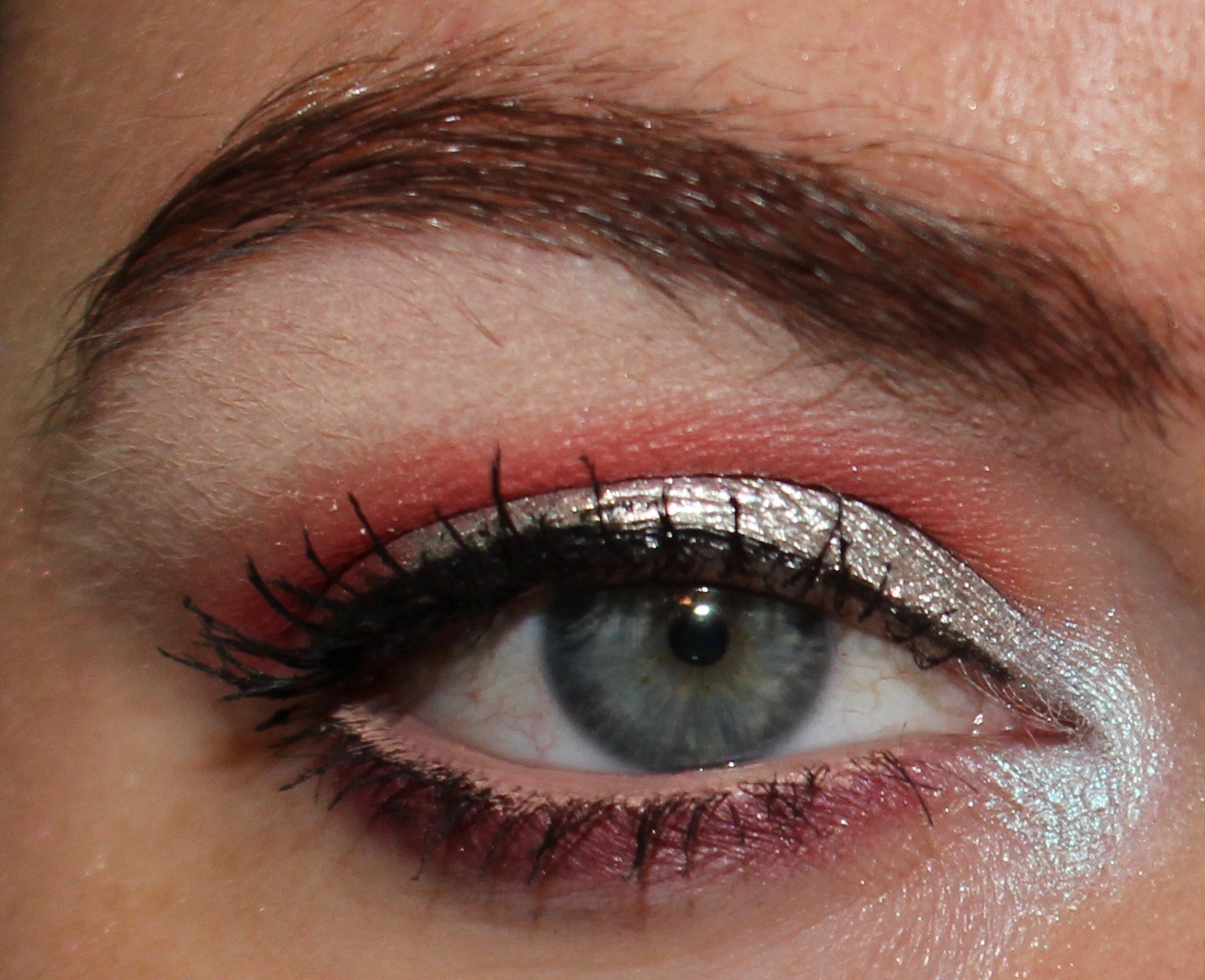
Fyrinnae Serendipity

One of my readers recommended this shadow to be, and I am so happy that they did because this is also an all-time favorite of mine. Serendipity is one of those shadows that I don't really even know how to describe. It's a little silver, a little mauve, and a little reddish pink. It can be paired with browns, mauves/purples, or even pinks. It is a gorgeous, complex color, and it looks stunning on the eyes. Like some of the other shadows on this list, it is certainly a neutral color, but it is just so much more interesting than typical bronzes or golds.

Serendipity on the lid
Fyrinnae Illusionary

I once heard this shadow described as Serendipity's cool-toned sister, and I absolutely agree with that. In the jar, this shadow looks quite purple, but on the lid, it is much more complex than that. Like Serendipity, Illusionary can lean silver or mauve, and it can vary dramatically by the colors it is paired with:

Illusionary on the lid with light peach in the crease

Illusionary on the lid with red/burgundy in the crease
Ardency Inn Rose Gold

I feel like many brands interpret "rose gold" differently, but, in my opinion, nothing beats the one from Ardency Inn. It is one of the more complex rose gold shades I have seen, and it is also one that truly looks like rose gold metal rather than a pink gold. It's a difficult shadow to photograph (though I've tried), and it's just a beautiful neutral that is just a little more interesting than standard fare.

Rose Gold on the lid
Colourpop Making Moves

This is easily one of my favorite shadows from Colourpop, and I love how rich in pigment it is and also that it doesn't come at a huge cost. This is the kind of shadow that really made me fall for the Colourpop pressed formula, because it was interesting, trendy, and high-quality. I have worn this shadow all over the lid, in the crease, and on the outer corner, and it is always really beautiful. It is a hot pink and peach hybrid, and something that I don't see very often.

Making Moves on the lid
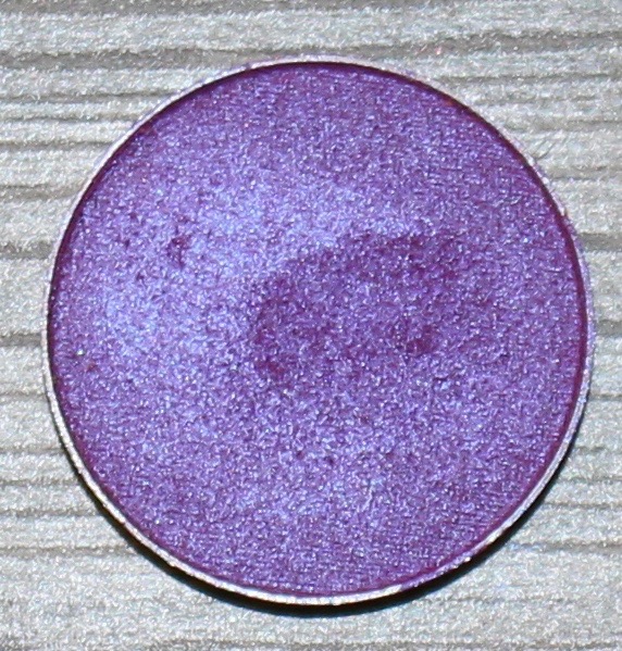
Colourpop 143

If I had to pick one all-time favorite shadow from Colourpop, it would be 143. This is a gorgeous warm matte purple with a hint of pink. I primarily wear this color on the outer corner, but it would be beautiful all over the lid or in the crease. I don't often see rich purple mattes in a ton of premade palettes, which is why I have included this one on the list. It is also the shadow I pull for most often when I am looking for something to deepen a look or just make something a little more interesting.

143 on the outer corner
Natasha Denona Nina's Orchid

On the whole, I don't like Natasha Denona matte shadows, and I especially did not like the first release of them, which included this shadow. However, I love Nina's Orchid and think it performs much better than other Natasha Denona mattes. It is unlike any other shadow that I own, and it makes such a beautiful crease color. I love that it can pull warm or cool depending on how it is worn, and it has been such a fun color to work into an otherwise boring look. Like all the matte purples on this list, I have included it because it is a color that I just don't see very often or have not seen at all, and I really like what it can add to a look.

Nina's Orchid in the crease
Inglot 392 matte

This is probably the most boring shadow on this list, and it is also the most difficult to represent in a photograph. I've included it because it's a shadow that I often use as a crease or transition shade, and there are not many shadows that I have seen that are comparable. It's a soft matte lilac, and it can look purple or pink depending on its accompanying shades. I have really enjoyed using this shadow to give a soft glow to some of my looks, and it has been a staple in many of my "sunset" looks.

392 matte in the crease
Makeup Geek Blacklight

This is another shadow that is difficult to photograph because it is a duochrome that shifts between purple and blue. This is easily one of the most unique shadows that Makeup Geek makes (Urban Decay has a similar one called Tonic), and it is the shadow that first made me fall for purple shadow looks. Like many of the shadows on this list, I love that it can be worn in a neutral look, but it also cam be paired with colorful shadows for more of a bold look. It is also the type of shade that really sells a palette for many people because it is somewhat different (look at Huda Beauty Desert Dusk), and it's a good shade to invest in if you don't want to buy an entire palette with shades you already have just because it has this in it.

Blacklight on the lid
Ardency Inn Orchid
This is an interesting shadow that is difficult to describe. In some lights it looks purple, and in others it looks pink. It also has a bit of a blue flash to it, which makes it similar to Makeup Geek Blacklight. I prefer to use this shadow all over the lid, but I don't have a photograph of me wearing it in that way, so I'll have to use one where I wore it on the lower lash line. I enjoy how complex this shadow is and love how many different ways it can look.

Orchid on the lower lash line
Coloured Raine Super Star

The market is really saturated with golds, but Super Star is easily the most unique one in my collection. I remember the first time I wore this and thinking, "Wow!" I was also wearing this shadow when a salty former coworker told me I looked like I was "going to the club" while at work. She meant it as an insult, but I took it as a compliment because it is such a gorgeous shadow. If you are looking for a statement gold, Super Star is what I consider the best.

Super Star on the lid
Fyrinnae Aztec Gold

This is one of my favorite Fyrinnae shadows, and it is a hybrid between an olive and patina gold. When I first wore it I wasn't sure if it would clash with the olive tones in my skin, but when paired with a warm brown, I thought it looked really beautiful. I have several greens in my collection, but this is the one that I find most interesting and unique.

Aztec Gold on the lid
Natasha Denona Glam Green

If Aztec Gold is a mix of green and gold, Glam Green is a mix of green and silver. It has taken me a long time to really appreciate silver shadows because my skin tone is so warm and sometimes silver can clash. Glam Green is unlike any shadow I have seen. It looks silver, but it has just enough green in it to make it not a silver at all. It can pair nicely with other greens, warm browns, and cool brows, and it can easily make a look very dramatic.

Glam Green on the lid
Notoriously Morbid Paradise Island

This shadow was released with the Wonder Woman collection, and I am not sure if it is currently available. But I absolutely love this shadow. This reminds me of the northern lights or aurora borealis. I've only paired it with pink, purple, and peach shades, but I'm sure it would also look gorgeous with blues, greens, and browns. This is the kind of shadow where I see it and wonder why every brand has not come out with a duplicate.

Paradise Island on the lid
Juvia's Place Chi

This is one of the shadows that cannot be purchased individually as it is part of the Juvia's Place Masquerade palette. I had to include it on this list, however, because it is one of my favorite blue shadows and unlike most of the ones I've seen. It is a cool-toned blue (and while it seems a bit weird to think of a "warm-toned blue," there are blues that are warmer), and it can lean blue or purple depending on how it is worn. I personally love wearing it with a warm brown in the crease, and I love the juxtaposition between the warmth and coolness. I also love how deep it is and how easily it makes a look very dramatic.

Chi on the lid
Costal Scents Lakeshore

This is also one of my favorite blue shades, and I love how it is a sea blue. Although this shadow has a shimmer finish, it is not as shiny or sparkly as other shimmer shadows, which adds to the depth of the shadow for me. I typically wear this shade all over the lid, but it can also be blended into the crease to add some warmth to a cool look. I love how many shades this can pair with (pink, purple, brown, teal, dark blue, etc.), and feel like it is an easy shadow to work with when first diving into blue shades.

Lakeshore on the lid
Urban Decay Boom and Untitled

I feel like it's cheating to include these shades since they are from a palette and equally cheating to include two at the same time, but I really love these two shadows and especially love them together. In general I feel like a good teal is somewhat unique, and a deep royal blue is surprisingly hard to find. I have really grown to love both of these colors and love to use them to complement otherwise neutral looks. Years ago I remember searching for a midnight blue (that did not lean black) because I had it in my head that it would look amazing with a champagne shadow. Looking back on it now, there's no way I would have ever worn that look even if I could have found the right shadow because I never strayed away from my neutrals. But now I have the shadow I was looking for all those years ago and also have the confidence and courage to wear it.

Boom on the lid, Untitled on the outer corner

Boom in the crease, Untitled on the outer corner